Customizing Cart 
Autore: Elsa-marie L.Hello.
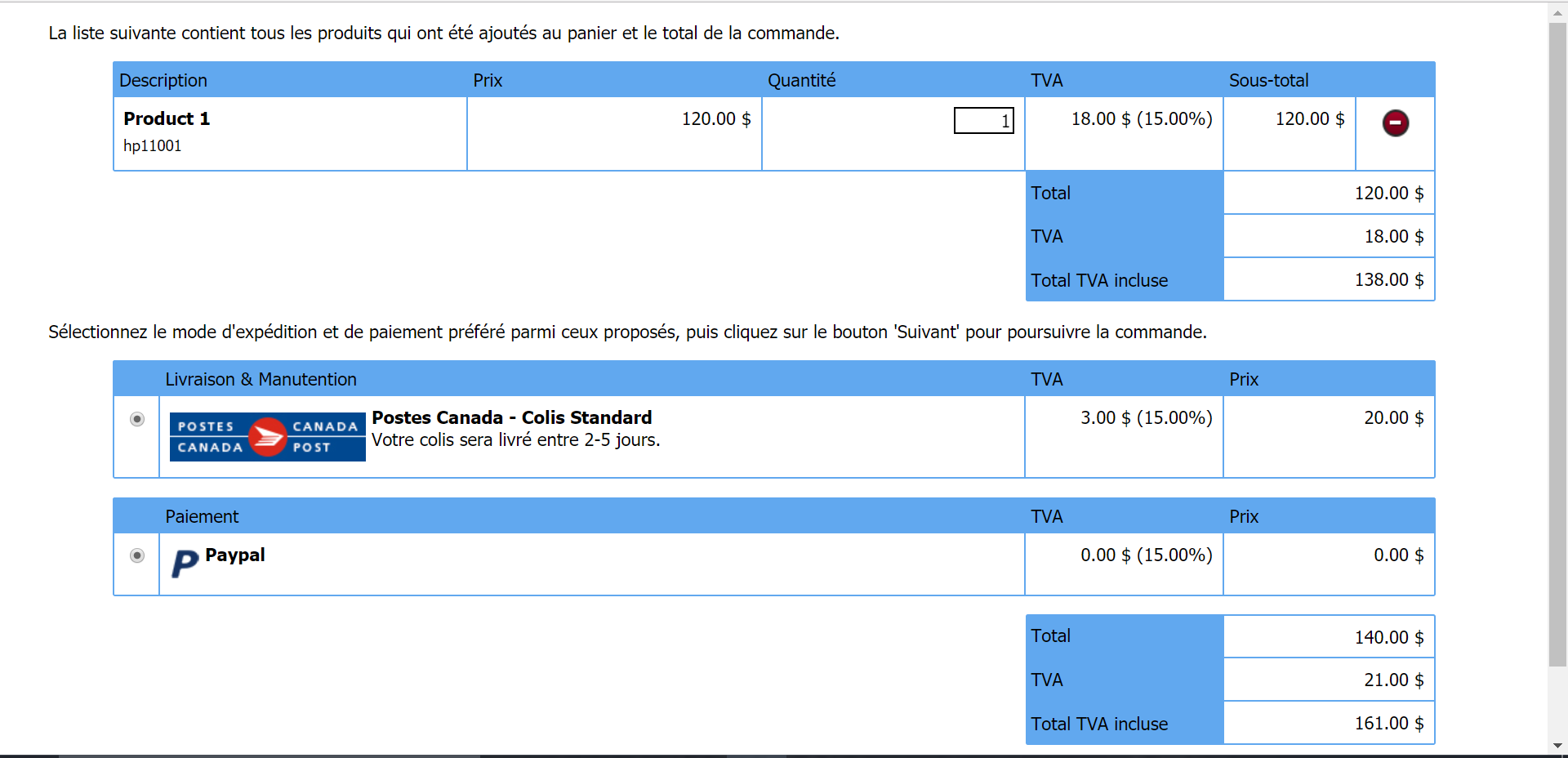
I have an issue with how the cart looks like, and how the layout is. And I was wondering if there was a way I could make it better. This is currently how it looks:

I can't seem to find a way to take away the two bottom bit, with the CanadaPost (my only shipping option) and the Paypal (my only payment option).
My issue is that in most carts, like Amazon, B&H, etc, the shipping and handling cost is right under the product price and the VAT price. It goes:
Product Total: 120$
VAT: 18$
S&H: 20$
Total: 158$
I want the same to happen here; but instead, its all separated into different blocks (the S&H amount is within the Canadapost box. And at the very end of the cart, it still doesn't say:
Product Total: 120$
VAT: 18$
S&H: 20$
Total: 158$
Finally, I don't at all need the Shipping and payment option selection boxes in the cart, as I only have one option of each automatically.
I hope you can help me,
Elsa-Marie.

Hello Elsa-Marie,
Unfortunately at the moment it is not possible to have this feature in WebSite X5. I would like to suggest that you open an "Idea" Post where you describe to us the feature you would like to see implemented in the future releases of WebSite X5.
Many thanks!
Autore
Thank you. That is unfortunate, as its the most basic thing in cart layout in all professional websites...
I will indeed post the "Idea".
Thank you again!