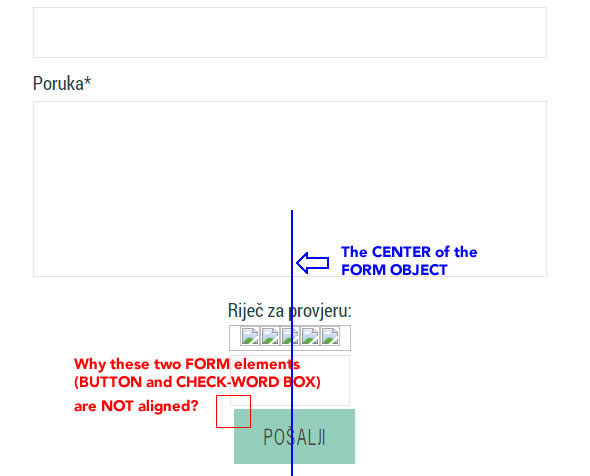
FORM ELEMENTS THAT SHOULD BE ALIGNED! 
Autore: Sinisa B.
Visite 1533,
Followers 1,
Condiviso 0
I had to talk fairy-tales today (B.S. actually) when my client asked me - why THE BUTTON and the CHECK-WORD BOXare NOT alignedto each other.
See below:

So, INCOMEDIA, why these two are not aligned in CENTER?
I have felt very unpleasant - 'cause this alignment should be done perfectly by design!
Postato il

Hello.Please provide a link to a page on the site where we can find this form.
Autore
@ Aleksej
Thank you for looking into it!
Probably the SUBMIT button is not align in the CENTER, I think that the CAPTCHA element is centered OK...
Here is the link:
https://www.crorosadamascena.eu/kontakt.html
Not much in it, if background was transparent no-one would know :-)
Actually, I think it's the other way on... There is 10px of padding to the right of the captcha, which when removed lines everything up nicely:
Unfortunately, there is no setting (that I know of) in WebSite X5 to remove this padding, so for the time being I'd have to say that I think this is an oversight on Incomedia's part. The padding is present by default even in a test project. I'll mark the thread for their attention.
Kind regards,
Paul
Search the WebSite X5 Help Center
As a workaround in the meantime, this CSS added in the 'Expert' tab of the page containing the form should sort things out.
To be added 'Before closing the BODY tag'
<style>
.x5captcha-wrap { padding-right: 0px; }
</style>
Autore
@ Paul
Incomedia should pay you guys, as I said to Aleksej, in GOLD!
Thank you very much - I had added the CSS - and everything is how it is supposed to be!