Row format header 
Autore: P. S
Visite 1952,
Followers 1,
Condiviso 0
I know i have asked this in the past, but is it still not possible to have a top menu included in a row format?
i.e. so i can have a row image on the home page, with the menu behind at the top.
Thanks
Postato il

Hello, but do you mean something like this?
http://www.ggwebdesign.altervista.org/
Autore
Hello Giuseppe,
yes, thats exactly what i was wanting.
so it can be done, but how?
thanks.
Scrivo in italiano (sono italiano) poi traduci con Google Translate.
Io ho ridotto a zero l'header e quindi in quest'ultimo non ho inserito nessun menù. Il menù in realtà è stato inserito sulla sticky bar e ho reso lo sfondo della sticky bar trasparente, poi ho attivato la sticky bar per ogni breakpoint nelle impostazioni "Sticky Bar" al PASSO 2 /Modello/Sticky Bar. Come primo oggetto ho inserito poi sulla griglia di impaginazione (PASSO 4/Pagine) una slide con foto scorrevoli (tu puoi inserire quello che vuoi) e, così facendo, il menù della sticky bar in automatico viene visualizzato sopra la slide in sovraimpressione.
Io poi ho usato qualche riga di codice extra per far apparire in modo diverso le voci del menù della sticky bar ad apertura del sito web e per fare in modo che con lo scorrimento della pagina poi apparisse anche uno sfondo colorato sotto le voci della sticky bar.
Per semplificare quanto da me descritto: prova ad usare il template gratuito "Web Design Agency" che trovi nella sezione "Design". Su quello è già attivo il sistema che ti ho spiegato con la sola differenza che nelle impostazioni della Sticky Bar il menù appare come Hamburger menù ridotto perchè è stato lasciato poco spazio in larghezza all'Oggetto Menù. Se però tu aumenti lo spazio in larghezza dell'Oggetto Menù avrai tutte le voci del menù visibili per esteso così come hai potuto vedere nel link che ti ho postato in precedenza.
Ciao
Autore
Thank you Giuseppe,
I did try this some time ago, but there was a bug that stopped the header being set to zero. Perhaps it's all fixed now.
I will try.
Thanks for your help.
Puoi farlo, usa il modello gratuito "Web Design Agency" che mette a disposizione Incomedia nella sezione inziale "Nuovo Progetto", è già tutto sistemato lì, devi solo allargare lo spazio dell'Oggetto Menù nella sticky bar per rendere visibili tutte le voci del tuo menù ed escludere l'hamburger menù. Ciao
GOOGLE TRANSLATE:
You can do it, use the free model "Web Design Agency" that Incomedia makes available in the initial section "New Project", everything is already arranged there, you just have to enlarge the space of the Menu Object in the sticky bar to make visible all the items in the your menu and exclude the hamburger menu. Hi
Autore
Hello Giuseppe,
I have tried this, yes it works just fine.
However, as you said, the sticky bar needs to change it's background colour once it is scrolled, so that the menu text can be read over coloured backgrounds.
Are you able give me any pointers on how to do this? (I am not advanced).
Thanks
Hello there!
You can set the background color for the Sticky Bar or Step 2> Sticky Bar in the general section:
Thanks! Kind regards.
Autore
Hello Elisa,
Thank you for the information.
However, this is not about changing the colour of the sticky bar - the bar needs to be transparent, so it can display a menu in front of a row image, but then change colour when scrolled, so that the colour of the text will not be lost whebn moving over coloured background elements on the page.
See Giuseppe's link above. This works fine, but i think he has used some code to do this.
Thanks
It is smart what Guiseppe has made - but there is maybe a more simple solution. This will however also require some code. But only a few lines and only once. I will try to explain.
Set the header to a height - could ber 100. Then define the menu in the header. You could define its background as transparent.
Then preview. Inspect the spurce to find the ID of the menu. It should be something like:
imHeader_imMenuObject_04_wrapper
The number 04 could be different for you.
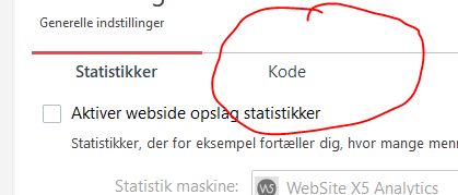
Then in the 1. settings / Statistic and codes in the
  codetab,you put this :
<style>
#imHeader_imMenuObject_04_wrapper {
position: fixed;
width: 100%;
top: 0px;
z-index: 4000;
}
</style>
again - the number could be different for in your case.
Then in the template structure you now set the hight for the header to 1.
This will do that the header will not be visible and the 1 px means that the sticky-menu first will be shown when the page is scrolled. There will be 1 pixel shown for the header, but the styling withe the fixed and the top position =0 will do that the menu is in top.
Doing it this way should function for all viewports once you have set the header and height for the sticky for every viewport. The hamburger should appear when the screensize says so.
A side-effect with this is, that you can use the full-height on the pages, and the menu will still be in top.
I hope I managed to explain how it could be done.
You only need to set the toptext-background to 0. The header should have same height as the sticky. If you change the z-index to 14000 then you can remove the menu from the sticky. Then the sticky is only used to give a background. You could say it is used as a back-curtain.
Hi, as I explained to you in previous posts, I used extra code to get that effect on the sticky bar, because initially the background of the sticky bar is transparent then when the page scrolls it becomes colored. I'm not at home now and I don't have a PC with me. When I get home I'll explain how to do it.
Ciao
Hi, to make the sticky bar background color appear when scrolling the page, enter this code in STEP 1 Settings -> Advanced -> Statistics and Code -> Code -> Custom code -> Before closing the HEAD tag. The background color of the sticky bar can be varied using the rgba notation (the numbers in bold, you can find information on the web):
<style>
#imStickyBarGraphics {
transition: 1s !important;
}
#imStickyBarContainer {
transition: 1s !important;
}
#imStickyBarGraphics.myStickyBar {
background: rgba(8, 69, 126, 1) !important;
opacity: 1 !important;
}
</style>
<script>
$(document).scroll(function() {
if ($(this).scrollTop() > 150) {
$('#imStickyBarGraphics').addClass('myStickyBar');
} else {
$('#imStickyBarGraphics').removeClass('myStickyBar');
}
});
</script>
I have an example here : http://eksempelsite.dk/test02/index.html
On the home-page I have combined Giuseppes invention with my own code. This creates an effect with the curtain. It is made with a header and and nothing in the sticky bar.
Disadvantage of doing it this way is, that you cannot have a row-format fort the header.
Here : http://eksempelsite.dk/test02/about.html I have solved this by making the page without a header and then using a "normal" menu that I styled the same way as in the header.
Here : http://eksempelsite.dk/test02/side-5.html I have 2 "normal" menus. I have made the lower menu sticky so that it gets sticky when it reaches the top.when using.
When you have no header, then Giuseppes invention is vey handy.
Advantage of using the header is, that when using anchors, the position will be correct - that is because the sticky and the header overlaps.
Autore
Thank you both Giuseppe & John S.
I can see from the examples this can be done, i am going to do some testing over the weekend to see how this looks.
It's a shame it's not a built in option / setting.
Many Thanks.
Si ottiene facilmente P. S, vedrai, bastano solo 2 minuti.
Ciao
Google Translate:
It is easily obtained P. S, you will see, it only takes 2 minutes.
Hi
Sorry - the anchors will still have to have some "help" when using the sticky menu.
I have an example here : http://eksempelsite.dk/test02/side-6.html
I have called the anchors Anker1, Anker2 and Anker3.
Then for the page (could have been made for the whole site) I use this style :
<style>
div[id^='Anker'] {
top: -50px;
}
</style>
I hope that INCOMEDIA will soon make it possible to set offsets for anchors.
Autore
All tested - working fine, and looks great.
Thank you for taking the time.
Thanks.