Better & More Professional Cart Customization 
Autor: Elsa-marie L.Hello.
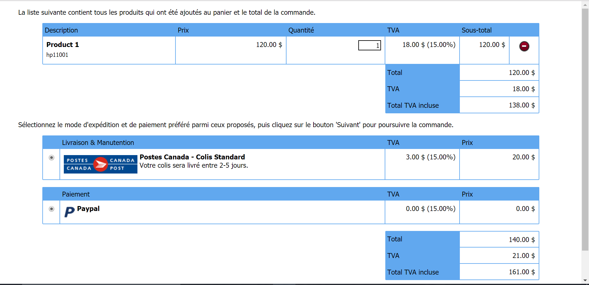
There is an issue with how the cart looks like, and how the layout is. And I was hoping I could post my suggestion so it can be improved to look more professional. This is currently how it looks:

My main issue is there isn't a way to take away the useless two bottom bit, with the CanadaPost (the only shipping option for many small businesses out there) and the Paypal (the only payment option for many small businesses) boxes.
My second but equally important issue is that in most carts, like Amazon, B&H, etc, the shipping and handling cost is right under the product price and the VAT price. It goes:
Products Total: 120$
VAT: 18$
S&H: 20$
Total: 158$
The same should happen here; from a designer but also business point of view, the buyer needs to see instantly the S&H cost without trying to find it somewhere down the checkout. In Website X5's case, its all separated into different blocks (the S&H amount is within the Canadapost box). And at the very end of the cart, it still doesn't say clearly:
Product Total: 120$
VAT: 18$
S&H: 20$
Total: 158$
Finally, most of us merchants don't at all need the Shipping and payment option selection boxes in the cart, as we only have generally one option of each, for budget reasons. And the few stores I saw that offered such options, it was in a drop-down menu (And at the end, they still stated clearly the total price in the way I showed above). But, as I stated, there is no way to take these boxes away, and it makes the checkout page confusing.
I hope this can be looked at, and fixed in future versions.
Elsa-Marie.
