Add Hover Button into Text Object 
Autor: Tom G.
Visitado 1360,
Seguidores 2,
Compartilhado 0
Is there a way to insert Hover Button into Text Object?
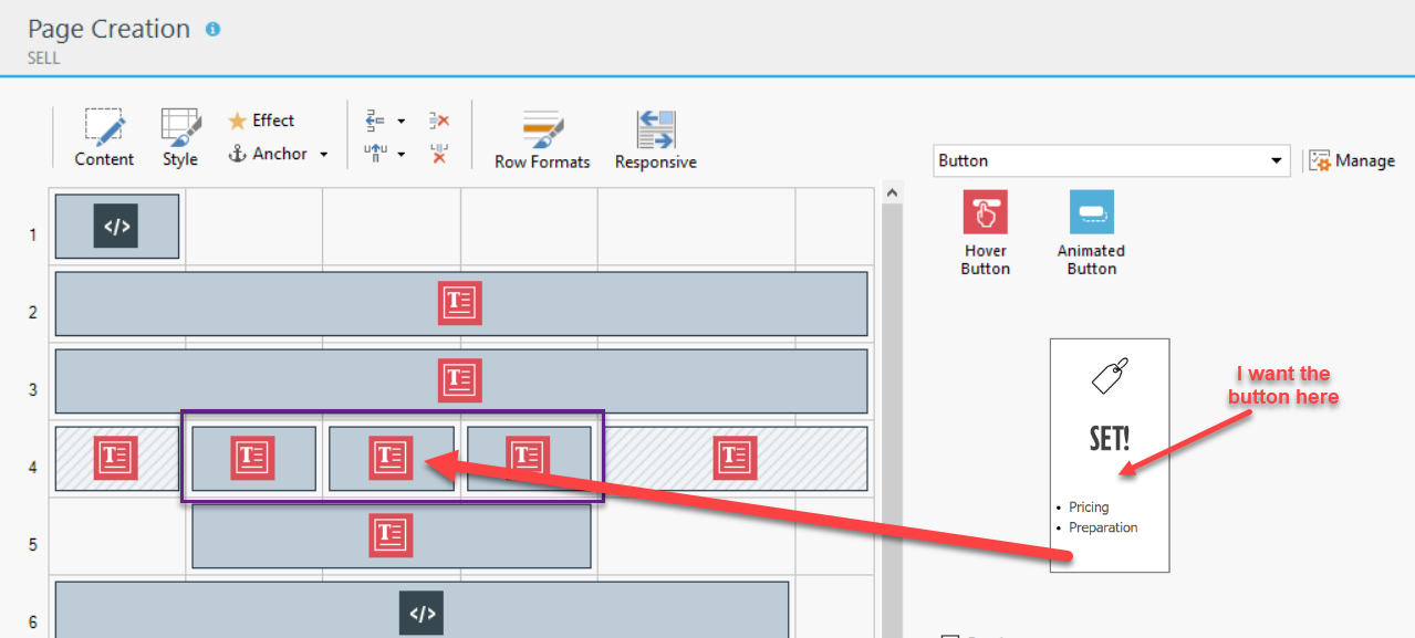
I have situation as shown below. All three Text Objects look like an image on the right. I would like to add Hover Buttons inside each of them.
Is it possible?

Publicado em

In the text you can create links as a button, for example, insert a picture and link.
The object Hover Button can not be integrated into a text object, but only used separately on the page.
You could let the whole split up text, middle button, bottom text, and through the style with targeted borders and spacing appear as a box.
Style for text above: without border below, without "outside" for below
Style for Button middle: without border above and below, without "distance outside" for above and below
Style for text below: no border above, no "outside" for top
This results in a homogeneous field for the 3 objects
Number responsibly correct!
JJ.
Autor
Thank you JJ, that's what I thought...
Autor
I've split my original object into three lines: icon, button and text. Created borders as you suggested and it almost worked. Almost. There are gaps in the border...
Autor
Changing "Outer Margin" (as you suggested) made it look much better, but still little gaps:
But these are acceptable.
Schönen Dank, JJ!
The small distances are also to be brought away
are the affected outer distances really zero,
Maybe the text on the left and right are too long, or their spacing affects the middle cells?
As a test you could copy the page into 3 sitemap and replace the outer texts on the left and right with empty html objects with automatic height to see if they cause the distance. Then erase the copied page, nothing is lost
JJ.
With some fine work and getting to know the many possibilities, this is perfect to achieve. I have done it with several times.
ATTENTION to empty cells responds sitex5 unpredictable !, especially thanks to compatibility with the responsive presentation
Autor
Thank you, JJ.
I do not quite understand what you mean here:
If you have used automatic translation from German, could you, please, put the German quote here, too? (I'm Polish-German American, so I will be able to read it).
Talking about responsivness, the three objects should be displayed in lower resolution one under the other. And they do, except they are positioned on the left side, and I can't find the way to put them in center...
Thanks, JJ!