Scrolling words bunching up 
Автор: Lauren W.
Просмотрено 3097,
Подписчики 2,
Размещенный 0
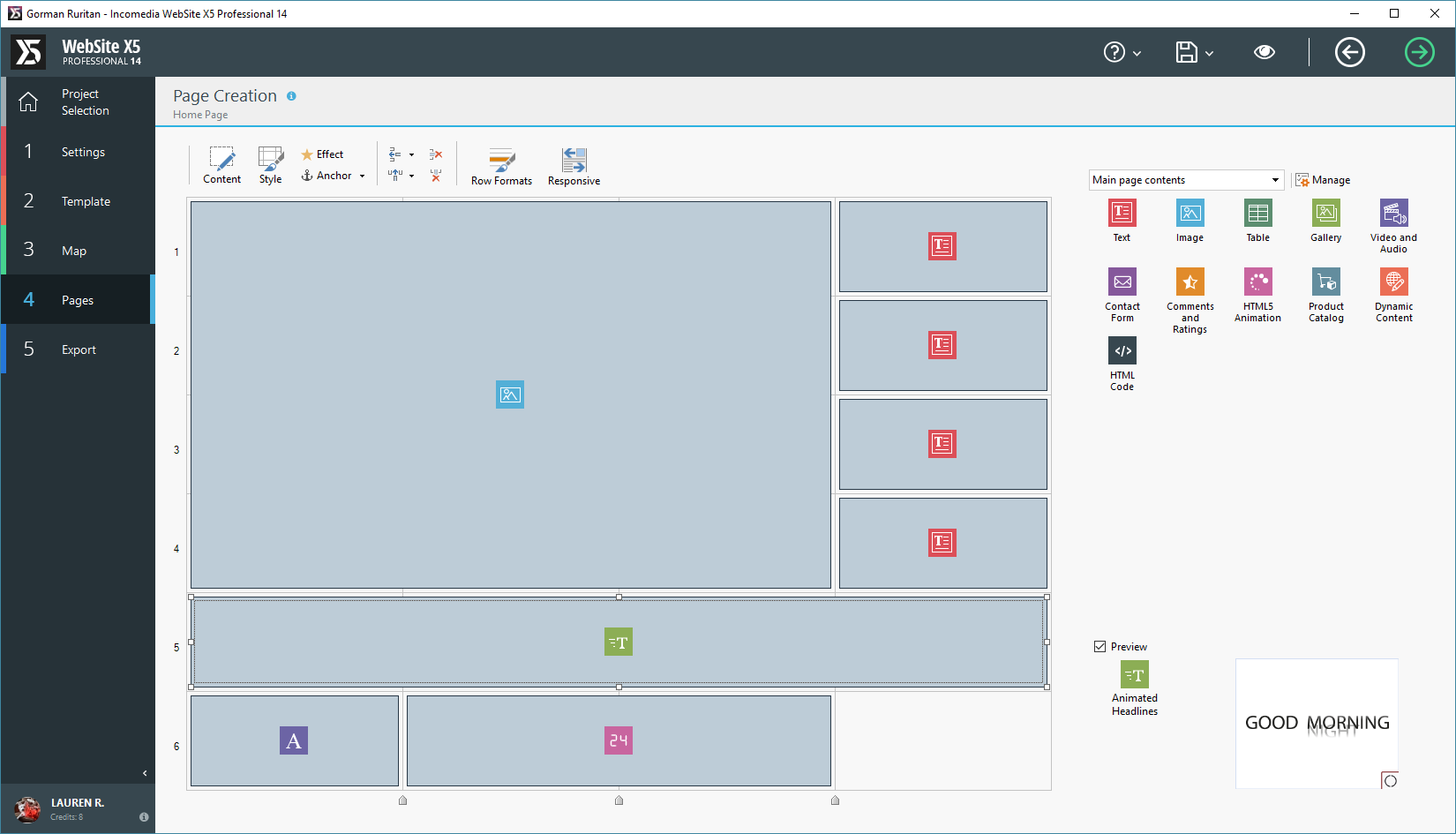
http://www.gormanruritan.com/turkey-shoot.html the scrolling words at the bottom talking about what we are serving bunches up sometimes and the longer words end up behind the words (at the hut)
Now it is working fine. go figure.
Is this a common problem?
I created with v13, imported to v14 and added that.
Размещено

Автор
here is it in action... (I use explorer when I need to delete cookies for projects... don't judge me)
Hello Lauren,
Is the object extended to use the whole width of the content space available?
In case it uses only a part of the width then you need too increase its width since it cannot expand automatically and you need to leave enough space to show all the content in case of longer text.
Many thanks!
Автор
yes it is/was
Автор
CANCEL That previous message, it was on the wrong screen. This is the message now
Hello Lauren,
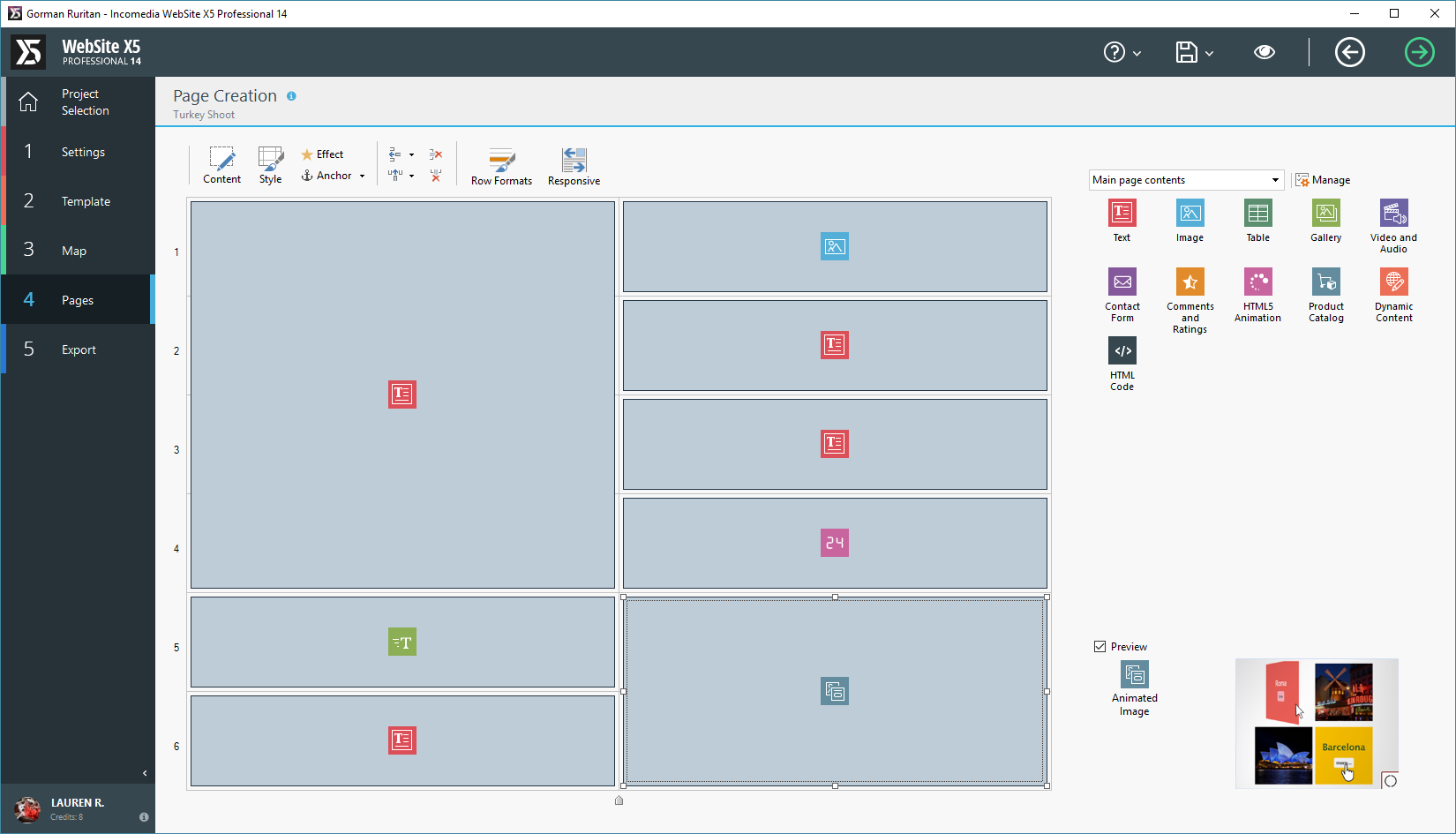
This depends in this case of the available space of the object. You need to extend it to use all the width so the text can appear completely. At the moment you don't have enough space with the layout of the last screenshot.
Many thanks!
Автор
http://www.gormanruritan.com/turkey-shoot.html
I changed it to fit the whole screen. I used 1 whole line. Do I need to use two lines instead?
Hello Lauren,
This object cannot extend the text on a new line. You need in this case to reduce the font width since with this size it cannot be shown completely on one line according to the template width.
Many thanks!
Автор
soo..change font size?
Hello Lauren,
Yes the only option is this one otherwise it will not appear completely.
As alternative you can also change the text or show half of it in the existing object and add a further one one the cell below where you display the rest of the text.
Many thanks!
Lauren - my apologies for putting in my 2 pence worth, however. . .
When I recreated your statement, I put the longest statement first (drinks and coffee?) and this meant that the space required for this was the minimum allocated, all words fitted, but there was a lot of white space before "at the hut"
The BEST result I got was leaving the starting text, removing the ending text and adding "at the hut" to each line of animated text, I personally like animation number 8 (clip)
My apologies for butting in.
In my copy of WX5, Animated Headlines object was recently updated, you may wish to check you have the most recent.
Автор
wow I feel stupid, that is genius! No spaces.. nice!
:-) - I am pleased you are pleased.