For wsx5 Gurus... 
Автор: Sinisa B.
Просмотрено 1402,
Подписчики 1,
Размещенный 0
Since Incomedia policy does not permits coding intervention in their own code - I must ask WSX5 gurus for help:
IN THE ORDER PROCESS -> SHIPPING INFO and PAYMENT info
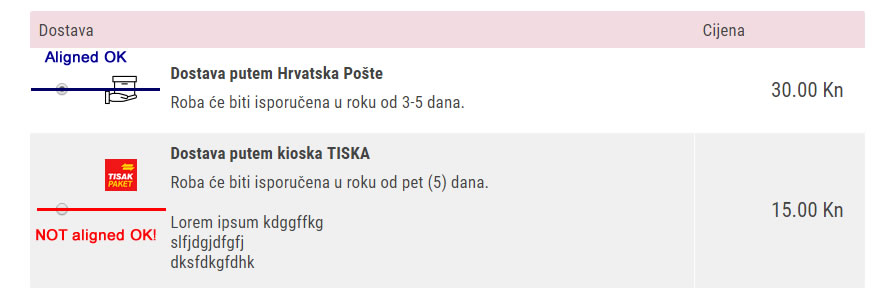
In the case of having 3-4 (or more) rows of text in the description (which is often) - it becomes obvious that the Shipping & Payment ICON is NOT ALIGNED IN THE MIDDLE OF THE TABLE (see below)!

Same icon issue could be seen in the PAYMENT table.
----------------------
Could this be fixed with CSS coding and how?
Thank you in advance!
Размещено

Doable by CSS
before
after
Автор
Cheers, Axel!
Those PHP pages are part of the shopping-cart process - on what page (what document) I need to change/insert CSS?
Since I'm not working with WSX5 anymore - I'm a bit "rusty" in that regard ...
Автор
Anyone else willing to share the code to fix this?
Thankful in advance!
Hello Sinisa,
You need to find the name of your element and to add this one into your CSS code into global parameters of your project
align-self:center;
Enjoy!
Axel
Автор
Axel,
OK - thank you very much!
Автор
Here is the solution for aligning icons in the SHIPPING & PAYMENT section:
(strangely, I could not get this answer from Incomedia)
You should put this code in the STATISTICS & CODE >> CODE (Before closing of the HEAD tag):
******
<style>
.ship-pay-image-cont {
align-self: center;}
</style>
******
Incomedia, well - I don't know what to say...
Axel, thank you again for your help!