Cover photos in blog 
Autor: Tyler D.
Besucht 2438,
Followers 1,
Geteilt 0
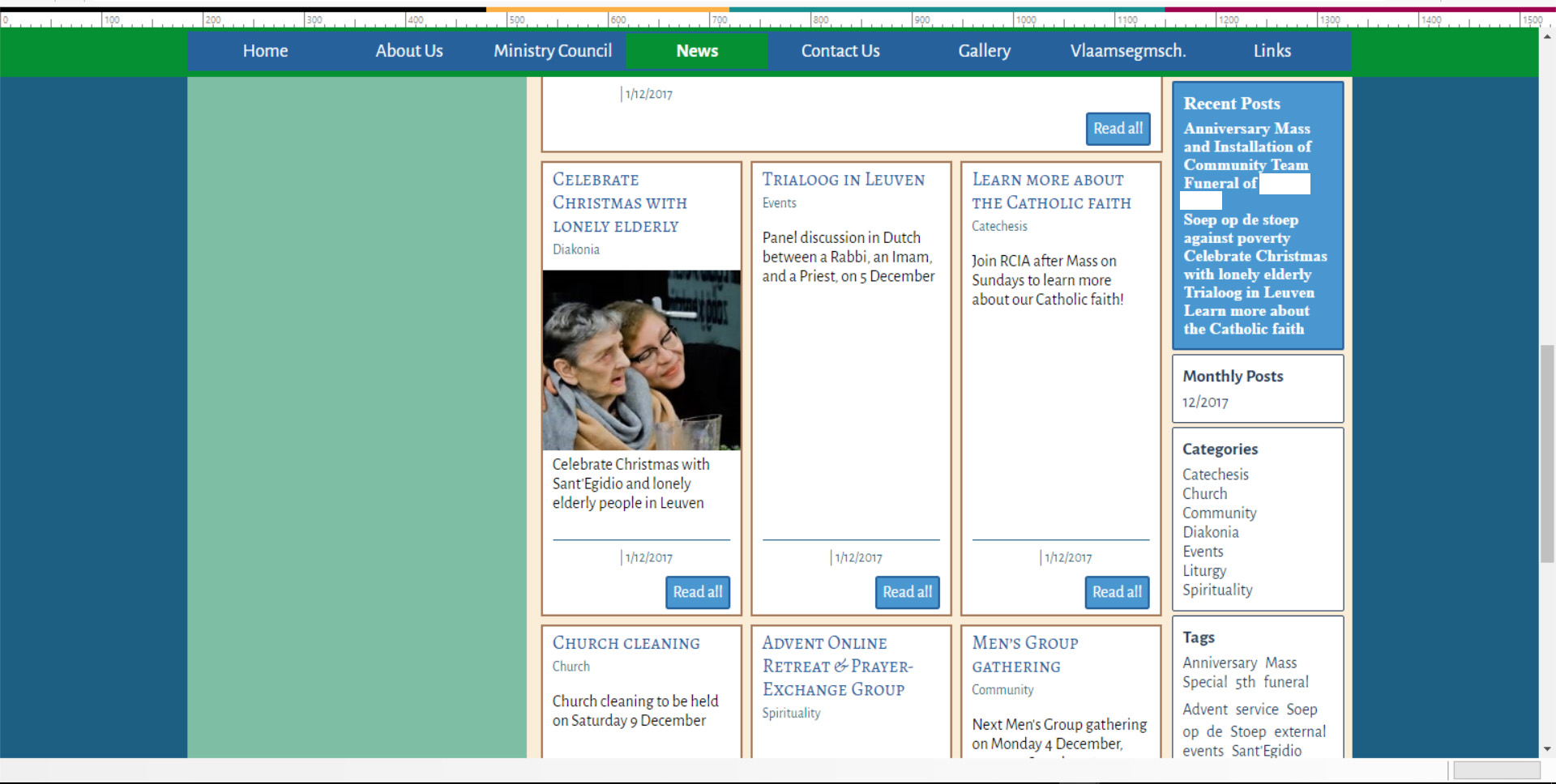
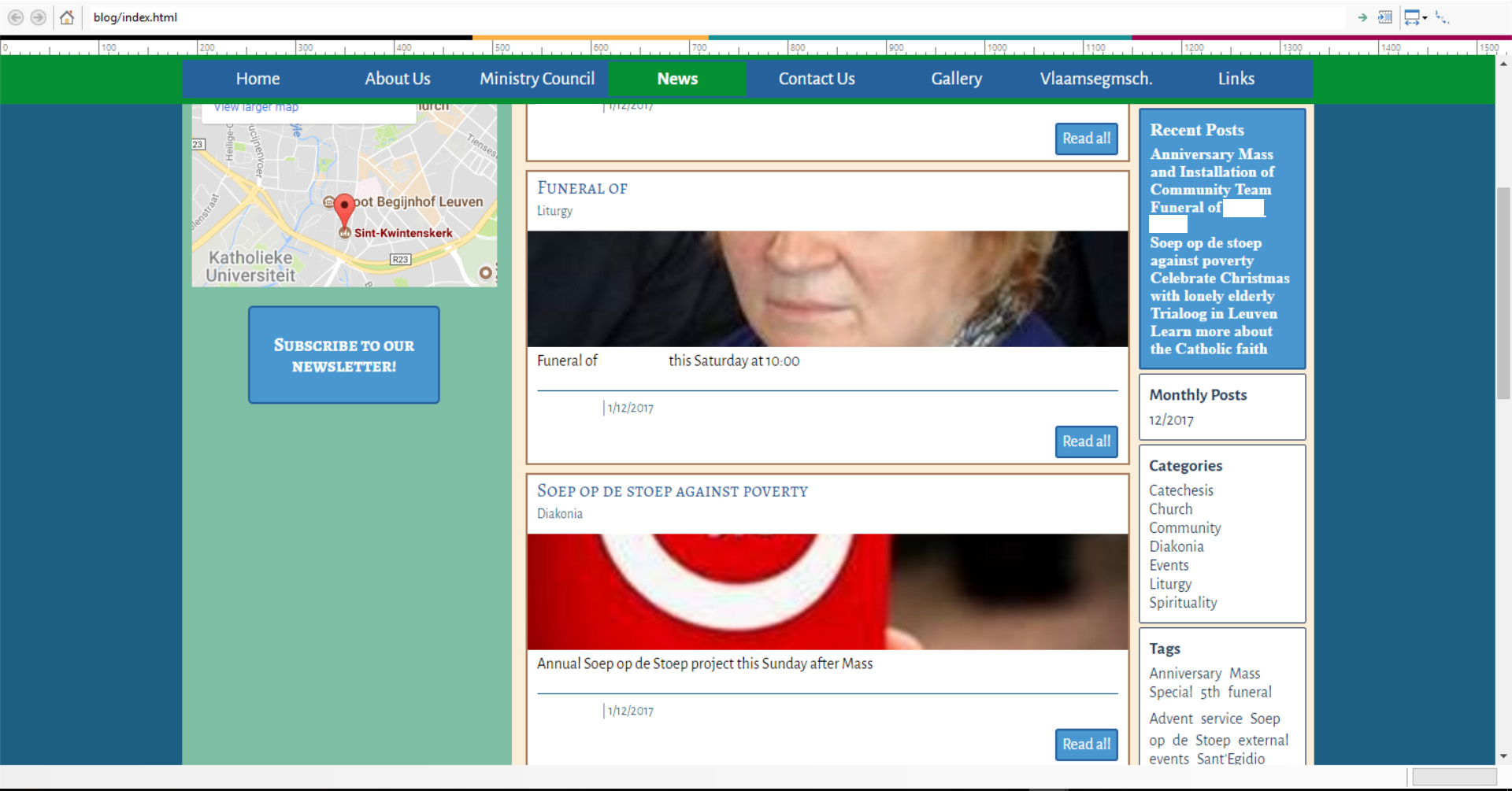
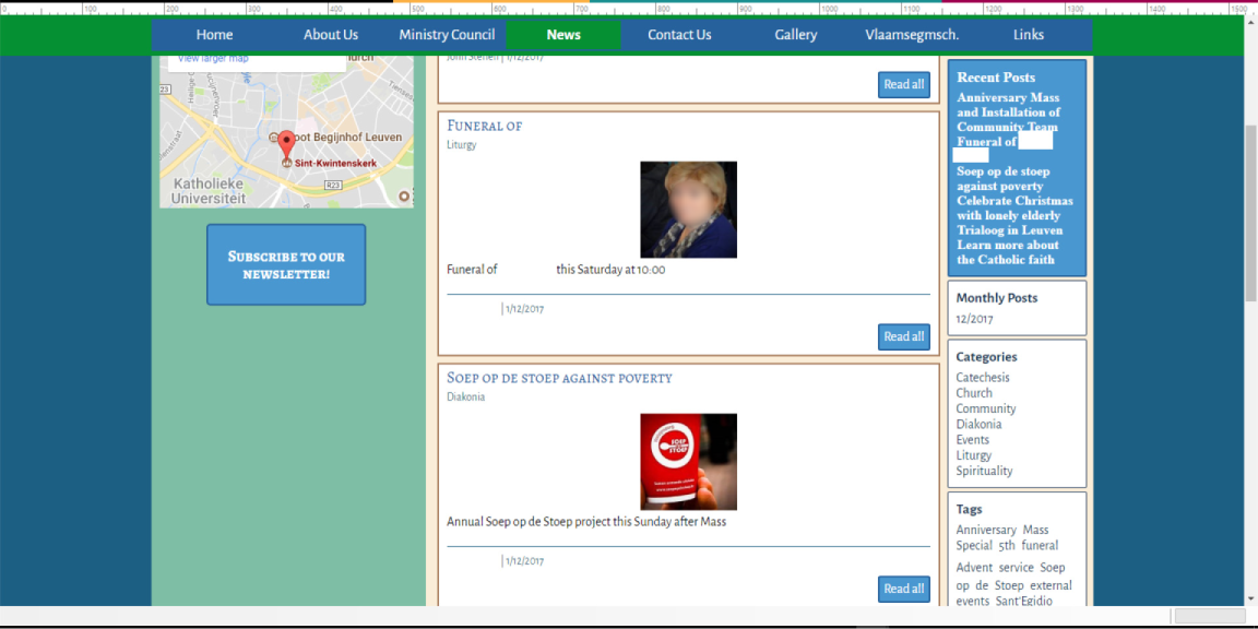
Hello, I am using Website X5 Evo 14. I have created a blog for my website, but I'm having some problems with the cover photos. Please note that the screenshots below have been redacted.
1. I have 3 cards per row (blog homepage) with a height of 450, and cover photos set to 40%. When I have a cover photo, the card looks fine. But when I don't have a cover photo, there is a huge whitespace and the card looks really awkward.

2. When I choose the option for highlighted articles, either:
- The cover photo is set to "fit card", but then it is awkwardly placed with no way of adjusting the photo without changing all the cards.

- Or the images are very small and not in proportion to the card.

3. I also can't find any way to edit the cover photos, for example, to add a drop shadow, bevel, etc.
Thank you for any help you can offer!
Gepostet am

Hello Tyler D.,
You can add in the posts without cover photo a longer description in the caption field to fill the empty space.
There is no option to edit the cover photos and you need to use imaged adapted for the space you will have available according to the width of the template and the percentage set as height of the card.
Many thanks!
Autor
Thanks for your response! I suppose I'll suggest it as an idea then...it's quite a hassle to have to figure out the math for every photo so that it fits just right into the card. A longer description isn't always an option, since we want people to click through to the post; making a longer description ends up being a bit artificial (just adding words to fill up space), or, if we use "useful" text, then people won't click to read the full article. (A lot of these image‑less posts are already short articles, like a simple announcement about an event coming up.)
Very disappointed with the functionality of the blog in v14. The height of posts is not adjusted according to the content!
Compared to the advertisement before launch, this is not good.