V2019.1.8 title object adapt font size to width of object 
Autor: Esahc ..
Besucht 2752,
Followers 2,
Geteilt 0
If you add a title object and set font size large (eg 100px) with adapt font size to width of object set.
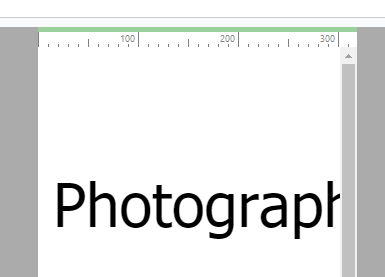
At 320px the resize fails. The text is greater than the width of the screen and the horizontal scroll bar appears.
To simply test, add a new resolution of 320px in step 2, resolutions and responsive designs.
This failure is also in v17
Sample project (empty 4) attached

Gepostet am

Hi Esahc.
Thank you for reporting this. I can confirm that I was able to verify the issue and I've proceeded to report it to the developers for further analysis.
I would like to ask for more information about v17 though since I can't seem to be able to reproduce the exact same issue there.
It seems to me that part of the text is sent to a new line instead of disappearing past the window borders.
Does this happen to you too? If not, could you attach here a v17 project where this happens?
Thank you
Stefano
Autor
Stefano, the behaviour is the same irrespective of version, I suspect the tick is missing in adapt font size.
I went back to v15 and created the same project (attached), the difference is that back in v15 there was not pre-defined resolutions. Back in v15 there was not a problem with this feature unless the user resized "below' 320px (perhaps this knowledge will assist the developers?)
320px v15
LESS than 320PX v15
In v16 the only way to display 320px is to use the predefined mobile icon
This is v16
The results are the same in v17 and v2019.1.8
(I have tested by creating AND importing the same project in ALL versions)
Enjoy
(It > En) ... check if you have Windows set to 125%, and in any case not 100% for texts and apps ...
ciao
Autor
Thanks KolAsim, I did check and found I was running at 100% and native screen resolution, I also checked at 125% and this makes no difference.
From v15 when I view on mobile there is no issue (but this is a relatively recent android and I suspect the nominal resolution is 480px). The problem appears in the preview on the desktop and when viewed through Firefox (it does not happen in Edge or Chrome).
I also tested in v2019.1.8 (same results as v15) displays correctly on my mobile, Edge and Chrome, but not preview, Firefox or IE.
It is looking increasingly like this is a simple rendering issue, but I was hoping it would be the reason that google occasionally reports content wider than screen for mobile display and I have difficulty finding the issue.
(It > En) ... sorry, it was an attempt.
... we hope that the STAFF can trace the problem.
... good luck...
ciao
.
Autor
In 2019.2.3 in the Fotograf template it appears even worse, but I find it strange that I cannot replicate the problem on an actual mobile phone display.
Woops - cannot find Fotograf template, maybe it was withdrawn?
No, not withdrawn! Found it!! (wouldn't it be nice if there was a search object in template display)
Hi Esahc
I've received word from the developers.
The problem is indeed visible when the preview window is shrunk below a certain point, and this is probably also the reason why it isn't reproducible on actual mobile phones. Most modern phones won't reach such a low resolution
I can confirm that the matter has been notified correctly and will be kept under careful check by the developers and should there be any news on this I will be sure to notify you here
Thank you
Stefano