MORE CONTRAST - GALLERY OBJECT 
Autor: Sinisa B.
Besucht 1856,
Followers 1,
Geteilt 0
I put this one into IDEA - but it's really a bug>
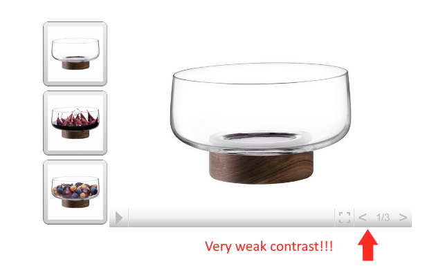
In the GALLERY OBJECT - please add the option that the COLOR of TEXT (COLOR OF COMMANDS) on the CONTROL BAR can be changed too!
The reason for this request is a very weak contrast between the BAR color and the COMMANDS color - so the commands are not visible (enough).
Here is the pic:
C'mon girls and guys from Incomedia - this is not hard to fix!
Gepostet am

CSS
+1
Autor
@ Axel - yeah, man, CSS is ALWAYS the "plan B"
Sinisa,
yes but like you said if we have choosen wsx5 it.s because the tool have a nice gui to create web sites
so if now we go into the code to run it completly its not neccessary to buy a gui tool
Autor
@ Incomedia
I know you have more important things to work on - but this is something that "pokes eyes" of every designer...
I really think that this issue could have a quick fix - so I'm asking you to put it on your TO DO list (if you have one).
Thank you in advance for your reaction!
Autor
@ Axel
Exactly, that's why I have written a record number of posts here... but with almost no results.
SIDE NOTE:
just for comparison - I have wrote post for adding more eCommerce option into the "M" software (not want to mantion the full name).
2 weeks later - the "M" software implements (some) of the eCommerce updates according to my post... Only 14 days later!
And the funny thing - I'm not their client nor I haven't buy anything from them (yet)!
But those girls & guys understand what drives new customers in...
Autor
@ Incomedia /Elisa or Stefano/
I have not received any comments from your side on this...
I guess that we could all conclude that fixing this is not a major IT endeavor - just tweaking-up the few lines in the CSS of the GALLERY OBJECT object.
Introducing 2020 version with this fix would be very welcomed!
Hi Sinisa,
I confirm that I have reported your request, in case on news I will be happy to let you know.
Kind regards.
Autor
@ Elisa
Thank you!
I really can see no reason why this minor "layout-issue" could not be solved for the very next update.
Cheers!