Responsive site - Line breaks not working at 720px 
Autor: Peter S.
Besucht 2054,
Followers 1,
Geteilt 0
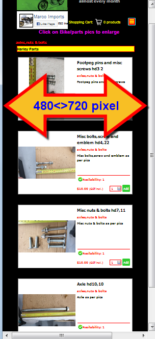
My responsive site https://marcoimports.co.nz is displaying well in all viewports except 720px.
My 480pv viewport is how I want the 720px viewport to work.
720px viewport automatically added line breaks and they show on the responsive settings page ok as per pics. But when previewed the objects are displayiing side by side whereas I want one on top of the other as in viewport 480px.
I have tried removing the line breaks as they appear to be doing nothing but I cannot remove them.. and they seem to be not doing anythink
Help as always is appreciated
Gepostet am

Do you mean the product catalog objects?
If you have inserted one in the row, then you have to set the red brackets before at responsive a breakpoint, so that it breaks at'm breakpoint 720px!
Autor
It seems the image i thought I had uploaded did not get to the forum.. So I will try that again. That will clearly illustrate the problem I am having.. All the viewports are OK except 720px where I do not want the catalog objects side by side - i need them 1 on top of the other please. https:/marcoimports.co.nz
This is done via the product catalog object! In the "Settings" tab there is the item "Boxes per line" where you should set it to 1.
Autor
Andreas, thank you for the comments. However, i was aware of the rows per Catalog item but the way I see it, the "boxes per line" applies to all viewports and I need 2 boxes next to each other, for Desktop viewport and Viewport 1
Then one "Box per line" for the other 2 viewports, that is viewport 2 and viewport Smartphone.
All views work ok except for viewport 2 which displays 2 boxes side by side with only squashed images. I need that to be one below the other.
Please see the attachment above RESPONSIVE MARCO ALL 3.jpg
(It > En) ... in the names of pages, and of files and folders in general, do not use special characters, but only alphanumeric; allowed (-) and (_) ...

axles,nuts---bolts.php (!) >> axles[,]nuts---bolts.php
... if you fail with the program options, then, for example, with EXTRA code for the current axles,nuts---bolts.php (!) you can get this result:
<style>
@media (max-width: 719px) and (min-width: 480px) {
div[id^='imCell_'] { grid-column: 2 / 26 !important;}}
</style>
.
ciao
.
Autor
Yes, KolAsim, thank you.. The code works great..
... ...
...