How to set up your Template for mobile 
Autor: Incomedia
When you create a responsive website, you will also need to think about the template.
We're going to show you how to save a bit of time when you're working on your template's layout.
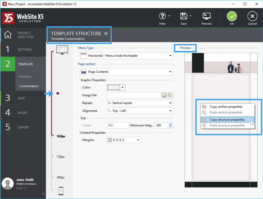
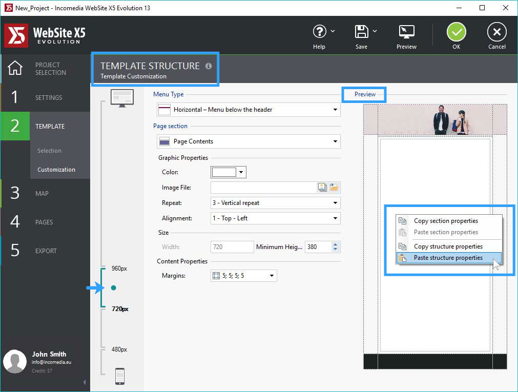
In Template Structure, click the right mouse button on the Template Preview and open a menu from where you can copy and paste all the layout's properties.

Once you have set up your template layout for the Desktop view, you can just copy it, go on to the next breakpoint and paste it in. When you have recreated a starting point, all you have to do is modify the parts that change from one viewport to the next.

When you have defined your template layout, you can concentrate on the header and footer. The space occupied by these two elements will gradually decrease as you go from the Desktop view down to the Mobile one. The best way to proceed is:
- Open the Header section of the Header and Footer Contents window and add all the necessary contents (title, logo, pictures, etc.) for the Desktop view, defining their properties, size and position.
- Click on the Responsive Bar to select the next view: the various objects you have added will probably be too big now, and they may overlap.
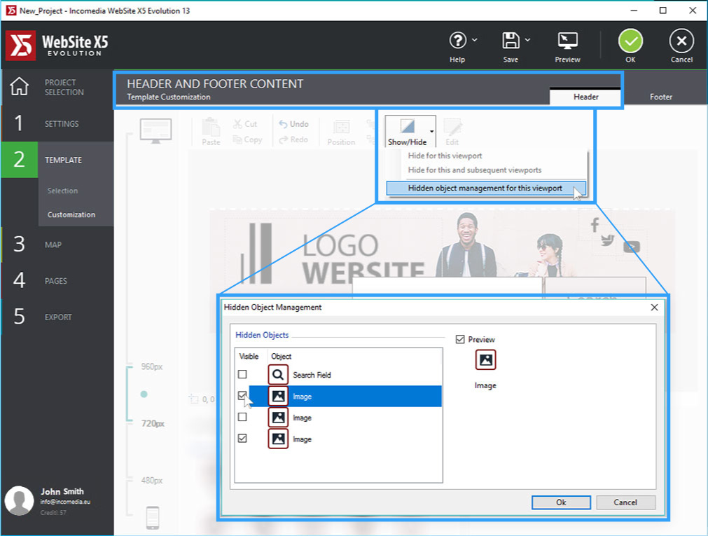
- Hide the contents you don't need for this view: select the object, click on the Show/Hide button and choose either Hide for this viewport or Hide for this and lower viewports.

- Change the size and position of the remaining objects, as necessary.
- Repeat these steps for all the viewports: remember that the golden rule for a good display in all the viewports is to show only what is necessary.
If you notice that you've accidentally hidden an object that would be better to have visible, just click on Show/Hide again and use the Hidden Object Management in this Viewport command. A list of the hidden objects in the current viewport is shown in a window: tick the one/s you want to make visible again.
