Better Customizations for Shopping Cart Look 
Autor: Elsa-marie L.Hello
I have a suggestion for a much-needed feature for the next version. Your website is already much more intuitive than most website builder I've owned in the past.
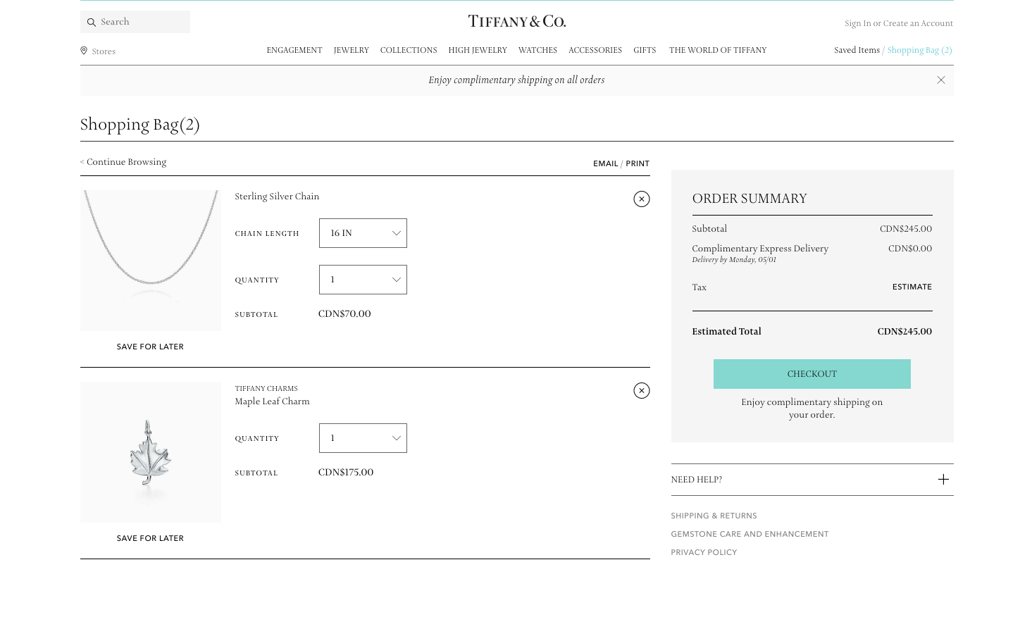
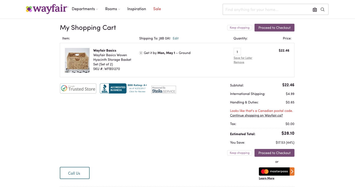
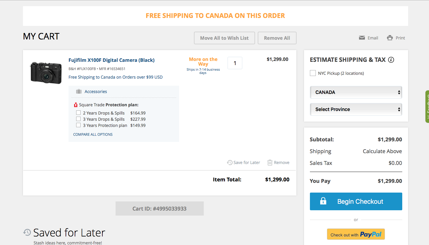
But there is one feature that could use some improvements: the Shopping Cart look is a bit too outdated compared to modern websites. I understand much of your users makes blogs, but there are many of us still that want to make nice looking stores and wish to compete with the mainstream ones. And for that, the site has to look modern and similar to what the customers will find. 95% of Website X5 looks perfectly modern, but when we come to the Shopping Cart look... it feels outdated. The products pictures are too small and you can't seem to be able to click on the product to see it in its product page, despite me setting it; and the layout itself is outdated like in early 2000s.
Please take a look at most Shopping Cart from popular (and more or less popular) stores (please click to see more clearly):


All share a similar style and layout, with variants; but don't at all look like Website X5's cart layout.
So for next version, it would be really great if you could allow much more customizations; or at least, offer a more modern template for the Shopping Cart look.
Other than that, great job for the rest; it feels very intuitive, and everything important and hard to accomplish manually are all done automatically.
Thank you

+1
+1
+1
+2
+1