Simple formatting question(s) 
Autor: Andy W.
Visitado 2047,
Followers 1,
Compartido 0
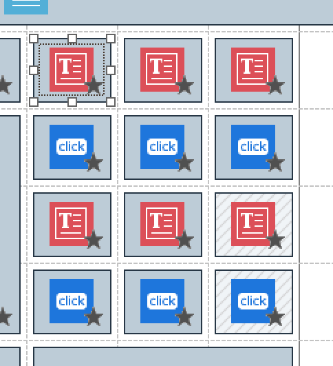
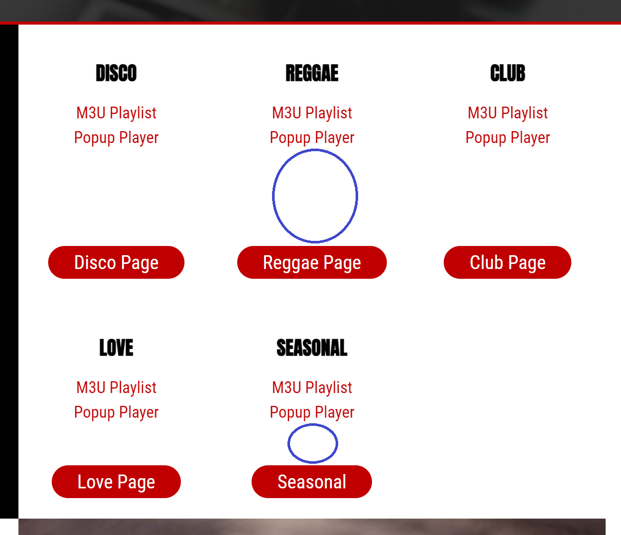
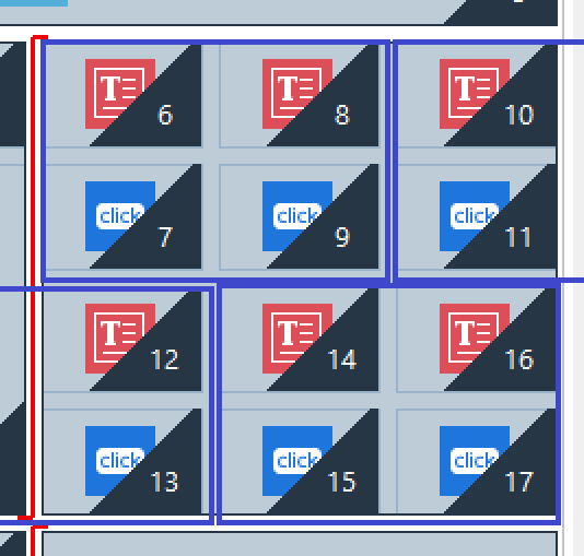
I have 12 cells with similar contents (text & buttons) that form rows on the page. But despite being equal in WX5, on the page they look disproportionate in 2 of 4 views (highlighted below in blue).


What is the best way of ensuring equal portions on all views?
Also, I detest the output in 720-1150px and want to change it, as I did with 480-720px. But I can’t seem to insert line-breaks where I want (depicted below in blue). Any suggestions?

Publicado en

Andy, for the row depth to be identical for every row, the amount of content must be identical in every cell (you have no content in the bottom right cells).
As for cell breaks, you need to change the order the cells display. Where this is not possible, keeping all related content in the one cell (eg text and button) is sometimes the only alternative and here some of the optional objects can come to your rescue.
Autor
Thanks for attempting to help me with this Esahc.
I copied content from cells 14 & 15 over to 16 & 17. This made absolutely no difference.
To the left of these 12 cells, I have 2 text objects. One on 1 row, and the other spanning 3 rows (which together align to the 12 cells on the right half of the page). I changed the text object on the top left to span 2 rows instead of one, and this made a difference to my group of 12 cells. However, on the page they still look disproportionate, albeit less disproportionate.
Yeah, I did have a look at my options for object types. But nothing jumped out at me as a possible solution.
I’ll keep playing around with it for today, in case someone else has a better way of solving it comes along. And, if I’m not getting anywhere, I’ll look into reformatting so the 12 cells span the entire page width over 2 rows. This is not ideal from an artistic perspective, but it might just fix the layout in all responsive modes too.
Thanks again Esahc!
Autor
I have resolved all problems by inserting & removing extra lines in the text objects to the left of my 12 cells, and shortening the button text.
Everything looks perfect in every view.
This is fun!