Buttons and things next to each other in mobile view - not only in column 
Autor: Jakub SkálaHello people. Please, how i can solve this? It is very mandatory to me. Im really sad the mobile (responsive) view of website does not allow me to make some buttons menu - only in column. Very ugly and very bad waste of space on display - website. I want to make somethink like in example in attachment. Example website is bimmer-tech.net for mobile.
I want same for my www.rokaworks.cz
The only present solution is that it makes all things in just one column (in mobile view) but I want it in some line where can be three things buttons next to each other in same line. Or two (like in example). PLEASE HOW?
By the way: in PC view of my website - you can see i have nice menu on left side. Impossible to make it in mobile view also.
How to understand the website making to make it work? Thank you

Hello. Try to do what you need with the appropriate grid on the page. And then adjust the column layout for different screen resolutions.
Autor
That does not work. You showing only for PC. But i need some thing to make it work like i want. Not that everything will line into one column. Impossible to delete also mobile resolution to make mobiles load like second responsive zone. Very mad about this. Dont want all only into one column
Hi Jakub,
I remember that your question already pops up somewhere here. The idea was to create another viewport for the mobile view. That means you set the existing one to a very low setting, e.g. from 0 to 50px and create a new one from 50 to 480px afterwards. When I remeber it right, only the last viewport has one fixed column without breaks.
Autor
I was really excited when I saw this template on marketplace


https://market.websitex5.com/en/templates/live-preview/30854b66-120f-473d-8d5d-3a44f1d1c51
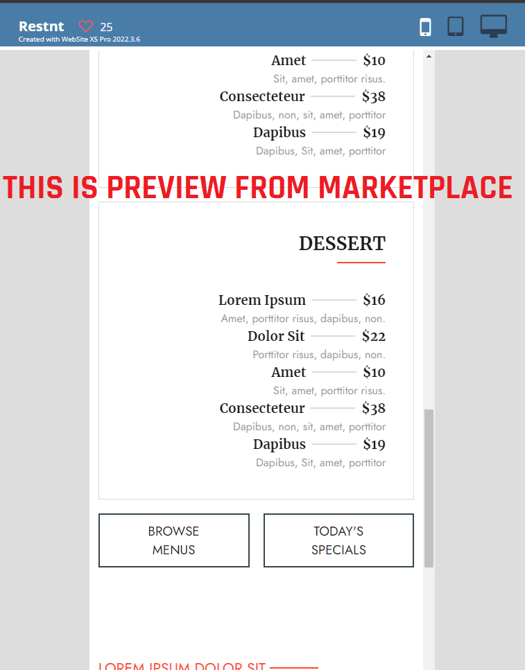
On up side of website, you can click on mobile phone preview and i saw two columns. GREAT !!! Because in middle of page - there are two buttons next to each other - those buttons where are "BROWSE MENUS" and "TODAY'S SPECIALS". I saw that on more templates. So I bought this "restaurant" template and after i enter my websitex5 pro, I have discovered it is a marketing fraud... Usually - iPhone viewing website is like around 400px. When I try to view this page, by wide 400px, it shrinks to only one column AGAIN, by viewport which is real mobile phone, not shown in template marketplace from link above - what a deceptive advertising.
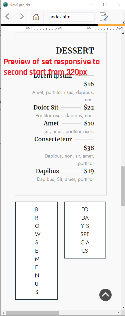
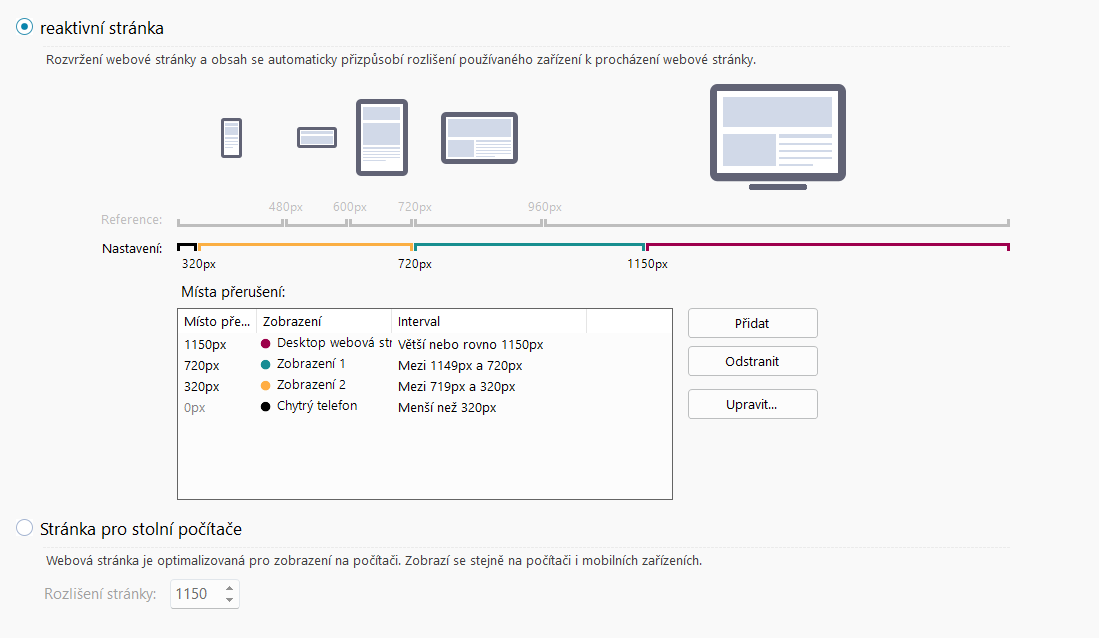
I never gave up, so I try that thing you wrote. And that is totally useless too. I make the first one to very low, but the mobile phone version does not let you less than 320px...and cannot be deleted also...VERY BAD...but iphone is from 400px. So i make the second viewport which should show two columns from 320px ending at 720px. this 720px is default ending of second viewport.
But when you try to preview on 400 or 480px just what most phones uses, there very bad sorting of content and big spare of non used space on left and right. Looks like that isnt changed, just showing more space on left and right edge of website. I attached here clues how it works. It really pisses me off and very unfair that i CANT MAKE TWO COLUMNS.
Im so desperate about this. Really need of to make website which is not boring by only one column, because it make the reading of page so much stupidly long. I need on main page some button menu where customers could fastly choose what they need. I dont want to present page, where you must scroll to death.
Ok I see the problem. Everything under 400px is mobile viewport with one column. So the problem is, that you need to plug two or more objects in one cell. The only idea left, is to use a text object and insert two button pictures with links in it. In the mobile view it breaks to one column with the text object and the two images in one row. But it seems tricky to adjust the dimension and correct resolution for the other viewports.
Hello Jakub
Unfortunately, this is currently not possible with the software.
As per design choice, on mobile phone the Objects will always appear in one column to be sure that they can be fully seen correctly and you don't get many small Objects one close to the other.
At the moment, it is not possible to configure the smallest responsive breakpoint any other way
I remain available here
Stefano
Hi Jakub, this is only a quick dirty test, without optimization and three different objects, how it could work.