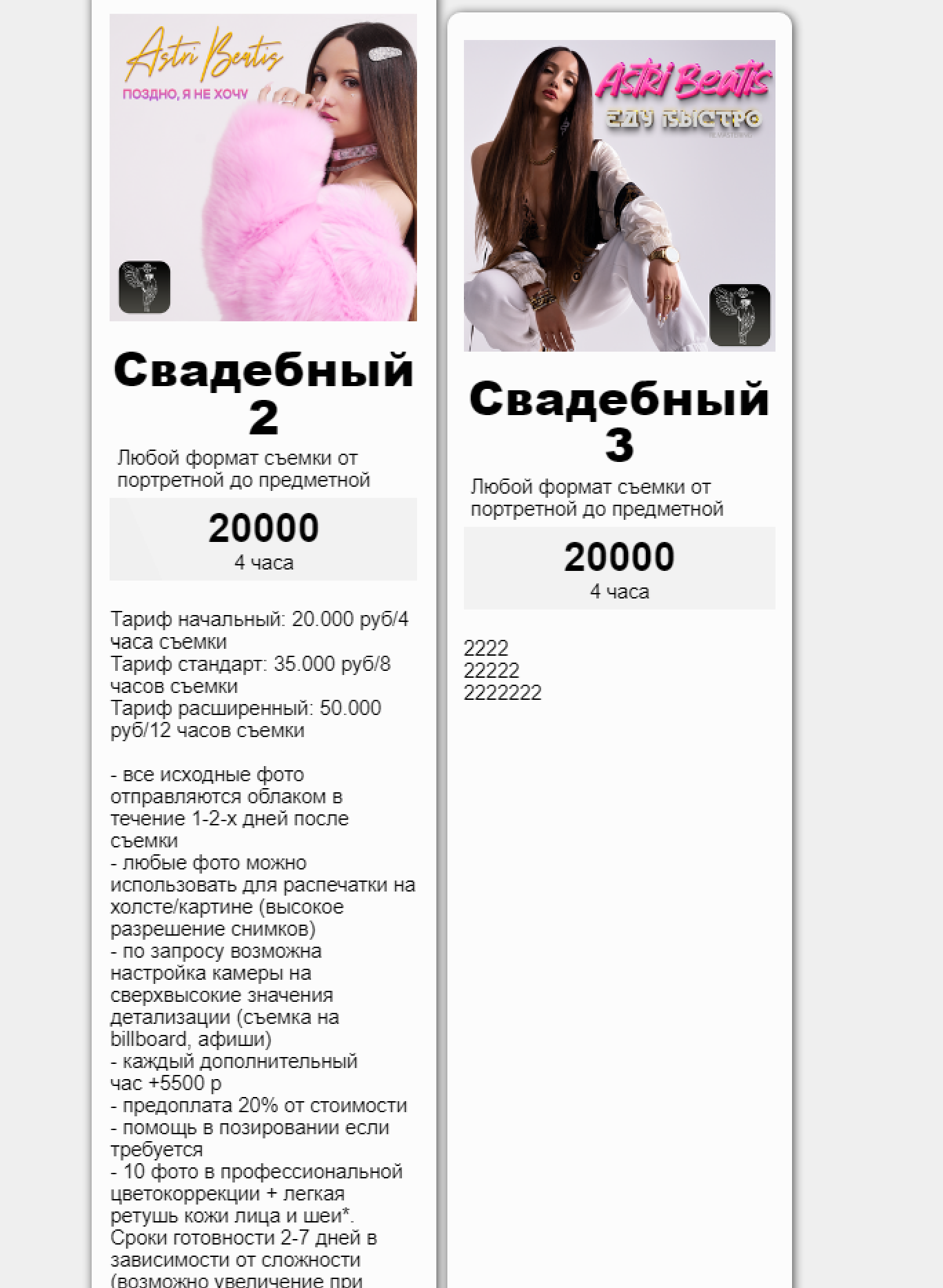
How to remove free space on the sides in the Price Table object? 
Autor: L. Myson
Visitado 1185,
Followers 1,
Compartido 0
How to remove the free space of the cover in the object, I need that the covers were without free space, at a resolution higher than mobile free space is not, but on the phone it is! I think this is a fault that needs to be fixed, you do not have an alternative cool object and working. 4 boxes is not enough for me for prices,make it a slider.
Is it from the desktop when there is a large description of the second object is stretched too( how to fix)?

That's my iPhone 12 pro max.

Publicado en

Hello,
what settings did you use for the description?
With the default settings and margins, I was not able to reproduce this, as my description was centered instead of aligned to the left.
Could you take a look at this page https://eric-c.websitex5.me/progetti/pricing-table/page-4.html with your mobile device, as I do not have the same model available for a test, to see if it is displayed as in the browser simulation or as your website instead?
Eric
Autor
Just like yours, the screenshot below is from my iPhone.
Autor
In your picture the object is not on the whole screen, I need that the inner fields where the cover is located were the same as yours, and the size of the card was on the whole area of the mobile phone.. Hello,
what settings did you use for the description?
With the default settings and margins, I was not able to reproduce this, as my description was centered instead of aligned to the left.
Could you take a look at this page https://eric-c.websitex5.me/progetti/pricing-table/page-4.html with your mobile device, as I do not have the same model available for a test, to see if it is displayed as in the browser simulation or as your website instead?
https://art.angellios.com/
now on the site the cards look bad, because they are a lot of space you have to scroll down endlessly, I had to create each card separately, add a separate image object to it, because I could not do as I have approximately! and I have more services than cards, I will soon need to add other objects to the site, blog, music, shop, and I can not do it compactly!
P.S update the music player object to display well on a mobile device.
Eric
[/quote]
Autor
I wrote you the answer above
Hello,
apologies for the delay, what you mean is that you would like the object to cover a wider area, such as the red rectangle here instead of the central portion of the page?
Eric
Autor
Hello Eric, yes I want the object to occupy exactly the area as you have shown, I need the picture to stretch as well as the body of the object.
Hello,
while the area occupied by the box can be increased by using a higher box width in the settings, the image cannot be enlarged in the same way unfortunately,
so without custom code this is not possible.
I will report this as a suggestion for an improvement for the object.
Eric
Autor
Thanks Eric, but it's all logical, why don't you do the usual logical things so that they work like a Swiss watch!? It's easy. If a person has done something, he wants it not to change, or to change, but the quality and aesthetics have not changed! You have a lot of luxury brands in your country, so why not do it with software, make yourself a Chanel, but in the world with your unique program. To make everything look luxurious, everything worked perfectly, all windows were optimized, and the settings were flexible. And then you will have no competitors. I wish with all my heart that you had no competitors! and I'm sitting on your version of the program and I'm going to use it, I feel very good. Sometimes I get upset because the team is lazy, but we need to work faster!