The background does not shrink 
Autore: Bahadır A.
Visite 2966,
Followers 2,
Condiviso 0
Hello incomedia
This is my website http://www.indesbilgisayar.com/emin2/
But I have a problem. This is my website. It is normal when I open the site with a Samsung phone, but when I open it with an iPhone, the background image on the home page does not shrink.
Postato il

try another browser if possible, is javascript enebled in the browser of the iphone?
Else Incomedia might need to check this.
check also: php 7.1 set at the webserver admin panel?
(It > En) ... @Bahadır A., ... ... wait and try what the experts will tell you, and then, if you don't solve, let me know if you are interested in trying my simple and old EXTRA code that has always worked with a copy / paste for all versions ...
ciao
.
Autore
Hello KolAsim
I did what you said but did not work, can you send the code please?
>> Step 3 - Map > The Page Properties window > ▪Expert | ▪Custom Code: > 3^opzion > Before closing the HEAD tag; ...> code (copy/paste):
<style>
#imPageExtContainer { background:transparent url('') !important }
html{ background: url('http://www.indesbilgisayar.com/emin2/style/a1.jpg') !important ;
background-position: center top !important; background-repeat: no-repeat !important;
-webkit-background-size: cover !important; -moz-background-size: cover; -o-background-size: cover !important; background-size: cover !important; background-attachment: fixed !important;}
</style>
... ... just let me know if it works for you on your iPhone, and if you need other explanations...
ciao
.
Autore
Hello KolAsım
I applied the code you said where you said it but still in the same case the background photo looks big on iPhone
... try and replace with this other alternative exclusive code of mine, which had always worked:
<style> #imPageExtContainer { background:transparent url("") !important } </style>
<script> $( document ).ready(function() {
divK='<div id="contenitoreK" style="position:fixed; top:0px; width:100%; height:100%; z-index:-1;"><div id="div_customK" style="position:absolute; top:0px; width:100%; height:100%; z-index:-1; background-repeat:no-repeat; background-image:url(\'http://www.indesbilgisayar.com/emin2/style/a1.jpg\'); -webkit-background-size:cover; -moz-background-size:cover; -o-background-size:cover; background-size:cover; background-position: top center;"></div></div>'; document.body.innerHTML += divK; }); </script>
.
ciao
.
Autore
Hello
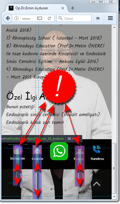
Your last code worked but I have another problem. When I enter the site by phone, there is a gap at the bottom. How can I solve it?
... to be able to understand what it is, attach a STAMP - screenshot, and then tomorrow I will check ...
ciao
.
Autore
... the problem is pre-existing ...

... in the FOOTER there are some oversized <button> objects, which go beyond the FOOTER bar in lower resolutions below 720px; ... check the objects in the FOOTER, and the measures of the relative containers in the various lower "breakpoints":
ciao
.
Autore
Thank you for your help have a nice day
... ... I checked; ... now the background and the footer are OK ... ... ciao...
.