Sloppy!Sloppy!Sloppy! 
Autore: Sinisa B.
Visite 1650,
Followers 1,
Condiviso 0
I don't know how many times I have written posts regarding the SLOPPINESS of the layout...50?
Again, ORDER PROCESS > SHIPPING INFO (and PAYMENT too)
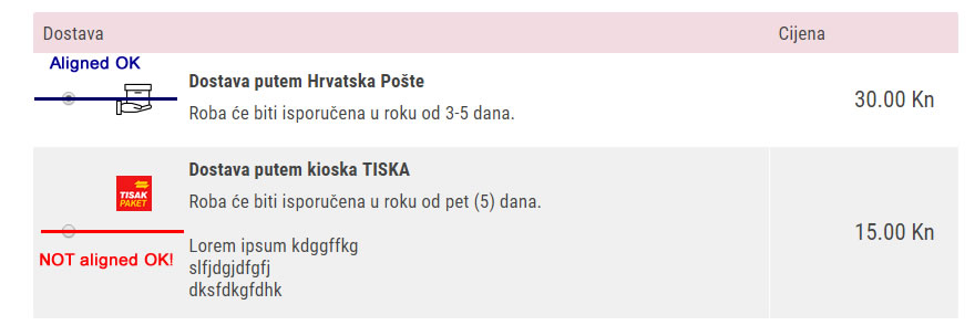
In the case of having 3-4 (or more) rows in the description (which is often) - The Shipping ICON is NOT ALIGNED IN THE MIDDLE OF THE TABLE!
See the screen shot below.

The coder has forgotten to specify the alignment "MIDDLE" of the icon's cell!
Same issue with the PAYMENT table > three or more rows of the text in description and icons are out of center!
----------------------
Please show me how can I align the icons in the middle of the cell!
Thank you!
BTW - the icon image is squared - no slack at the image rims...
Postato il

Hello. Please send a link to the product page.
Autore
Aleksej, thank you for your assistance!
Below is the URL of the ORDER PROCESS (step 2) of my DEMO shop.
On the DEMO shop this issue is not so notable because the description text is short (only two rows of text).
https://www.izradawebshopa.eu/demoshop/cart/index.html#step2
****
But still you could see that the icons in Shipping (HR: Dostava) and in Payments (HR: Placanje) are OFF the center of the table cell or <div>
I have checked the CSS of that DIV - but maybe you'd know what part of the ICON alignment is not defined right... thank you!
Hello Sinisa,
On my demo https://wsx5demo.afsoftware.fr all icons are in the middle
All icons used for my payment gateways have same size... around 120 x 40
So it could be the origin of you issue
Enjoy !
Axel
Autore
@ Axel
Thx!
The problem occurs when you have more than 2 rows of description text. Try entering some more rows of text and you'll see.
The icon is just not aligned in the center regardless of the icon-size... Cheers!
OK. you are right...
Incomediaaaaaaaaaaaaaaaaaaaaa ????
SOS again !!!
Enjoy
Axel
Autore
@ Axel

Yeah, Incomedia did it again
****
@ Stefano
Could this be fixed in the next update?
It's solvable in 5 mins. Thx!
Hello. I sent a notification about your question to the company employees, expect an answer from them here in the comments.
Autore
@ Aleksej
Thank you!
Yeah, that's the "order page" they need to fix.
Hopefully I'll get the answer soon...
Looks like the icon's are not centered but placed on top directly below the header of your card/payment.
To be honest, you want these to be seen fast so you can as customer select correct payment directly.
i am not sure if i would like it centered personally..... if changed then make it please adjustable Incomedia.
sorry just my humble opinion.....
Autore
@ Andre
The client pointed this issue to me - and to be honest - it really looks bad from the design point of view.
One more thing - you can have an XY number of payments - and the description text may vary- so it would be a mess with the different icons alignments: some would be at the top, some at the center...
The RADIO button (selection) is well centered - but the icon is not.
The icon should be ceneterd as the radio button is!
***
Of course, the best possible solution would be if Incomedia gives us an option how we want to center it, but...
Hello Sinisa
I've verified this and notified the developers to see if this can be improved
I'll keep you posted here should there be news on this
Thank you
Stefano
Autore
@ Stefano
OK - please fix this in the next update - it's a 5 min. job for the developers - thx!
One CSS line :-)
or 2
30s max (just time to open the source, find the function, copy/paste the CSS code, save the file
Enjoy !
Axel
Autore
@ Axel
The main problem is that software "quality control" is weak or nonexistent!
I can remember selling my own software - we have been testing every new version rigorously for days!
And IF the BUG was found later - we have notified all the current users and offer, of course, FREE update (this was the time of very slow internet and no automatic online updates - so this must be done via e-mail download links or even by sending an installation CD via snail mail)...