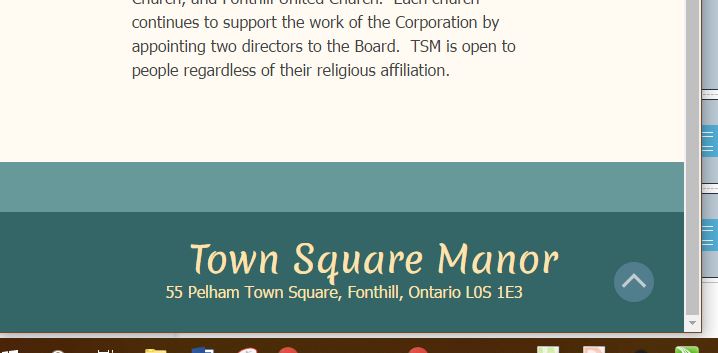
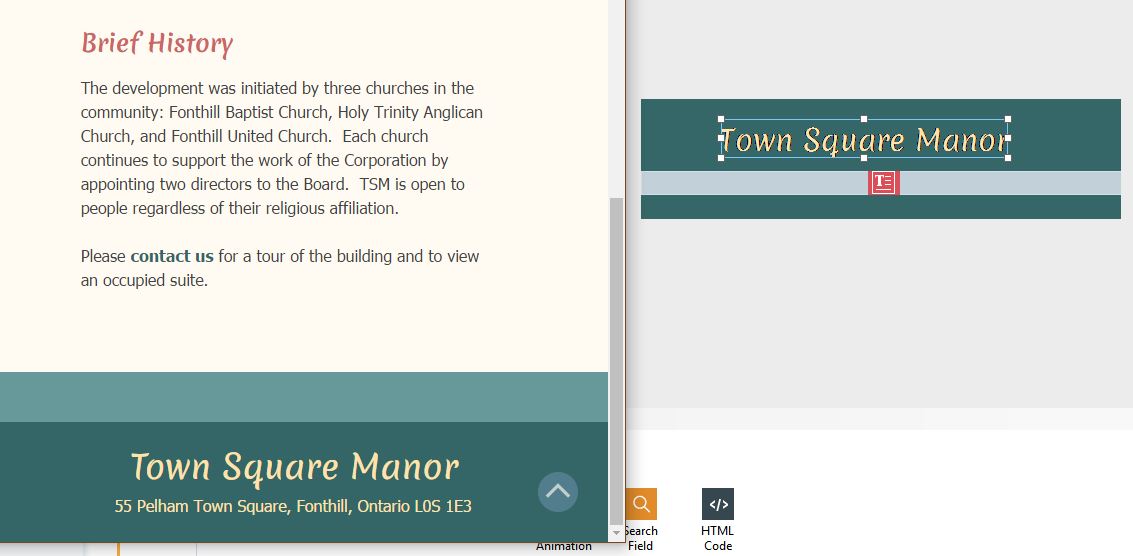
Header and footer content keeps changing alignment?? 
Autor: Sigita V.
Visited 1561,
Followers 1,
Udostępniony 0
I am wondering if I am the only one with the problem - I started a new project, set the header and footer content, then proceeded to complete the site. After a few saves and preview I realized that my header and footer content keep moving around on its own. And even though the content is centered in the development mode view, when previewed or published it suddenly is off center. What am I doing wrong??
I should mention that the footer and the header titles are meant to adjust for size depending on screen size.
I have attached two images to show the problem.
Development mode:

"Live" view:

Posted on the

The address in the text box can be center justified, but the text box itself must be centered for this to work. Please ensure when you select an object that all 8 handles are within the displayable area.
This must be done for the header and footer for every resolution. Whilst the content itself is carried down to the next lower resolution (unless you hide it), the positioning and the object sizes are independent and set manually, eg at mobile resolution you may choose to have the address on 3 lines by making the object narrower and deeper.
Autor
Thank you, but I think you are talking about the "text" (address line) object. Which is working fine.
Because it is "text" and stays the same font size no matter the screen size, I have been able to center it on each screen size and forget about it, as the size of it is not that important.
It is the title "Town Square Manor" which keeps moving around without me moving it and without me wanting it to move. In the sample above it is the title that has moved, the text (address line) is fine. And I did not move it, it was moved after I closed, then later re-opened the project to continue working on it, only to discover, in previewing a page, that the footer title had moved. And it has now happened a few times - I adjust the footer, see it centered in a preview, save, then close the project, then on re-open I find the footer title has moved off center again.
Because I want the title to be a different size for each screen type (mobile, tablet, desktop) that means that I can not make it a "text" and extend it across the footer to center it as I did with the address line, as then the title font size would stay the same size no matter the screen size. It has to be a "title" object to be resizeable. But I have not found a way to make sure that the title object is not moved around almost after each save and re-opening of the project. Sometimes it moves a bit to the left, sometimes to the right - without me doing anything at all to the footer content...??? and I can not find a way to make sure the program does not, for whatever reason, move it. I don't know if I'm explaining it well enough... :( I just want the title object to be centered and stay centered. Glue...?? ;)
Sigita, I realise this project is a work in progress, but is it possible to put it on-line, perhaps in a folder (eg http://www.townsquaremanor.ca/temp )
I am not aware of any issue affecting the placement of the title object except where the object is initially placed outside the displayable area, in this case WX5 "sometimes" adjusts the position on saving.
You can treat the title object the same way you are treating the text object ie set the object to fit side to side for every resolution and turn on adapt font size to the width of object and centered. If you do not want the font size to change, simply make the text object box deeper and it will use multiple lines.
Autor
I have tried to treat the title object the same as text, but then it is not changing its size - the font size remains the same when the screen size changes, even though the checkbox for "adapt font size" is checked.
I have just saved and uploaded the site, however, I had to change the alignment of the footer title again a couple of times before it saved looking as it should. I had to finish the site and get it "live" so had no time to take screenshots. But as I keep working on it I will keep saving the screenshots, then maybe at some point, with enough screen shots to show the discrepancy between the placement of the title on footer and what is seen in the preview, the issue can be sorted. In the meantime I will just keep adjusting the footer as needed. Thank you for trying to help!! But it looks like more documented evidence is required before the issue becomes clear and can be adressed :)
Sigita, it looks fine on my android in both portrait and landscape. If the problem is with centering the title for mobile view, it could be related to the fact that mobile is defined as 480px but internally wx5 seems to use 320 (you can see the affect of this if you make your desktop browser extremely narrow (less than 480px) you will see a horizontal scroll bar and text will go off centre.
I always add an extra resolution of 320px to deal with this issue, but unfortunately in Evolution you cannot do this (320px mobile will only ever be seen by very old or very cheap mobile hardware).
Autor
It DID look fine, in the previous save. Then, today, I went to change a page, and then when I went to preview it I noticed that the footer had once again, without me doing anything, changed position. So I had to adjust it again. I had to set it off center to the left to make it looke centered in the preview and live view. This time it only happened in the tablet and mobile resolution, but it has previously happened in desktop resolution too.
What I found when I opened the project - as you can see the title is centered above the address text object in the footer setup (right view), but that gives me off center location of the title in the preview (left view):
Then I moved the footer title to the left - clearly off center (right view), and it centered the title in the preview (left view):
So...could anybody solve the mystery for me, please??
Sigita, I can see all 8 handles of the title object, could you confirm that all 8 handles of the text object are within the displayable area on the footer and that the text box for mobile is deep enough to accomodate 2 lines?
Could you also advise which fonts you are using for both the title and the address, and if they are google fonts, have they been added to the project?