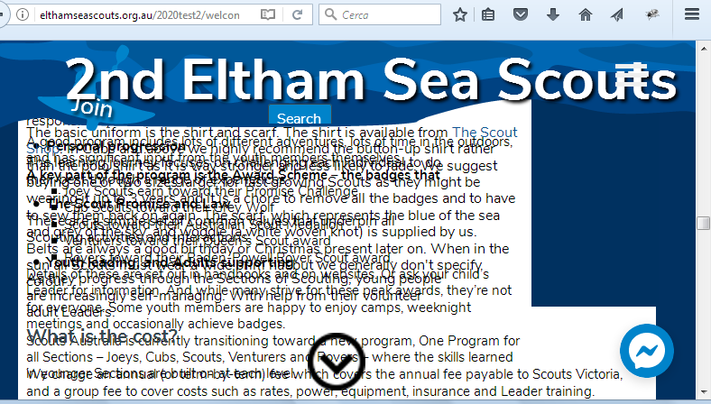
Full Height, internal link, overshoots destination by a couple of inches. 
Autor: Wayne G.
Visited 3157,
Followers 2,
Udostępniony 0
http://elthamseascouts.org.au/2020test2/welcome.html
I have created two internal booklets for information for the scout group. The whole site uses the full height.
When you click on any of the links in panel 2 of the page the result will overshoot the destination by a couple of inches so that the title is hidden. You can easily scroll back up but I don't think that is the intended design when using internal links...
Screenshots provided.
Posted on the

Hello Wayne
This is an old problem. The combination of anchors and sticky bar, makes it neccessary to make "dummy space". This is not a good nor an elegant solution.
There are many posts about this.
The solution would be the possibility to specify an offset when using anchors in combination with the sticky bar. I hope some day in this century that the programmers will implement a solution for this.
It can quite easily be made with some code - but the best would be to have it as an option in the X5.
Autor
ah so they just chose 300px at random or thereabout and everyone suffers. LOL.
It is strange when the snap to section is so elegant but this is so clumsy by comparison. It makes a beautiful document look amateurish. LOL (blame the design) I tried searching for an answer before we asked the question. What search terms would have helped to find these other posts. I just tried full height as a starting point.
Hello Wayne
On the page with the anchors you could in the expert tab / before closing the head tag put something like this :
<style>
#Anker1 , #Anker2 , #Anker3 , #Anker4 , #Anker5 Anker6 , Anker7, Anker8 {
position:relative;top:-150px
}
</style>
I think you have 8 anchors. Remember to name the anchors to the name you have given them.
The position of 150px you can style to your needs.
Hope you have it to function
Correction
<style>
#Anker1 , #Anker2 , #Anker3 , #Anker4 , #Anker5 , #Anker6 , #Anker7, #Anker8 {
position:relative;top:-150px
}
</style>
Autor
Wow, that is an elegant solution. It works like magic and is perfect yet again.
I am literally stunned. I have only applied it to one page with the problem and I will do the 2nd page in the morning but dam you have knocked this out of the ballpark. I really appreciate your help. No, we really appreciate your help. Yes, it would be nice to see this fixed by Incomedia. But in the duration this is perfect.
Yet again thank you!
Autor
No idea what just happened - now it doesn't work.
it did work perfectly and then it didn't.
<style>
#alaw , #bresilient , #commitment , #dcode , #ehelp , #fwho , #ghow , #htalk{
position:relative;top:-150px
}
</style>
I even changed the anker names so they were sequential and in order
The code further down the page breaks and the down arrow button disappears and the first photo that the anker is attached to is broken. all is ok again if i remove the code.
Autor
here is the second screen shot.
There seeem to be a semicolon missing after 150px
But strange that it functioned at first.
This should function - but change the names of the anchors
<style>
#Anker1 , #Anker2 , #Anker3 , #Anker4 , #Anker5 , #Anker6 , #Anker7, #Anker8 {
position:relative;top:-150px;
}
</style>
If still, problems, could you please give a link to the page with the anchors/code - so I could maybe see what goes wrong.
Autor
<style>
#The_benefits_of_scouting , #what_is_scouting , #what_is_the_program_uniform_cost , #Where_are_we_located , #Session_times {
position:relative;top:-150px;
}
</style>
<style>
#alaw , #bresilient , #commitment , #dcode , #ehelp, #fwho , #ghow , #htalk {
position:relative;top:-150px;
}
</style>
Thanks John,
This is the code that I inserted as per above.
Fixes the height problem but breaks the images (there are plenty missing) and displaces some of the text on the two pages. I tried two different naming conventions. Keeping one traditional and one clean and in alphabetical and subsequential order.
http://elthamseascouts.org.au/2020test2/welcome.html
http://elthamseascouts.org.au/2020test2/welcome-2.html
Hello Wayne
Maybe it is because there is made the automatic with the anchors on the pages. Could you please remove (uncheck) this from the pages and see if the anchors then functions.
This will give a hint of what could cause this.
In the meantime I will try another approach to the problem.
I think I have found a way.
I will make some tests on my own testsite.
If it functions it will place the things correct BUT when clicking a link, it will immediately place the page on the correct spot - there will be no "scrolling down effect" to the spot - it will happen immediately. Could you live with that?
If - then I will make some tests and then give a description.
If not - then I think that you either have to remove the automatic anchor scrolling or you have to make some dummy space before each existing anchor and then make this dummy space the new anchor(s)
Please tell what you want to do.
https://misha.blog/css/ssyilki-yakori.html
This article describes several ways to solve this problem. I hope it helps.
ps: Use the site translator from Russian to English
Autor
john jumping directly is a way better option
OK - here it comes.
I think the best way is to make some dummy sections that will not take up space on your page.
the 2,4,6.8 and 10 is supposed to be your existing content.
You then insert the 1,3,5,7 and 9 on the page.
The content of of 5 could be :
The first new object should be named Ank01, the second Ank02 and so on.
This makes a div. The object is not an anchor ( well it is - but not for X5). The object does not take up space on your page.
I am not sure if the automatic section scrolling requires anchors - if not, then you maybe don't need anchors.
The style should be something like this :
<style>
#Ank01 , #Ank02 , #Ank03 , #Ank04 , #Ank05 {
position:relative;
top:-150px;
}
</style>
Now we only need to create the links.
You make the links like this :
Remember to open in the same window.
The .. I used so you can see the "full" URL - the URL you should use is of course the correct location of your page. This could be confusing if/when you use preview.
You specify the URL like this :
http://elthamseascouts.org.au/2020test2/welcome.html#Ank01
The #Ank01 directs the browser to the page specified in front of the # and to the section of the page specified behind the the #
As we have an offset of -150 the section starts 150 pixels down - which should also be what we want.
I hope my explanation is understandable and that you have it to function.
** The names you use - like Ank01 must be unique and must not be used somewhere else and not be used by the system. I think if you use Ank01, Ank02 - it will be OK.
(It > En) ... anchors must not be used on the page in Full HEIGHT, since the automatic positioning controls of the rows that interfere with the Anchors are active ...

... the Anchors should simply be used in normal pages and without applying effects, and possibly in these pages avoid the Sticky Bar ...
(... alternatively you could use my exclusive jQ code, but there is no need to waste time and it is not worth it, if you proceed correctly with normal pages ...)!
... caution! ... you have something wrong with your page and need to move the chat button:
.
Hello Wayne
My last solution should function for you. Please try it and tell how it goes.
You could remove all X5 anchors on the page.
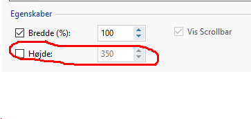
If all other fails you could in the html object set a height
The height should match the height of the sticky.
Keep the code (that makes the div ) int the dummy html objects
AND remove the styling.
This will make a dummy section on the page, and then the links will just be links to a section on the page. The section will of course be behind the sticky bar but this is also the idea. What will be visible will be the object under the html object - and that is what we want to see.
Disadvantage with this solution is that you have unused space on the page.
Autor
A huge thank you to John - got it working perfectly - only one little bit over on one page and that is because the page has too much information and cannot be formatted any other way. The error is so minor that nobody notices except for us. LOL. Your support has been nothing short of amazing. Your instructions and perseverance was to be so highly commended. From the bottom of my heart thank you! It took me a couple of days of experimentation to get my head around it. But when I figured out that x5 is sometimes slow in uploading code to the server and then for the server due to caching of small amounts of code sometimes misses that there was a change. But it is all working like a dream now. yet again thank you!