I have a question about the appearance of the menu in the store 
Autor: Adrian B.
Visited 1561,
Followers 1,
Udostępniony 0
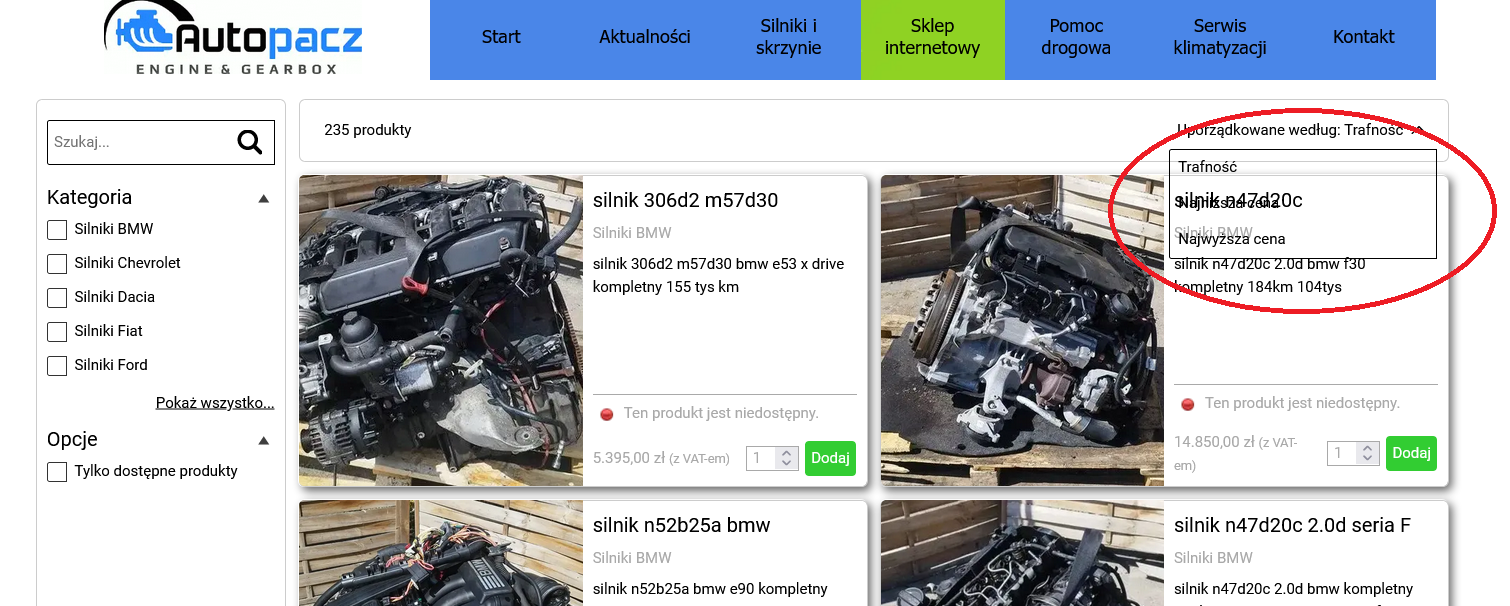
The shop menu regarding sorting like this:

Can this be changed somehow and where?
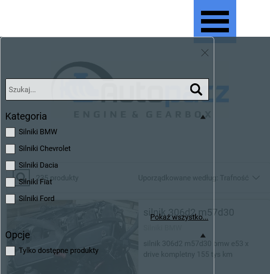
The selection menu in the store is difficult to read on mobile devices. Too little contrast.

Can this be changed somehow and where?
Posted on the

Hi Adrian
That selector inherits all of its style from the style given in Step 3 to Shopping Cart: Search:
You probably configured "Transparent" here and that's why it's looking like that.
Can you try changing there and see if the result is better?
I remain available here
Stefano