Shop and blog adaptation issue, help how to solve the problem 
Autor: L. MysonHello I have a question that needs to be solved. Now I am creating a shop where will be a composer to sell music in games and other projects.
I saw your template, clicked on it and had some adaptation questions.
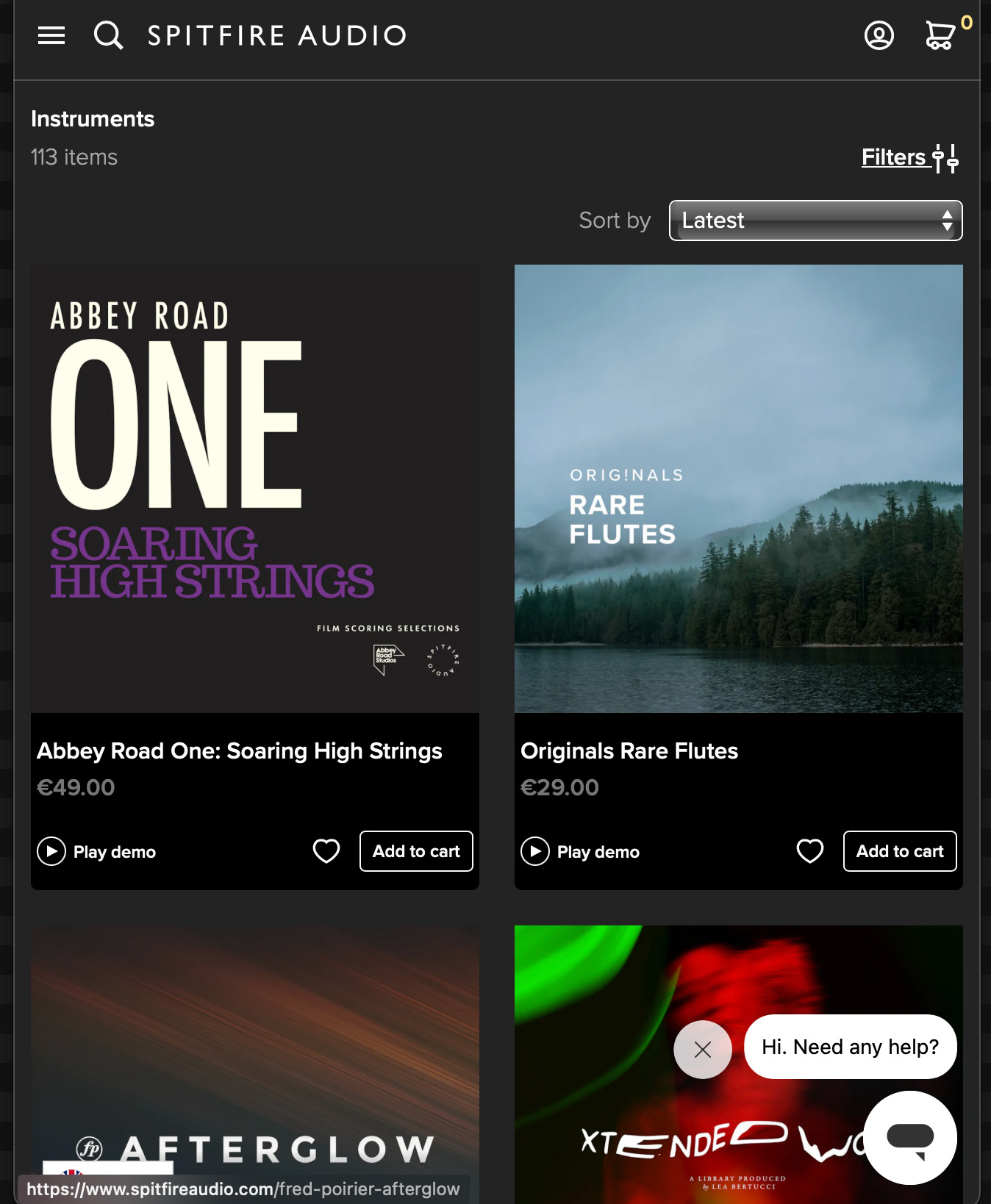
I saw how your system works with my favourite company.
https://www.spitfireaudio.com/instruments?rrp_to_pay_usd=%3A50&page=4
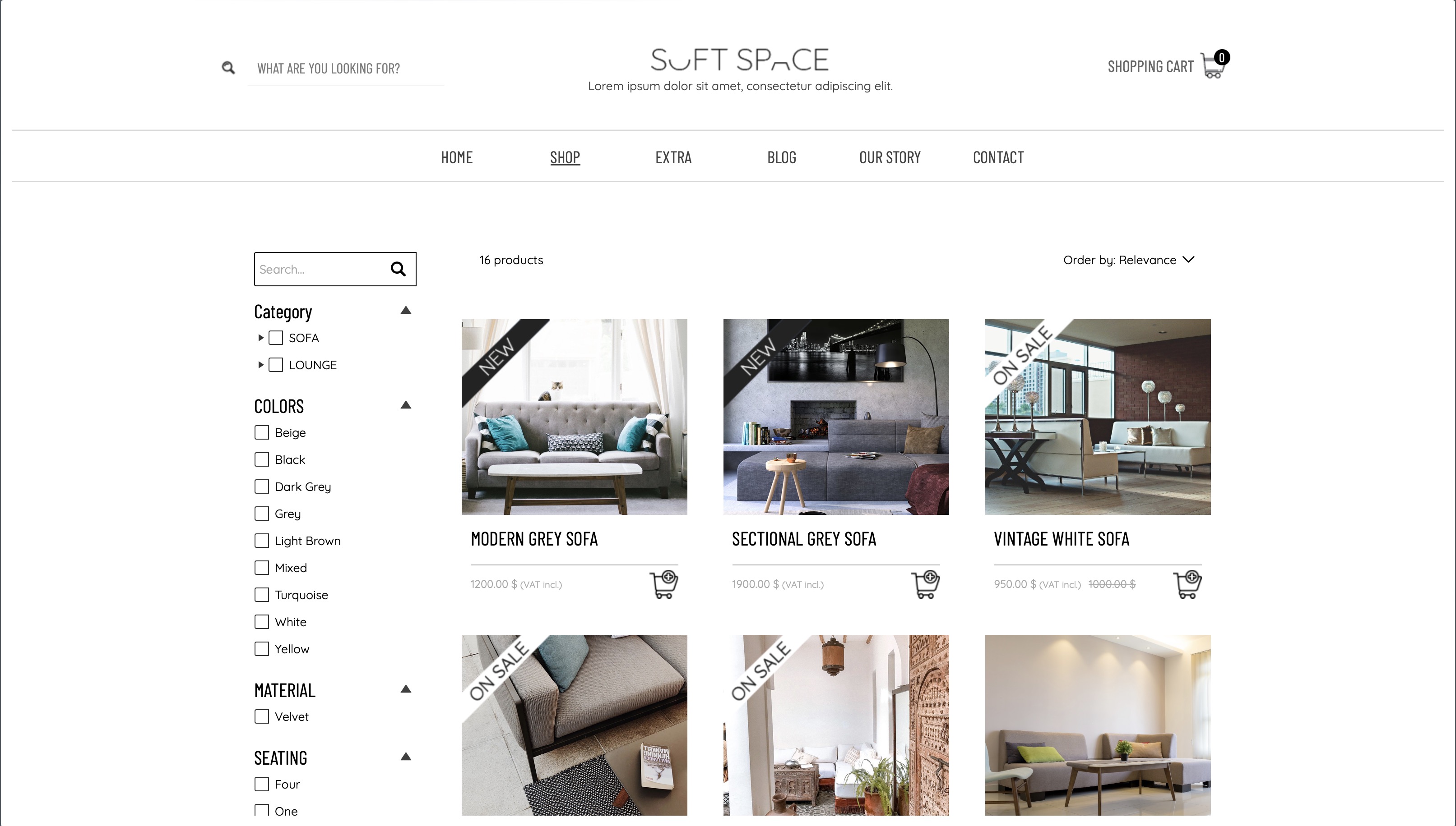
and below as on a mobile device
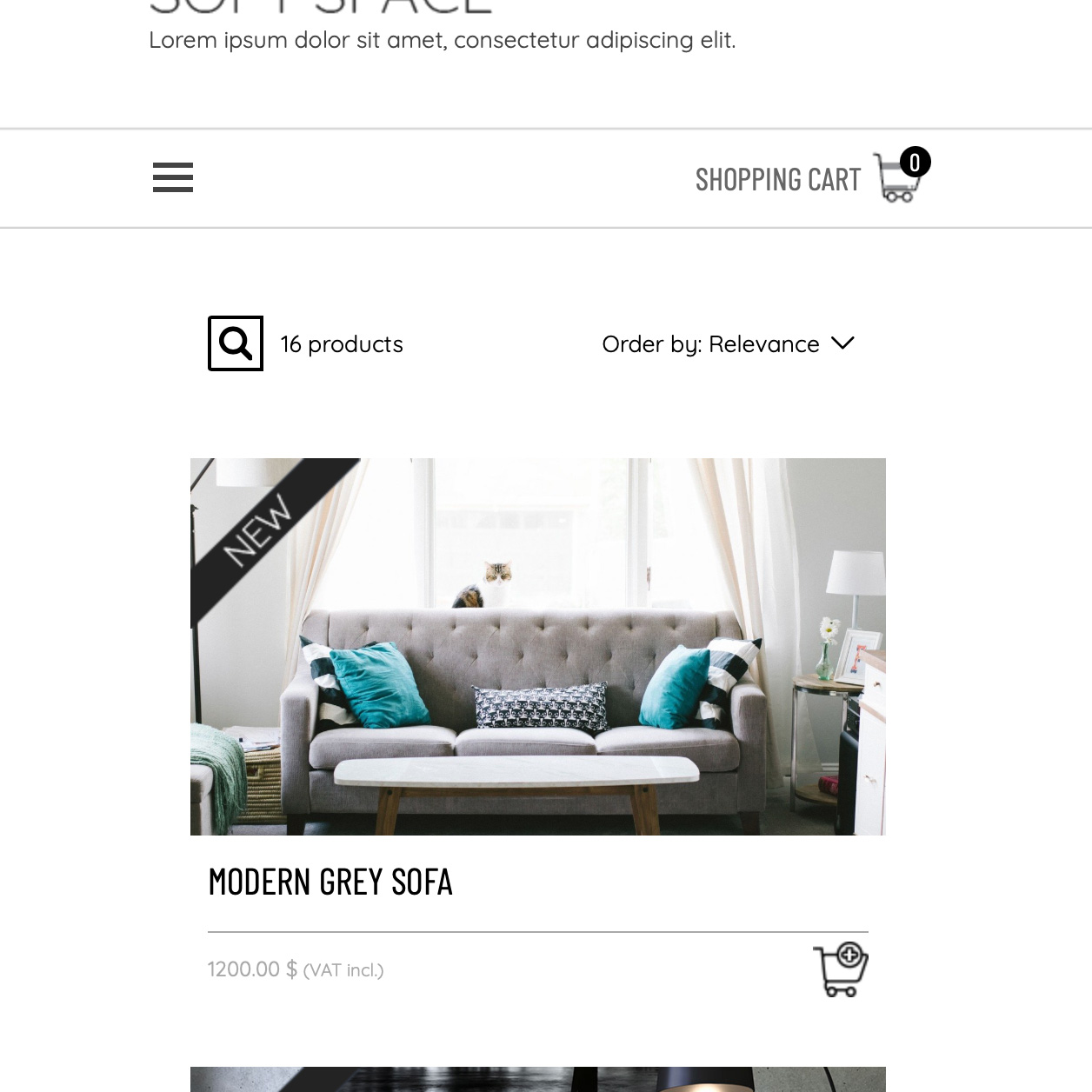
I like how the company has, how to make it so that there are many covers in this section!
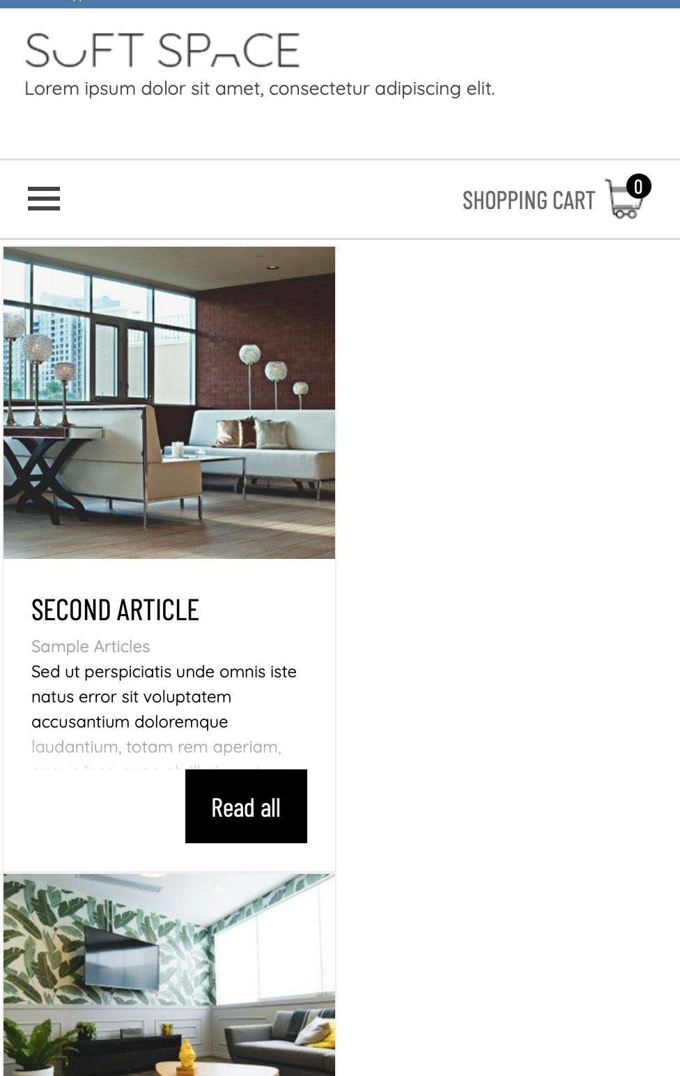
question 2) - why blog articles don't adjust to mobile device if it has a picture in the sidebar
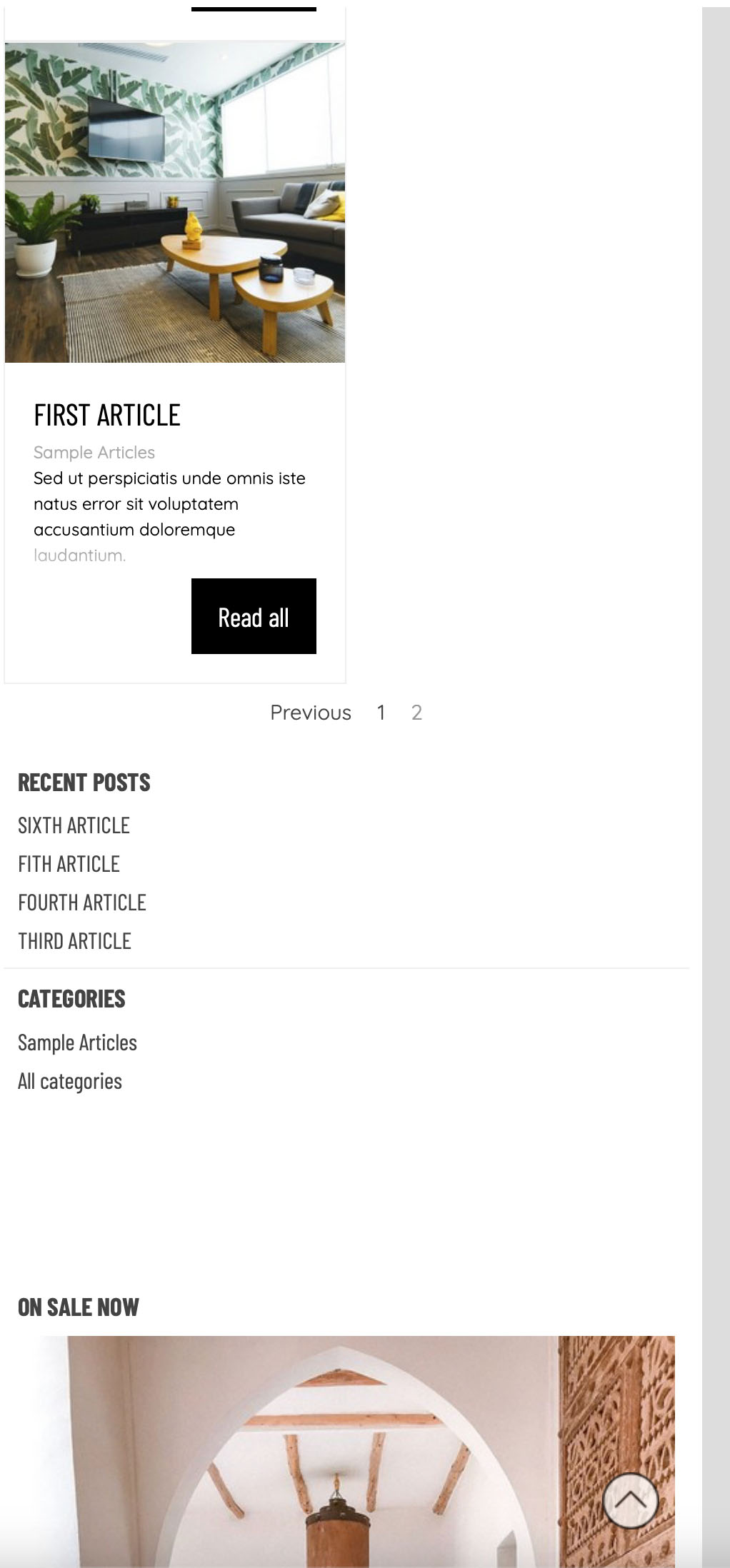
below is a picture on the computer on the right side of the picture on sale now adding a picture there does not align the blog
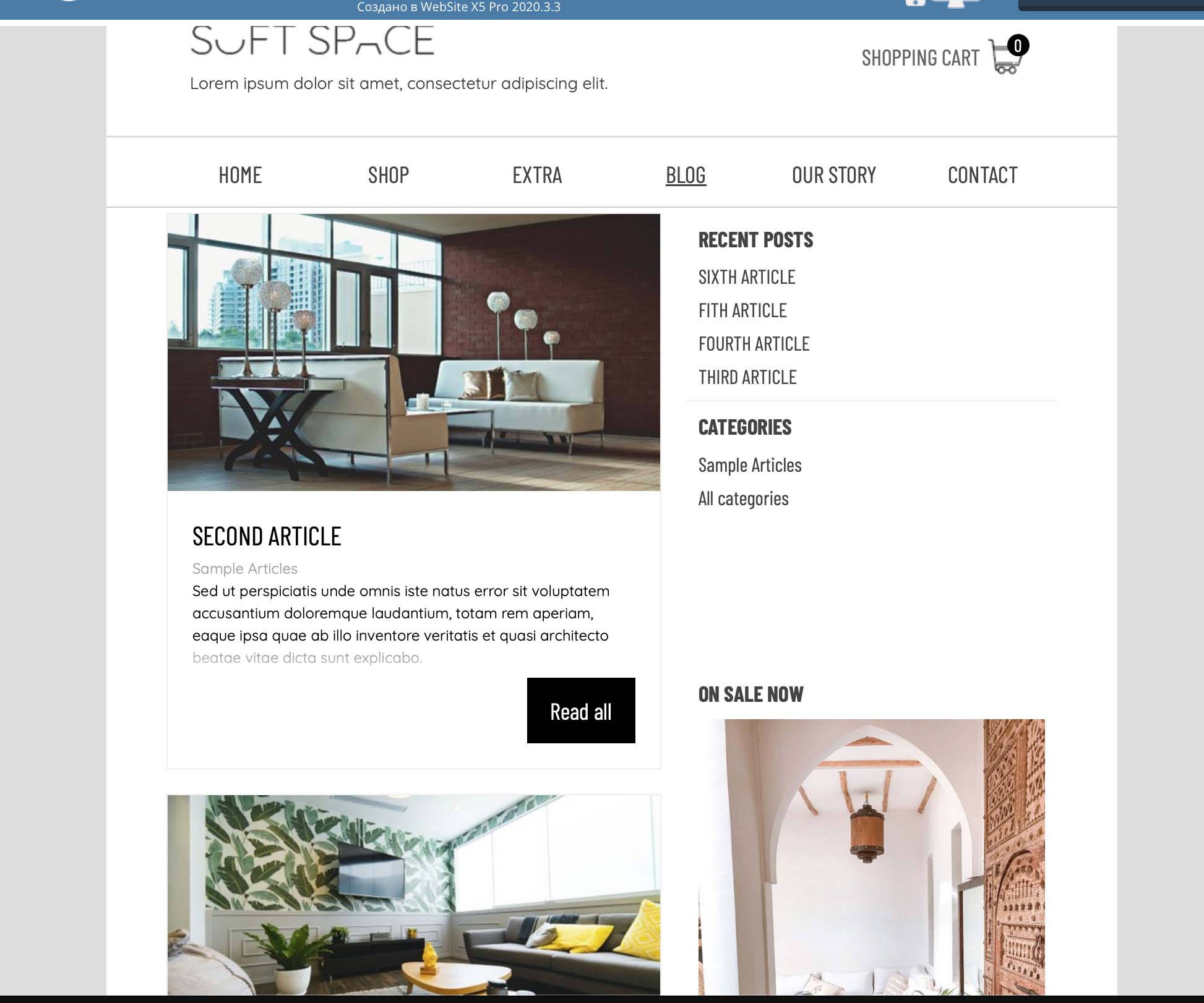
pictures below when they are on a mobile device, why don't they cover the entire space of the mobile phone? There's a lot of empty space on the right side, why doesn't the system levelling it all out so it's even? Why does the picture at the very bottom prevent the blog from working full screen, and how to fix it?

Autor
HOW TO MAKE THE WHOLE SHOP OBJECT OCCUPY THE WHOLE AREA FROM EDGE TO EDGE? in STORE pic 1
New settings for wider websites in Responsive:
A) Change the 1st entry to the desired largest width (e.g. 1600).
B) Then add an entry with the next smallest width (e.g. 1150, the largest width so far).
-----
I have now changed my demo shop with blog from 1150 to 1600, see
>> https://findelinks.de/123shop-hosteurope/
Autor
Hello,
do you have an URL for this page? What resolution is your monitor, also?
Eric
Autor
Hi Eric, I have a 16-inch MacBook Pro and 2 monitors with 4k resolution
Maybe it makes sense for my MacBook to set other resolution for site projects!
I can't give it like that because I didn't download and set up the project
I don't think it makes sense to do something for all resolutions.
The Pro version only has 10 points.
Most users are unlikely to view websites in full screen width. And when texts reach a certain width, it becomes difficult to find the beginning of the next line.
So perhaps in addition to the 4 standard resolutions up to 1150, there is also No. 5 up to 1600, No. 6 up to 1920 (Full HD) and then maybe 2 or 3 resolutions.
The question is also who the visitors are and what devices they use.
Does it even make sense to set up the website for more than 1920 (Full.HD)?
Autor
Yes, I understand that it is not worth doing for all resolutions, I used to work on a regular laptop, then changed it to a MacBook and a surfcase, so the quality is better, all my friends have MacBooks or a surfface, and those who play games of ordinary computers with a resolution of 1920 or 4K screens, well, and iPhones, iPhones, or Samsungs, so when I create a website version for a desktop, I create for the resolution of MacBook and 1920 since I have a MacBook for only 2-3 years, I'm not used to doing it under these resolutions, but I want to make personal sites for the resolution of MacBooks and Surf. I'm also thinking whether to delete for Phones 480 resolution in 2024? When does everyone have iPhones and other devices?
The question is also who the visitors are and what devices they use.
Does it even make sense to set up the website for more than 1920 (Full.HD)?
Autor
I forgot to say, I've seen some sites when they adjust when stretching and the content always looks good, it seems to me to solve a lot of questions and when I open it on my MacBook and when I minimize the window and make it 2 times smaller, the content is always filled from one edge to the other and there are no empty spaces, when you put the dots when stretching, they do not change smoothly. In fact, I'm talking mainly for the store section, in other cases, everything is enough.
As in this template https://market.websitex5.com/ru/shablon/predprosmotr/1d1eed8a-30f1-4205-a284-1f68f017cfa/CFFPDS-0824
As far as I know, there are supposed to be two different methods for responsive websites, one of which uses WebSiteX5. I don't know the other method.
Autor
Hi, yes, I got it) do you happen to know how to change the color of only the side panel in the store and the product cards separately? Now I'm changing the card and the sidebar is changing
Here is an example of background color changes on the product search page with CSS code.
---- CSS code -----
<style>
#imContent { background-color: gray; }
.filter-sidebar { background-color: lightyellow !important; }
</style>
---------------------
Below you can see other screenshots of how and where the CSS code needs to be inserted.
-----
-----
-----
And here is another example of CSS code for the product catalog page.
-----
---------------------
-----
Here you will find the color names and color codes for the CSS code.
>> https://www.w3schools.com/colors/colors_picker.asp
Correction:
This CSS specification ...
#imContent { background-color: gray; }
... can also be done directly using the function in WebSiteX5:
3 Sitemap, select page > Properties / Graphics
-----
Autor
Thank you very much for your help, I will save your examples to remember the lesson, and thank you for the site where you can choose a color, I did not know about it.