
Two images in a row must be seen in a mobile version 
Autor: Mandar V.
Visited 460,
Followers 1,
Udostępniony 0
Hello WX5 masters,
Please visit https://www.shivamoffset.com/index.html
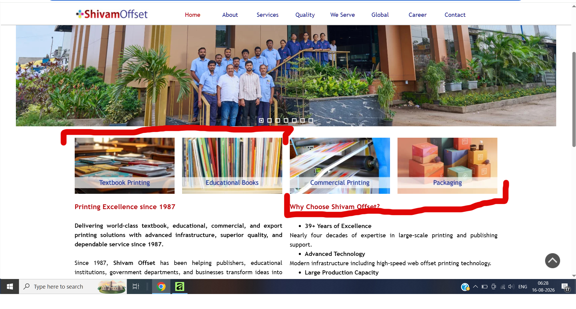
I request you to please visit the website and see the screenshot attached below. In a desktop version these 4 images appear in a row; but in a mobile version only one image appears by default. I want two images to appear in a row in mobile version.
I want your help to create it. Please help.
Thank you in advance.
Posted on the
Normally it should be sufficient if a smaller width is defined in addition to the width for mobile phones, see screenshot (1)
Then when 4 images are displayed in the row, then click on "Responsive" above the grid and add a line break, see screenshot (2)
----- (1) -----
----- (2) -----
----- (3) -----
Autor
Thanks Daniel W
I'll try it as per your suggestion and will let you know the end result.
Thank you once again.
Autor
Unable to do it dear Daniel W.
Even if I choose to split two images; whenever I choose a lowest breakpoint, it automatically goes to a single image.
Can you please share me a sample project file?
My mail ID is ***
Thank you in advance and sorry to trouble you.
It is important that the lowest screen width is not used; it only serves to determine the screen width from which only 1 image per line is displayed.
-----
Your post specifies the 2025 version of WebSite X5.
I'm using version 2026.2.4, maybe that's the cause if it doesn't work for you.
Autor
Thanks Daniel W.
I'll try it as per your suggestion.
Try adding an extra breakpoint; if the last one is currently at 480px, add one at 320px. That way, you should have control over the 480px one. Cheers.