
Produkt Card 
Autor: Klaus G.
Visited 338,
Followers 1,
Udostępniony 0
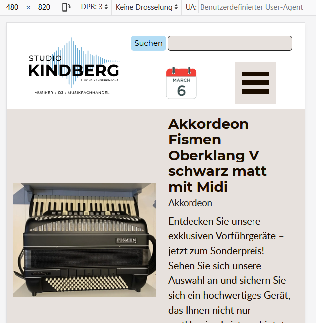
Hllöle zusamen,
das dass Aussehen bei 480px ist wie bei 360px ????
Gruß
KLAUS
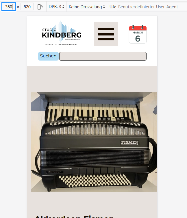
360PX, Coverbild oben, Text unten.
Posted on the
GEnauer beschreiben... bei mir schaut es unterschiedlich aus!
Autor
Hallo Andreas,
ich möchte rein optisch das Aussehen von 360 px schon bei 480px haben ???
Gruß
KLAUS
Autor
Also dass das Coverbild oben ist und der Text unten.
Wie halt bei Ansicht 360px.
Hello Klaus,
the layout changes depending on the available space for the elements (image and description).
In the lowest breakpoint, the image and text will be displayed vertically, outside of that breakpoint if at least 200 px are available, they will be displayed side by side.
In the case of your breakpoints, at the lower end of your second smallest breakpoint this should indeed occur with a 50% width for the card, so if this is not the case I will investigate the cause.
Online translation:
Hallo Klaus,
das Layout ändert sich abhängig vom verfügbaren Platz für die Elemente (Bild und Beschreibung).
Im niedrigsten Breakpoint werden das Bild und der Text vertikal untereinander angezeigt. Außerhalb dieses Breakpoints werden sie nebeneinander angezeigt, sofern mindestens 200 px verfügbar sind.
Bei Ihren Breakpoints sollte dies am unteren Ende Ihres zweitkleinsten Breakpoints tatsächlich bei einer Breite von 50 % für die Karte der Fall sein. Sollte dies nicht so sein, werde ich die Ursache dafür untersuchen.
Autor
Ich glaube ich habe es geschafft :-)
über responsive Einstellungen.
Und ein wenig CSS :-) :-)
<style>@media (max-width: 480.9px) and (min-width: 480px) {#im-product-container .container-gallery .container-gallery-top .swiper-slide .swiper-slide-image {scale: 106%;}}</style>
<style>@media (max-width: 480.9px) and (min-width: 360px) {.container-gallery-info.mb .im-cc-products-card .im-cc-products-name {margin-top: 5px;}</style>
Autor
Hier mal ein Link zum Testen:
https://www.studio-kindberg.de/Test-Preview-2026.3.2/product/?akkordeon-hohner-bravo
Gruß
KLAUS
Der Breakpoint 720px schaut jetzt ein bissen zerstört aus im Header!