Help with Responsive Design 
Autor: Elsa-marie L.Hello,
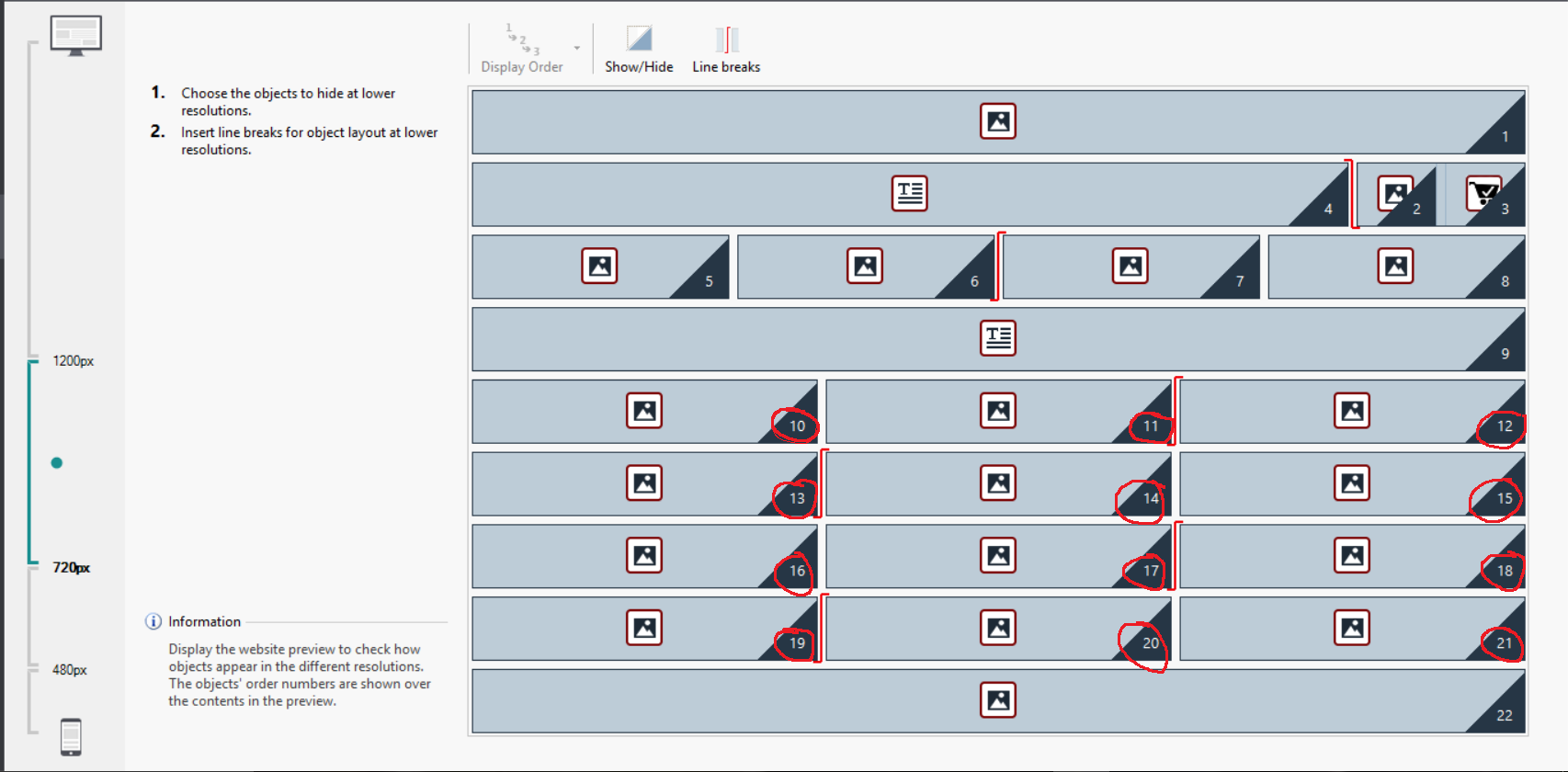
I have a slight issue with the Responsive Design. Here's my starting point:

At 720, I want 3 cells per row (my products images); but when I'll move to the 480-720 point, I want the design to become 2 cells per row. So cell 10+11, then 12+13, then 14+15, 16-17, 18-19, and 20-21. In the past, Website X5 made the transition between cells in a linear and seamless transition, so that 12 and 13 would automatically become two cells in one row, as I break the seam between 11-12 and 13-14. But it seem that it changed, because now I get this:

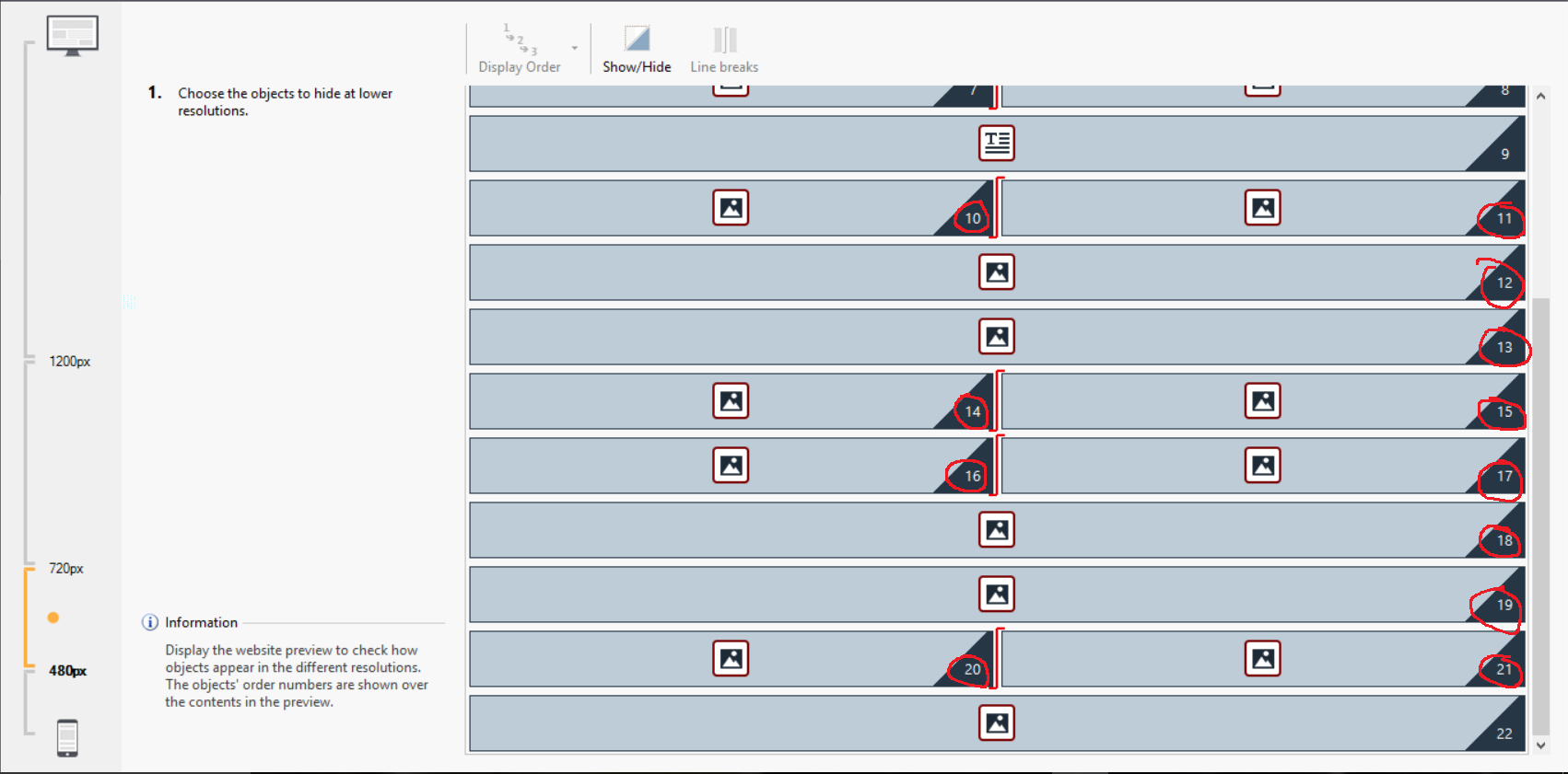
As you can see, cell 12 and 13 have been separated into one row each, as with 18 and 19; while the rest of the cells from 10-11, 14-17, and 20-21 formed the 2 cells/row as I wanted.
I can't figure ou how to tell the program that I want cell 12 & 13, and cell 18 & 19 to be in the same row as the others. It once did this automatically, but now it seems that it doesn't any longer...
Can you help me?
Thank you,
Elsa-Marie

The content is probablt too width to fit in 2 screens, then they automaticle become 2 lines.
Try to reduce content or margins. I am not sur cause I don't know the conten, but meke both smaller and see if it fits.
Autor
They are all exactly the same size and margins; and they are only images (images of my products), for the moment only copies of the same 4 images (test images, and exact same size/margin). So for example, the content in the cell 12 and 13, who are on a separate row each, are exactly the same as 10 and 11 who are on the same row... I hope there's another solution... (crossing fingers).
BTW, I see you're always answering to every single discussion. :) Thank you for taking the time; and sorry I ask so many questions... Its just that my online store is scheduled to open by mid-November, and I'm alone at creating the site...
Autor
P.S. And yes I did try to make it smaller, but it did the same thing... :(
Elsa-marie, since these are images, have you looked at using either the justified gallery or masonary? Both will display as many images across as required and automatically adjust to suit responsive design (each is 16 credits).
https://market.websitex5.com/en/objects/live-preview/23b8d5b1-3e44-410a-b39e-254a0c735b3
https://market.websitex5.com/en/objects/live-preview/39976c19-3123-4a69-b368-3abb553df8f
Alternatively I suspect the only way you will get something close to what you require is start with 4 cells, drop it to 2 for tablet, and then 1 for small tablet. The way it is working in V13 is the way it is intended to work (cells will not "line-wrap").
Autor
Thank you; I'll explore those options.
Its just bizarre, because either with the V13 demo or the V12 demo I had, it didn't do that, it did the "line-wrap"; that was why I was confused when it no longer does so.
Thank you again,
Elsa-Marie
Maybe try to make the resolution a little big bigger, I am not sure if it helps, it's a bit of trying all kind of thinks to get it to work if you realy wish this.
Autor
I really appreciate your help; but for the moment, since we're very tight on the deadline, I'll just duplicate the website and make a standalone mobile site, and link it to the desktop site with the automatic screen resolution detection at the entry page.
Thanks again!
No problem, glad to help out.
I still think it's worth a try, but as you said, later...