Extend page to browser width 
Автор: eyal melamed
Просмотрено 2964,
Подписчики 1,
Размещенный 0
Hello,
X5 ver 15
1. Is there a way to extend the website pages to browser width by code or any other means.
2. Is there a way to get the side bar out side the page area?
Thank you
Размещено

Hello Eyal
Is it something like this : http://www.bramminginfo.dk/brm09 you mean ?
Автор
Hello John,
Yep. You got it.
(translated by Google) Add:) to configure for all the resolutions that go for the most ...
> 1) - with the v.15_PRO you have 10 breakpoints (> ▪
... or you can use the background in the style of the lines to simulate the full width ...
> 2) -excuse, I did not understand what you are referring to.
(IT)
> 1) - con la v.15_PRO tu hai a disposizione 10 breakpoint da poter configurare per tutte le risoluzioni che vanno per la maggiora...
... oppure puoi usare lo sfondo nello stile delle righe per simulare la tutta larghezza...
> 2) -scusa, non ho capito a cosa fai riferimento.
.
ciao
Hello Eyal
The shown example is made with the normal settings in X5.
No special code used.
The setting is here :
The issue is to set the page-background to : left.
This will bring the sidebar to the left.
The video and the image is made by using the row-formats
Here you specify : Extend to width of browser window ( in Danish : Udvid til bredden af browservinduet )
Same goes for the 2. row - here it is an image instead of a youtube-video, that is used.
Hope you are helped by this
Kind regards
John S.
Автор
I'm gona run and try that
100 thanks
Hello Eyal
You could also look at this post : https://helpcenter.websitex5.com/ru/post/188978
I think it is much the same you want.
Hope you are helped
Kind regards
John S.
Автор
Hello John
So sorry but it did not work for me.
I will explain my problem more detailed:
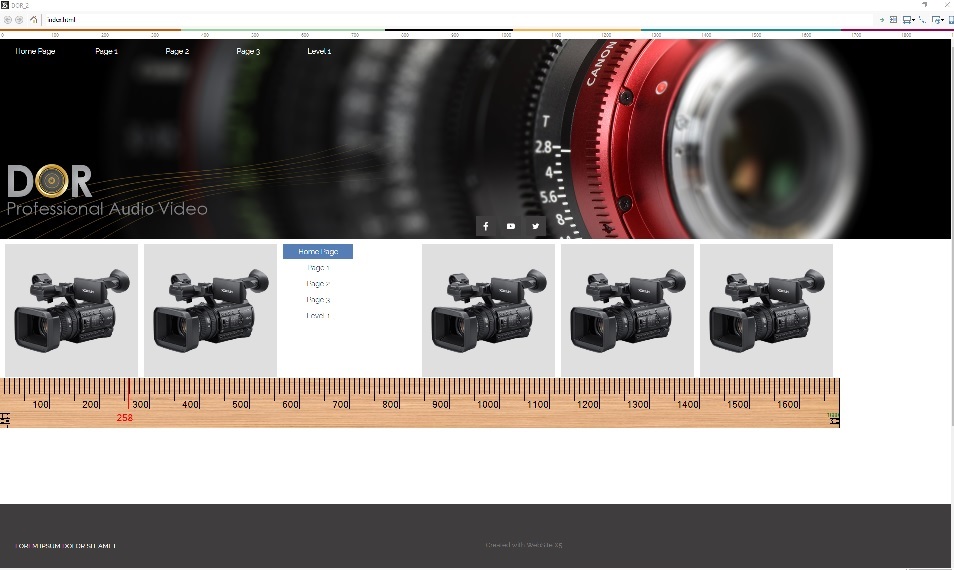
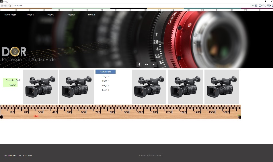
In X5 the "page content" width, is determined by the next breakpoint.
Meaning if for e.g. i have breakpoints 768 followed by 360, when i work on 768 "page background" the "page content" will be not more than 360 (less than hulf) and there is no way to change that only use more and more breakponts which is a huge work.
When I add side bar, the side bar size is always taken from the account of the page content thus making the content even smaller!!
I attached 2 photos showing that, on a 1080 backround withe 1680 first breakpoint.
My question therefor is: is there a way to increase the page content size to background size or browser size?
Or use the side bar outside of the content size?
Thank you

Hello Eyal
There are different approaches for that.
1 - One way is to make all pages without the template. This requires no special code.
You can have the menu on top of each page. Doing it this way, you cannot have the menu sticky.
2 - You can also make the same and make the menu fixed. This reguires some code.
3 - You can also make the page width "full" size, by specifying this in the settings for the template structure.
4 - you can also make the menu sticky outside the page area. This requires some code. And is not responsive-friendly.
5- You can have the page width set to a quite big value and have the menu in top ( no sidebar )
6 - If you are familiar with html/css/js coding you can make the page with a sticky meny. Example here : http://www.bramminginfo.dk/brm05/ The fixed header is made for every viewport ( 4 ) to be responsive. The page width could be made bigger. The sticky menu could have been in the left side instaed of the top. Using the X5 the "normal" way will be the easiest to maintain.
I would recommend a page width of 1200 and the menu in top.
You can have backgrounds images, slideshows and videos to fill the whole screen by using the row-format.
If you, for a specif purpose, want an object to fill the whole width you can use some code for that.
You can see an example here : http://www.bramminginfo.dk/brm02
This is made with only some code for the slideshow ( about middle of page ). The rest is the "normal" X5 settings.
on this page : http://www.bramminginfo.dk/brm02/s.-ansgar.html You will see a sticky "page menu" in the lower right.
This is made with some code. The rest is made in "normal" X5 settings. On the page is also a level-menu. This is the normal X5 menu - I have just added some code to have if span the whole width. As this menu is on the page, it disappears when scrolling.
Again - My recommandation is : Make a rather wide page size and place the menu in top. You can make the menu sticky.
And then use the row formats. Use only special code when needed.
Tell what you intend to do now, and I will try to comment on that.
Kind regards
John S.
Автор
Hello John,
First thank you for your kind help.
My knowledge in code is 0. Most I can do is copy and past where i'm told. (That way I managed to change few things with the help of Claudio from Incomedia)
The only thing I want to get is image categories that would span to the whole width and 2 sticky side buttons for shopping cart and one more. I also love! to have a fixed menu instead of the sticky one.
This would be an eCommerce website with many products and categories.
For your approaches:
1. At this approaches i'm loosing header and header BG so need to add it to each page manually . its too much. secondly its only good for the first breakout point in responsive mode. after that it again determine by the next point automatically.
2. I would love fix menu but the same problem as before.
3. In template structure. there is nowhere "full size"
4. Don't know code and mast have responsive.
5. Sorry but did not quit understand how to do that. also, i need side bar only for 2 buttons.
6. The first e.g. looks great. Again, I don't know code
If you, for a specif purpose, want an object to fill the whole width you can use some code for that.
You can see an example here : http://www.bramminginfo.dk/brm02
This is made with only some code for the slideshow ( about middle of page ). The rest is the "normal" X5 settings.
Yes I would like my image categories (image objects) to fill the whole browser width. (don't know code)
on this page : http://www.bramminginfo.dk/brm02/s.-ansgar.html You will see a sticky "page menu" in the lower right.
This is exactly what I need for my cart object.
Best regards
Eyal
Hello Eyal
Here : http://www.bramminginfo.dk/brm02/testside---kopier.html
you can see a page made the normal way - BUT - with the page menu fixed outside the page area.
Here it is two levels of menus, but I guess you will only need 1 level - right ?
On the page - turn on your soundcard :-) Even if the page is for test, and even if you don't understand the words, you should listen. You can stop the video by clicking outside the page area.
Is it such a fixed menu you want ?
If - then I will eplain the code for it.
Do you have a link to your site ?
Kind regards
John S.
Автор
Hello John,
Thank you for all your tryings.
I really feel bad bothering you with my problems, maybe i cannot explain myself right.
Here is a link to a website which uses full size page for its image categories and a fixed menu on full size.
https://www.amtel.co.il/
Do you think i could ever do this with some code and incomedia?
My website is on my PC. only in early stages.
Since ver 13 i manage to finish only one site.
(Your track is great BTW)
eyal, WX5 does not support variable width content, only fixed width. The information offered above will achieve a website that to the average user appears to "fit the device", after all, with the exception of a PC, few devices allow infinite variability of display width. If you choose your breakpoints with care, your site will be perfectly designed for each device. There is nothing in your example that cannot be replicated for specific resolutions.
John and KolAsim have provided the appropriate details, and in case it helps, here is a similar link https://helpcenter.websitex5.com/ru/post/191291
Hello Eyal
It should be possible. Take a look at a test I have here : http://www.bramminginfo.dk/brm05/index.html
I don't know for the image categories, but the slideshow can be done.
Only look at the princip.
If the last example is something of what you want, then I could try to make a test. I think we should continue by mail, as this is now just about making a template I think.
You can use the contact form here : http://calendarforum.dk/contact.html
Then we see what comes out of this.
You should not feel bad - I do this for interest, and I myself learn a little bit, every time I assist. Sometimes it is more challenging than other times.
Kind regards
John S.
Автор
Esahc,
Thank you for your answer.
I'm obviously don't imply for the variable width. I just want to show how i want my categories to show: full size. (And to show John the fixed menu).
And this can be achieved only if the contact width could be determine by the user and not taken automatically, by incomedia, from the next break point size. This forced the poor user to use the whole 10 breakpoints for no real other purpose and make the user spend huge amount of time for nothing.
I truly don't understand why in row format you can aplly the full content to everything but the page content.
BTW, I'm asking the forum for that since ver 13
Автор
Thank you John,
The fixed menu is exactly as I wanted.
I will be happy to continue by mail.
Have a great day