WebSite X5Help Center

 
Craig K.
Craig K.
User

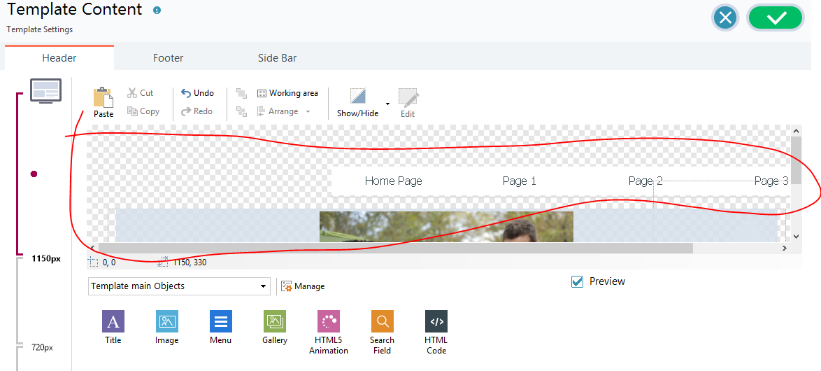
Why is 'template content' header workspace so small?  en

Автор: Craig K.
Просмотрено 821, Подписчики 1, Размещенный 0  

How do you make this bigger - it is very difficult working on the header with such a small window.
Размещено
8 Ответы - 1 Корректно
Giuseppe Guida
Giuseppe Guida
User

Hi, follow these screenshots, the interface of my software is in Italian but what you need to do is very intuitive...

Читать больше
Размещено От Giuseppe Guida
Giuseppe Guida
Giuseppe Guida
User

and finally...

Читать больше
Размещено От Giuseppe Guida
Giuseppe Guida
Giuseppe Guida
User

Ah ok, now I understand, you want to make that working window wider, not the header... Unfortunately, what you ask cannot be done...

Читать больше
Размещено От Giuseppe Guida
Craig K.
Craig K.
User
Автор
Giuseppe Guida
Ah ok, now I understand, you want to make that working window wider, not the header... Unfortunately, what you ask cannot be done...

Yes it is very small. This makes it difficult to work with.

Читать больше
Размещено От Craig K.
Craig K.
Craig K.
User
Автор
Giuseppe Guida
Ah ok, now I understand, you want to make that working window wider, not the header... Unfortunately, what you ask cannot be done...

I like your "Officina Ferrante Service Car" site. I see the headers are consistent across pages. I think what I have misunderstood is that the  'template content' header window is just for logos and menu and not for the large image at the top.

Читать больше
Размещено От Craig K.
Giuseppe Guida
Giuseppe Guida
User

Hello, thanks for the compliments. On the "Officina Ferrante Service Car" site, I entered only the logo and the navigation menu in the Header, while on each page I inserted those images in "Row format" and in the layout grid I inserted the buttons and texts corresponding to those images.

Читать больше
Размещено От Giuseppe Guida
Craig K.
Craig K.
User
Автор
Giuseppe Guida
Hello, thanks for the compliments. On the "Officina Ferrante Service Car" site, I entered only the logo and the navigation menu in the Header, while on each page I inserted those images in "Row format" and in the layout grid I inserted the buttons and texts corresponding to those images.

Thanks, it makes much more sense to me now.

Читать больше
Размещено От Craig K.
Giuseppe Guida
Giuseppe Guida
User

@Craig K. wink Ciao

Читать больше
Размещено От Giuseppe Guida