Drop Down List Auto Resolution 
Автор: Ionescu C.
Просмотрено 2516,
Подписчики 1,
Размещенный 0
Hello,
I have a Contact Form section that has within a Drop Down option.
In lenght of the Form is 100%
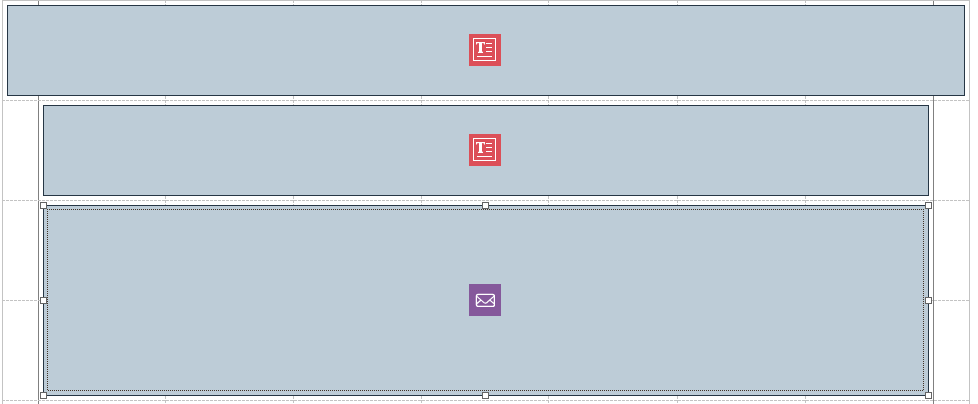
In the Desktop mode it shows accordingly.
In smaller devices, due to the fact that the text from the available options is bigger it will not be displayed - Preview mode (smaller resolution devices):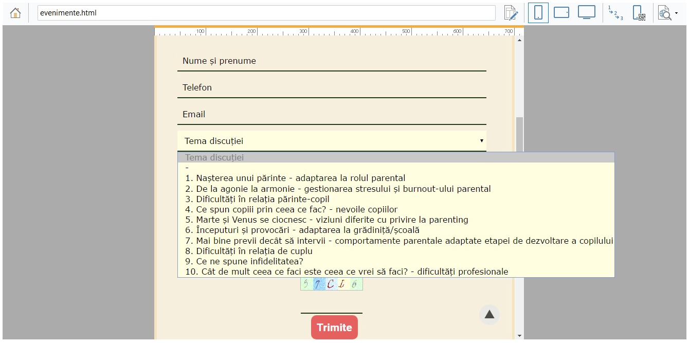
Or the view from the actual mobile: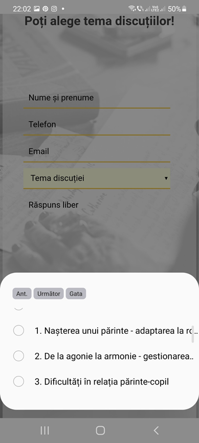
Any ideas ?
Regards,
Cristi
Размещено

Hello Ionescu,
Do you have activated the responsive mode ? to have a better displaying on differents devices.
Enjoy!
Axel
Автор
Hey,
Yes it is activated the Responsive Mode.
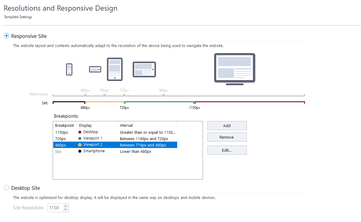
Regards,
Cristi
Can you provide the url (website address)?
Автор
Hello,
Certainly, this is the url:
https://iulianapopa.ro/evenimente.html
Regards,
Cristi
Ionescu, is the form 3rd party code (I can not find that functionality in WX5)?
Using the standard form, would the agreement conditions field meet your needs?
Автор
Hello,
I am using 3'rd party code in the website, but in the contact form used in the https://iulianapopa.ro/evenimente.html, there is no such code/script.
It is the standard form.
Don't know if this is relevant or not, but I'll put it anyway:
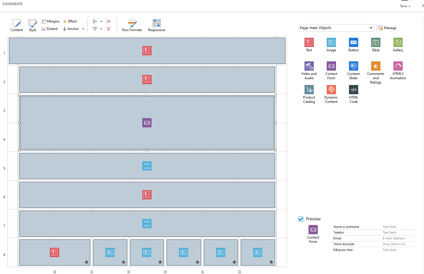
Regards,
Cristi
OK, time to educate me.
Which option did you use to achieve your list in a box (I cannot reproduce it and suspect old age is getting in the way :-)?
Автор
:)))
you are very funny
The option is called Drop Down list
Regards,
Cristi
Thank you Cristi, I have used the standard drop down list on many forms but it never occured to me that the lines did not auto-wrap when they were longer than would fit (I only ever use a few words).
I suggest we ask Incomedia to change the behaviour of the drop down list in the form object such that the lines of text wrap if necessary to display at lesser resolutions (eg mobiles).
This would require you to change this post from a question to an idea.
Please be aware that such a change is extremely unlikely in any foreseeable future (based on the evidence of other similar requests over the past many years), so do not get your hopes up. The functionality of the list box as in WX5 seems much the same as in alternative add-in products (eg https://www.coffeecup.com/web-form-builder/).
I have marked this post for attention by Incomedia in case this helps.
Автор
Thank you very much for the information.
This would require you to change this post from a question to an idea. - can you tell me how to I do that?
Raise another post as an idea, or...?
I will take it with the customer and see how we will move on regarding this.
Regards,
Cristi
Good afternoon
I confirm what Esahc commented. This field is currently not using any particular custom functionality. It is a but a standard HTML5 Select field and it being standard is what allows it to work the way it does on mobile for example, where the small window appears to better select elements.
As of now, this is the way HTML5 select fields work and when the text is too long, it will render just as you experienced it. I'm afraid that there isn't much that can be done about it since all select fields on the web should pretty much work the same as long as they're standard HTML5 fields.
If you wish, however, I will turn the topic into an Idea anyway to keep it highlighted in case it becomes possible to improve in the future
Keep me posted
Stefano
Автор
Hello Stefano,
I think that it could be a good idea for the future versions.
Not all the available texts from an drop down section have between 10-30 characters long, other may be longer and would be nice to have the text wrap for smaller devices.
Regards,
Cristi