Responsive 
Author: Henk R.
Visited 2352,
Followers 1,
Shared 0
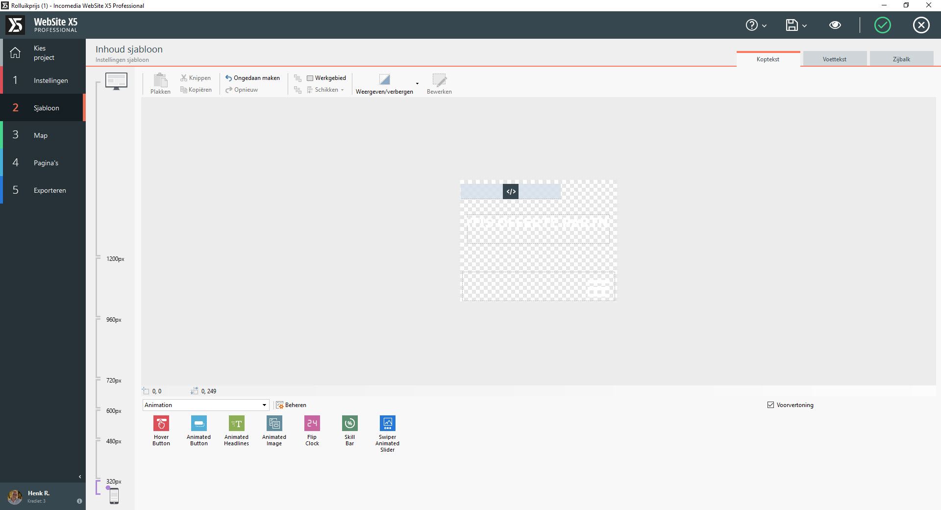
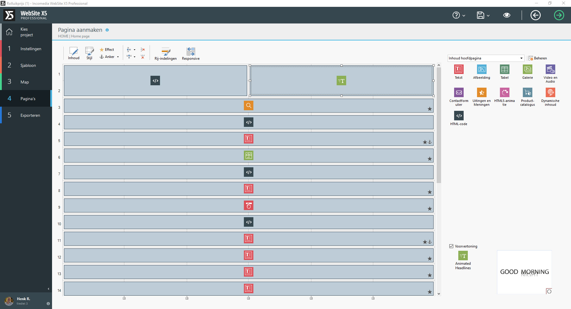
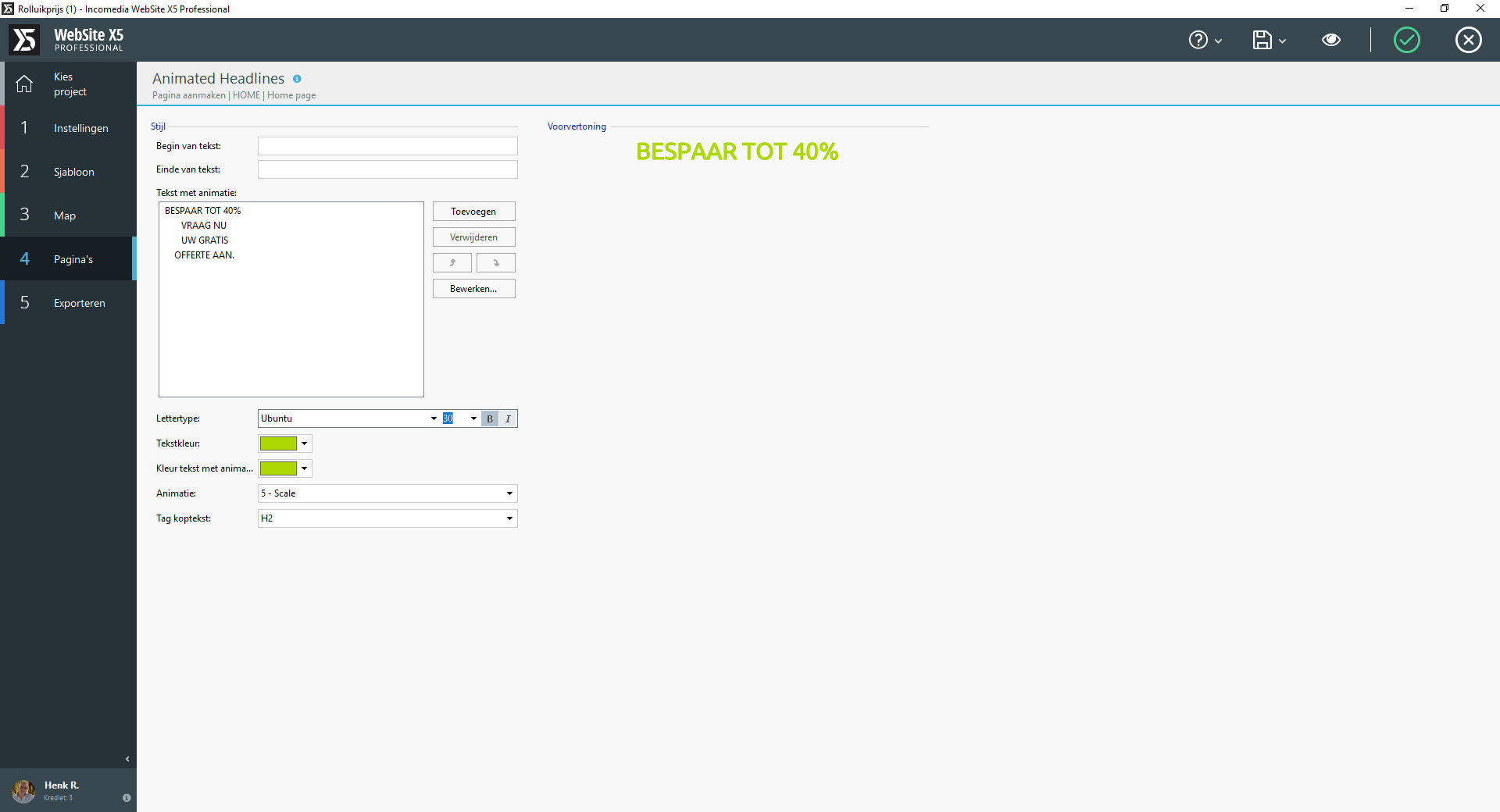
Hello, can someone tell me what i do wrong? The Responsive previeuw from the breaking points test its show the Animated headline good and the other text to but iff i use the new button mobile preview on a samsung note 4 or samsung Edge 7 it dont show all text. See pictures.

Posted on the

Henk, just as in v14 and v13, you need to visit Template, customisation, header and footer content, for EVERY resolution so you can adjust the content accordingly.
If you feel the space is inadequate, you can modify the depth of the header and footer for each resolution via template, customisation, template structure.
Author
Hello Esahc, i did that and even bring it back to a vieuwpoint 460 but nothing change when i use the phonevieuw button the text stay the same some letters i cant see.
Author
This are the settings i use now
Henk, assuming your preview is fully up to date (ctrl+preview), the reason could be that your phone cannot/will not display 480px wide in portrait. I always add an extra mobile display resolution of 320 (I leave the 480 there), this way if a phone has an actual resolution of between 320 & 480 it will correctly display the appropriate resolution without cropping the text or graphics.
Author
Hello Esahc, thank you for your answer,but its not the problem i try several settings but the the prblem is the animated text dont ajust to the settings , before i use 60 points and have t bring it back to 30 (thats to small) than you can see te text compleet but to small for normal desktop use.
If changing the point size for mobile also changes the point size for desktop, you are doing it wrong :-)
First off, make your desktop as you want it.
When you place a title (text) click the checkbox
Now when you move down a resolution, drag the handles of the text object, this will shink the text only for that resolution.
Do the same for every lesser resolution.
IF THIS IS NOT SUITABLE FOR SMALLER RESOLUTIONS
Select the text or object in question and hide it.
Once it is hidden for this and smaller resolutions, add a new text object (perhaps multi-line) to meet your needs.
Many people (myself included) use this feature to have totally different headers (&footers) for each resolution.
For each resolution you can make the header as deep as necessary.
Please advise if you are still having a problem.
Author
Hello Esahc, Thank you again but its not what i mean this one is the same problem.


HTML code, in the header?
Can you provide a link?
Author
How can i cintact you private Esahc ?
The problem is that regardless of the resolution and responsive setting in the template content, you end up with images in the preview as if you made zero changes. They do not show at all. The software appears to be pulling from the cache memory and not recognizing the changes. Also, when you have the setting at Save after Each Preview I found that it did not save at all. The changes were lost. When I restarted the system it informs me that a Temporary Copy exists. Oddly, the changes aren't there either.
Henkel, you will find contact details at www.esahc.com