Bad logo displaying into custom payment gateway 
Author: Axel
Visited 1297,
Followers 1,
Shared 0
Hello Stefano,
I go back to you with this issue already seen before, with you.. But I don't remember how to fix it ?
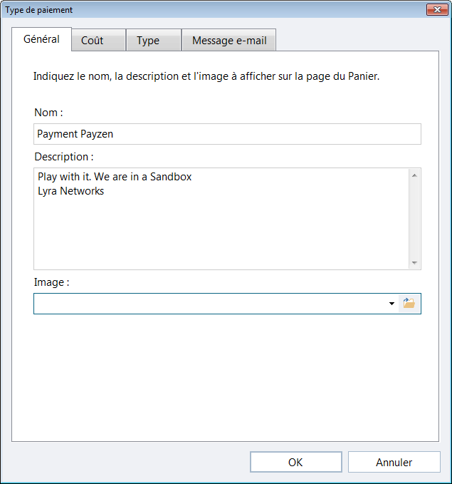
In the custom payment I use an image to display payment logo into the payment list.
Configuration is here :

The display into the payment list is here

But when the order is confirmed I have this image displayed on the left.

If I remove the picture into this window, not logo is displayed after order confirmation.

You can test it online on my demo https://wsx5demo.afsoftware.fr
I am using WSX5 Pro v2020.2.7 (PHP 7.4.11)
Thanks for your feedback
Axel
Posted on the

Hello. I sent a notification about your question to the company employees, expect an answer from them here in the comments. Due to the holidays, the reply may be delayed (https://helpcenter.websitex5.com/en/post/235811).
Author
Hey Stefano,
In fact this bad displaying of logo is done because I have a message in this tab..
This message is also displayed after order confirmation and the logo too
With no message into the tab the logo is on good place.
Axel
Hello Axel
I apologize but perhaps I didn't understand this correctly.
The issue is generated by the image inserted via code in the message then, is this correct? If this is right, I am afraid that nothing can be done software-wise as of now. You can probably add additional code there to make sure that both images are positioned correctly though
Is this the issue if I understand correctly?
Keep me posted here
Thank you
Stefano
Author
No...
the bad displaying is caused by the message content (image or not I don't know. It the job of your team to understand why...)
The conclusion is if no messge into the tab... no issue. !!! So probably a bug with a content into the tab.
if a messge is configured (image or not I don't know)... the logo is not displayed correctly
So configure no message from your side and the logo will be OK
configure this one into the tab and the logo will not be ok
-------------------------------------------
<img src="http://www.moigemme.fr/images/commande_ok1.jpg" width="150" height="150" >
Bonjour,
Nous vous remercions de votre commande.
<strong>Rester sur cette page</strong> car vous allez être <strong>redirigé automatiquement vers le site du paiement</strong> dans 15 secondes.
Ou cliquez sur l'image ci dessous !
Dès <u>réception de votre paiement</u>, votre commande sera traitée.
Vous pouvez nous contacter sur ***
Cordialement
Toute l'équipe
----------------------------------------------
make it sense ?
Axel
Hello Axel
Yes your explanation is clear.
I've tested this again though and I don't remember this ever being a bug
As you can see from my test, the image for the Payment Method always appears on the side as well. It will appear on the side positioned more or less in the center of the space that the description occupies:
In my case where I added a lot of text, the icon is displayed halfway through the text
Can you confirm this? I don't remember this being an error
Thank you
Stefano
Author
Hello Stefano,
pls use my previous code to test and you will se that the logo is not based on the beggining of the text.
May be I added a picture into my text... But it's need to be align like you at the beggining and not somewhere between 2 lines
Or Can you try to add my picture into your text like me.
Note: Yes we have had some posts about this one long time ago. bug or not I don't remember.
Axel
Hello Axel
I've forwarded the matter to the developers and received a response. At the moment, this works exactly as I explained it above:
The image will appear on the side positioned more or less in the center of the space that the description occupies. This means that you can decrease the size of the image or add more text to the page to change the amount of space occupied by the text to make it so that the image appears elsewhere, but it cannot be considered a bug as of now
Can you try one of the advice I gave and let me know if it works?
Thank you
Stefano
Author
Hello Stefano,
Thank you very much for your time on this issue.
For me the image should be stayed always in front of the name of payment system like here.
And no to change position If I add comments or html picture...
And the image should not be "positioned more or less in the center of the space " like said your R&D team but always in front of the payment name..
No time to do Incomedia quality control. Not my role.
For me, it's a bug and hope to see this new one fixed asap.
And you explanation is a workaround... more, less exact.....
Enjoy
Axel