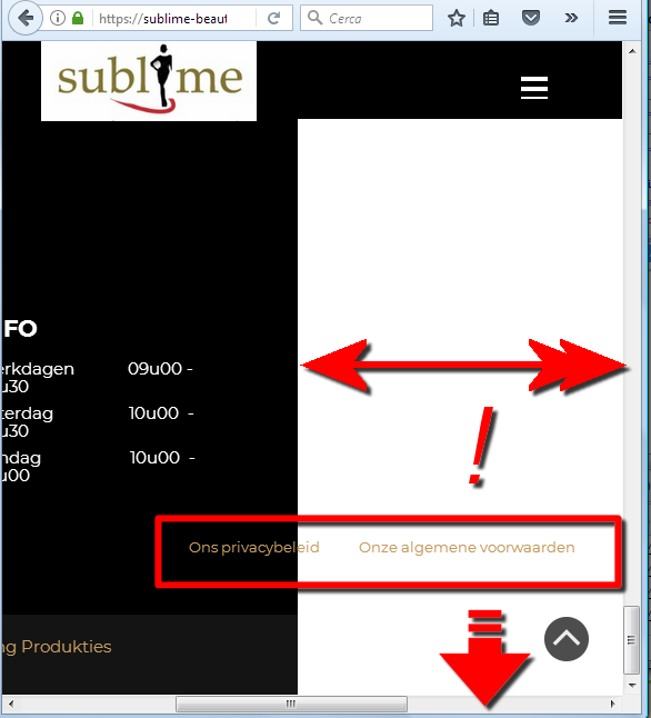
Hamburger menu too wide on smartphone (ok in preview, but not in live view) 
Author: Spring Produkties
Visited 2112,
Followers 1,
Shared 0
the hamburger view is too wide on smartphone (so you have to zoom out or slide to see the menu choices in the center)
in the preview mode on Website X5 PRO, it looks fine in smartphone view, but after uploading in real environment the problem occurs
probably we touched somewhere accidently a setting, because originally it worked fine also on the smartphone
anyone an idea what we should check or do to solve it ?
site is : https://sublime-beauty.be
thanks
Wim
Posted on the

If it looks good in preview, do a ctrl+preview then do a full upload (not new and changed). If that does not fix it, please advise.
Author
thanks, tried this suggestion
1) crtl + previews and full upload -> no difference, problem persists
2) emptied the full hosting location (removed all files of this site) + full upload -> no difference, problem still persists
thanks in advance for your further advise
(It > En) You have inserted objects outside the FOOTER in the lower resolutions; ... check their correct positioning in the various breakpoints ...

.
ciao
.
... I add that, in the background of the lines you used excessively large and heavy images, not recommended for smartphones ...
.
ciao
.
Author
thanks ! You are right. There was a transparant object in the footer that was going outside the smartphone view. As it was transparant, it remained unnoticed, but with your hint we could find it.