Hamburger screen on mobile phones 
Author: Ross P.Hello
I have a client who keeps coming back to me saying the following (her words) -
"It's incredible how the laptop page is perfect and the cell phone page is different in its tool bar layout but I like the colors lots!
When I press the tool bar button (on the cell) I get a white blank page then if I swipe that page left I get another white page that has the tool bar down the length of the right hand side.. do you not get this on your cell phone?"
Her website is https://smileinsight.kiwi/
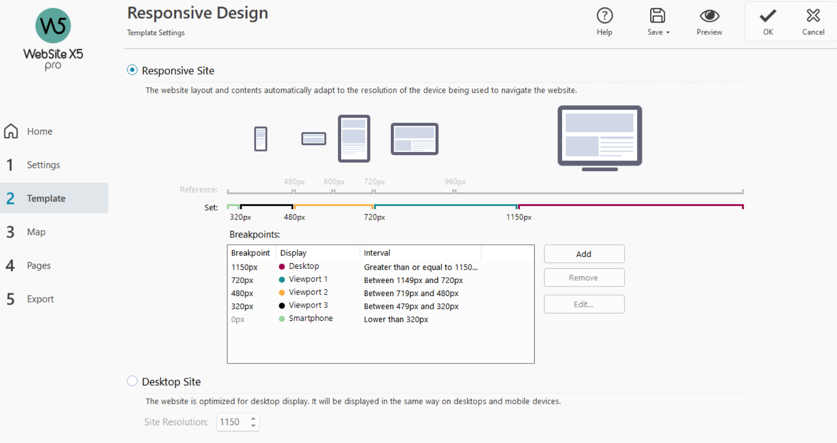
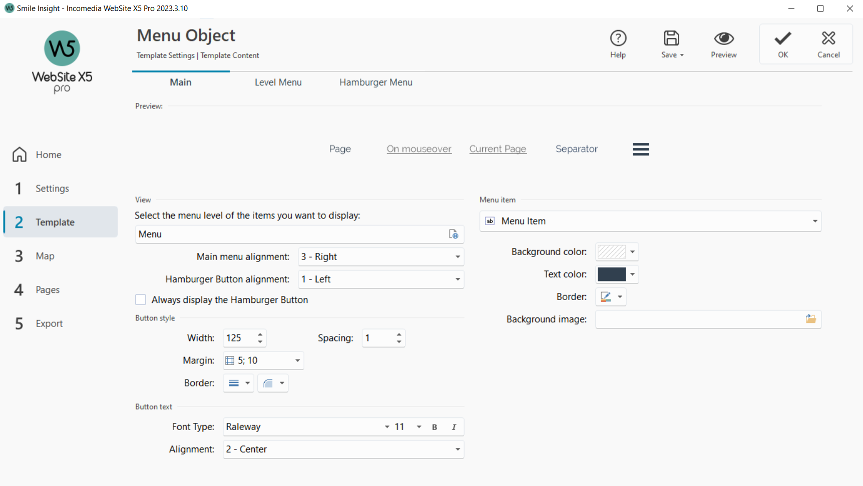
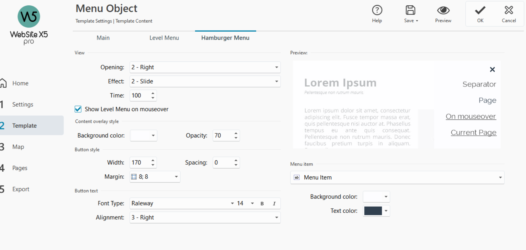
I have attached images of the setups I have done and wondered if anyone can give me some guidience as to why this is happening (my thought is that it may be a setup thing with her phone?)
Template setting

Menu setup

Hamburger menu setup

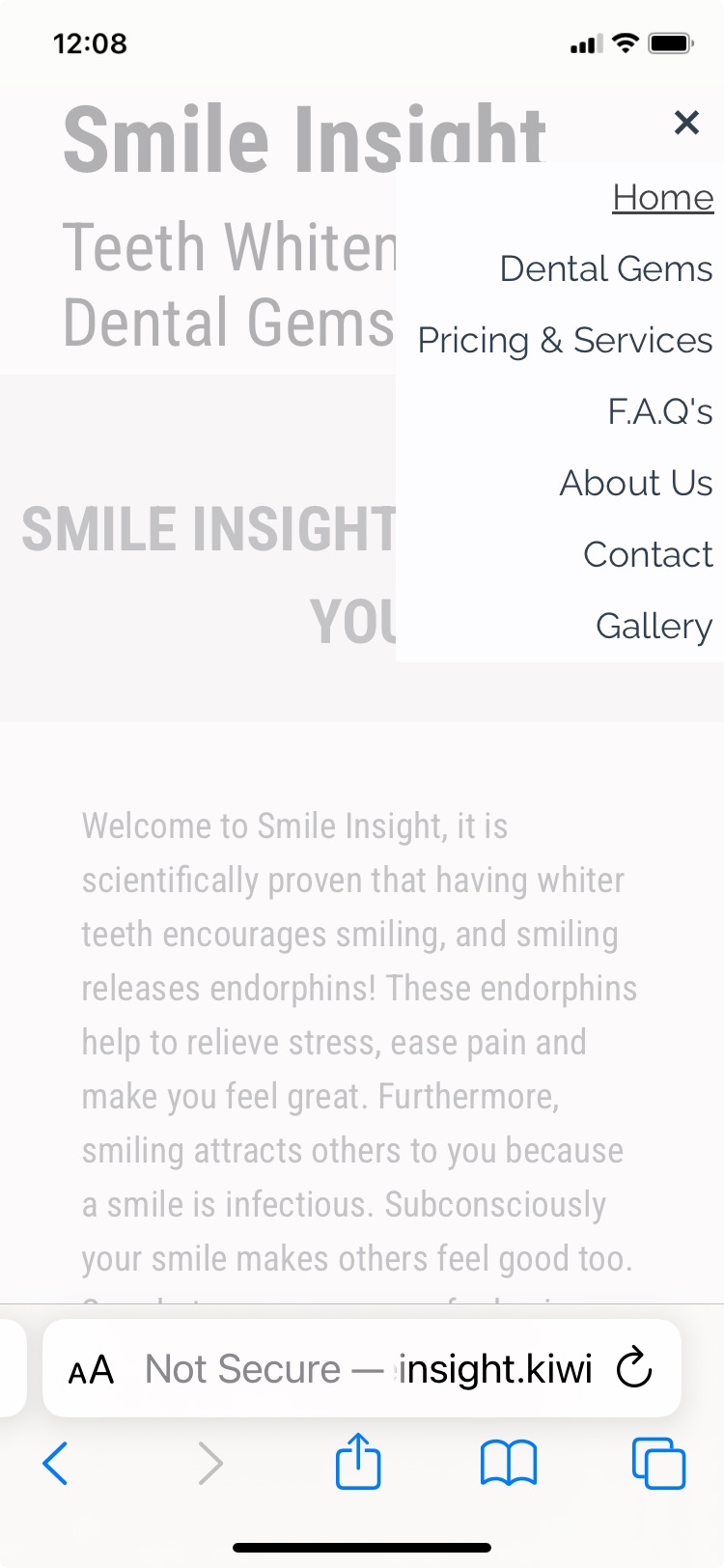
My iphone screenshot which shows it correctly

Here's hoping some kind person can help me with this problem.
Kind regards
Ross

The Google Tag Manager is included twice in the head area of the source code.
There is a <DIV> code and a script for Facebook in the header area and also in the body area, the placement in the header area is probably wrong because a >DIV> code does not belong in the head area .
I don't have a smartphone to test, but this problem also occurs on my notebook in Firefox during the smartphone simulation, see screenshot below
-----
Since I don't use Google Tag Manager or Facebook, the moderators would have to help here.
you have an image in the footer that is too large in size and comes out to the right.... Delete it or resize it !
hi, try to fix this line at the bottom which is too large and at smartphone resolution it goes out of the display
oops, a moment later while I was writing
Author
Hi Giancarlo
My apologies for not replying earlier to say thank you very much for your idea which fixed my problem.
Really appreciate your help.
Kind regards
Ross