Icon Image: Menu: Size & Margin Space 
Autor: B. Admin
Visitado 2970,
Followers 2,
Compartido 0
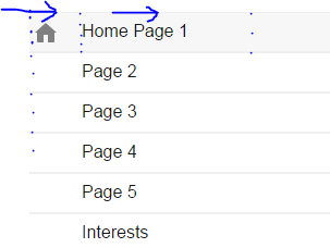
MENU ICON AND TEXT ALIGNMENT (size/margins/MD principles)
NOTE: (See Image example)
Edition: V14pro
Summary: Sidebar | Vertical Main Menu Navigation
Problem(s):
1. Cannot move icon to the right without moving to whole object... (icon page menu | 24x24px)
2. Cannot evenly line up size of text so its aligned with the icon on the left.
Can anyone offer a suggestion on how to indent the icon menu image on the left and also align it with the text so its center aligned.
As you can see in the image, the icon sits even in the middle and the text it raised.
I've tried some Illustrator work-arounds but had no luck yet.
Many Thanks!
:)

Publicado en

Beta, if you created the image on a transparent background the size of the button with the icon placed where you want it, then set menu background to transparent, would that work?
I assume you are placing an image as a background behind the menu object?
Hello Beta
I have used the icons ( V14 ) here : http://www.energifremtiden.dk/c4d/page-157.html
An in the old version 12 an example here : http://calendarforum.dk/nav.-bar-right.html
Is this kind of what you mean ?
Kind regards
John S.
Autor
Thanks for the reply!
The mockup i'm trying to layout is similar to that of the Google express layout. (see image)
Current Method: I'm uploading a 24x24px transparent icon via the Page Properties -> Graphic -> Options -> Icon for the Menu Item (upload)
-------------------
I'll give it another try, but let me know if my current method is incorrect.
Greatly Appreciated!
-------------------
Autor
Heres the mobile layout. Basically the same but the Logo Drops. (not concerend about the logo dropping...Just the alignment of text/icon..as seen here)
Post the LINK of your online example, so that we can evaluate, maybe some ideas come.
(IT) Posta il LINK del tuo esempio online, in modo che si possa valutare, magari viene qualche idea.
.
Autor
https://express.google.com/
... ... LINK of your online example, ...otherwise, it does nothing, like not said...
... ... LINK del tuo esempio online, ...altrimenti, fa niente, come non detto... ;-)
Autor
... ... I appreciate your help so if i sound frusturated, I am, But not at you. . Thank you.
... ... Mi dispiace. Non parlo italiano. Ma ho guardato The Godfather parte 1,2,3 questo fine settimana. Film meraviglioso. Io parlo inglese. È tutto. E un po 'di spagnolo.
---------------------ebsite i'm working on is not live yet (if thats what your asking)
Here are the settings within the X5 control.
Also, I sketched an example of the sidebar menu alignment.
----------------
It would seem to me that the "Icon for the Menu Item" would have a container size that can Align and Center with the Menu Text on the Right.
------------------
Heres what it looks like on X5-14pro .
As you can see the Text is Raised and the Icon is Center Left Aligned
Autor
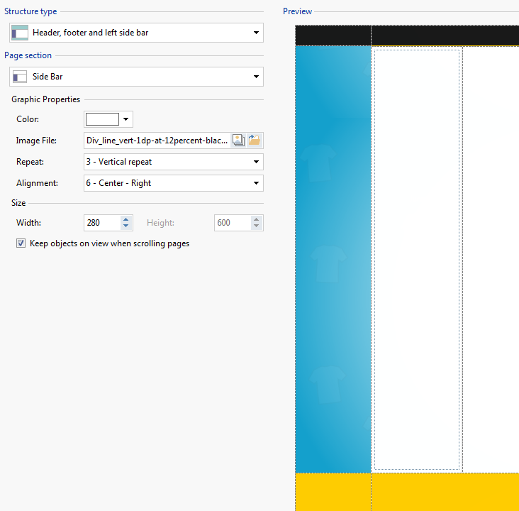
Heres the Template structure. Just in case.
As already mentioned by Esahc .. - With your graphics program you could create PNG icons with the size of the button, and with a 100% alpha transparent outline (yellow!), Suitable for distance.
... otherwise it would be necessary to study extra solutions with personalized code ...
(IT) - Come già detto da Esahc .. - Con il tuo programma di grafica potresti realizzare icone PNG con le misure del pulsante, e con uno scontorno trasparente alfa 100%(yellow!), adeguato per la distanza.
... altrimenti occorrerebbe studiare soluzioni extra con codice personalizzato...
.