Responsive not work 
Autor: Kim Hansen
Visitado 3690,
Followers 1,
Compartido 0
Hi
When I open my test project on my iPad Pro (2017). looks everything as it should:

But on my old iPad 4 does responsive not work, and it's all messy around and beyond the width of the page:

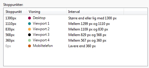
My breakpoints are:

Someone has an explanation of why, I'm using v.17 pro 17.0.6.
Sincerely
Kim
Publicado en

Kim, your ipad 4 browser may not support this functionality. Can you update the browser (or perhaps try an alterantive browser)?
Autor
Hi Esahc
I use both Safari and Google browser updated to the latest version, and they are the same in both.
I have a similar project built in v16 Pro. and it works as it should on the iPad 4, so it's v17 that fails.
Kim
your ipad 4 not support css grid command because css grid created in 2016/17. Your ios ver is very old...
Autor
Yes that's right, it's an older version of iOS (10.3.3) the last to iPad 4, so if css grid command is from 2016/17 then it must be the explanation.
v16 works fine on iPad 4 with iOS 10.3.3, so I'll be on v16 so far with my projects.
Sincerely
Kim
Sorry i wrong... grid supported from ios 10.3.x.. maybe other problem or not full support
Autor
Ok no problem, I leave the thread open for other suggestions.
Kim
Hi Kim
If you're seeing this issue on the Safari browser of the iPad 4, then Safari's version is probably the real reason for this.
Grid CSS rules are officially supported since Safari 10.2, for which reason it is most probable that the v17 version of the websites won't work there.
In this case I'm afraid that yes, you will simply need to keep those websites updated with v16, which didn't make use of this new technology yet
Thank you for your understanding
Stefano
Autor
It's both in Safari and Google browser it shows the page incorrectly.
Kim
Autor
And what about my UP, what do I get for those money? I thought I got Update Protection for my projects.
Kim
Kim, is it possible to recreate you page using an alternative technique that may work on older ipads?
The links along the bottom, are they simply images placed in the footer in a text box, or perhaps each is a separate image object?
Have you considered using a gallery set as horizontal thumbnails or the optional objects masonary and justified gallery which can both be size adjusted to have only a single row.
If I have guessed wrong, perhaps you could explain how the current page is constructed?
Autor
The images are inserted into a single row of nine columns with a picture opjekt in each, all images are the same size.
kim
Kim, have you tried removing ALL empty objects (and where necessary adding an object text? html? without any content becauseWX5 does not cope well with empty objects) If this fails are you able to try any of the above alternatives and see if any overcome the problem?
Or perhaps place images in a row in the footer??
Autor
Hello Esac
I have tried and changed the image objects with a picture gallery, and it looks right on my old iPad 4 so I think it has solved the problem.
I just leave the thread open for a few days, until I've played a little more with it.
Thank you for your help so far .
.
Kim
Autor
Hello Esahc
Everything looks right and work on my iPad 4, many thanks for your help.
Kim