How To Create Website Pages: Adding Content And Some Tips On Page Layout 
Autor: Incomedia
Introduction
In the previous T&Ts we have spoken a lot about steps 1 and 2, looking at how to create and customize the Template (http://answers.websitex5.com/post/4449 and http://answers.websitex5.com/post/6674 ), and how to create the Sitemap (http://answers.websitex5.com/post/8615 ): now we can move on to step 3 and see how to create pages and add content to them.
The basic concepts
Thanks to WebSite X5's page layout mechanism, based on the page layout table and Object drag&drop, creating pages is, technically, very simple.
The default table has 2 rows and 2 columns, giving a total of 2 x 2 (4) cells, and each cell can contain one object. This may sound a bit rigid at first, but you'll see that it's not at all!
First of all, you can add more rows and columns to obtain a page layout table of up to 12 x 64 cells. Secondly, an object can occupy several adjacent cells. Furthermore, you can change the width of the columns and margins. So, in actual fact, it's possible to create page layouts that are as complex and sophisticated as required.
But let's take it one step at a time!
Defining the Page Layout Table
You can add or remove rows and columns in the page layout table by clicking on the buttons: ![]() ,
, ![]() ,
, ![]() ,
, ![]() .
.
We suggest that you decide right from the start how many columns will best suit the type of page layout you imagine for your website, and then stick to this number for all the pages. This helps give coherence and uniformity to the website. The number of rows in the table depends on the information to be included in a page: don't add more rows than you actually need for a page, otherwise you'll have a lot of empty space (you can always delete unnecessary rows).
In our Tees X5 Store website (http://tees.websitex5.com ), for example, most of the pages have 12 columns in their page layout table, even though we haven't ever had 12 objects to present in a row. The reason why we chose 12 columns was because it gave us a “squared page” to play around with, on which we could obtain more or less detail, according to the particular layout we wanted for each page.
By setting the page width to 960 pixels (in Step 1, in the Custom Template window, using the Width option of the “Header” Page Section) and using a page layout table with 12 columns, we have adopted the model proposed by the 960 Grid System (http://960.gs/), which is a very well-known framework that is often used to quickly create excellent page layouts. With WebSite X5, we can create a structure like the one shown in the 960gs example (http://960.gs/demo.html) to obtain different page layouts, without having to download frameworks or work on CSS.
Inserting Objects
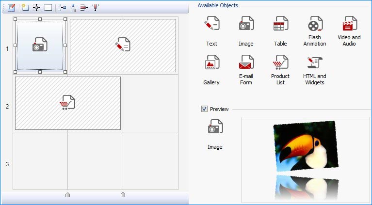
Select an Object from the list of those available, drag it onto the page layout table and drop it into the cell where you want it to appear.
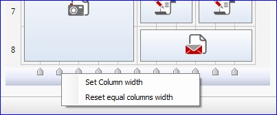
All the columns have the same width, by default, and the objects that you insert in a cell are automatically resized to fit in it. You can change the width of the columns by clicking on the cursor and dragging it to the required value. Alternatively, you can move the mouse over the cursor and click the righthand mouse button to set the column width using the options in the popup menu.

You cannot change the height of a row manually: this is determined by the height of the tallest object that is added to a cell of the row.
Sometimes, when you insert an object, you realise that it's bigger than the space in a single cell. In these cases, you can spill it over into adjacent cells by pulling the object's selection handles horizontally and/or vertically (remember that the adjacent cells must be empty: a cell cannot contain more than one object).

A practical example
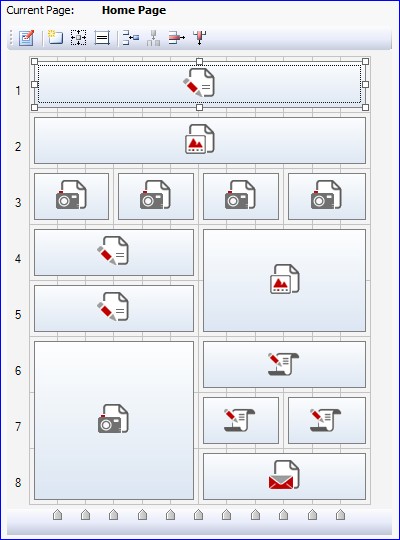
We're going to take the page layout table for the Home Page of our Tees X5 Store for our example of page creation, and we're going to look in detail at the choices that have been made.
As we said earlier, our page layout table has 12 columns, and the objects have been arranged as follows:

There are a few Text objects, but at the moment we are more interested in the other types of object that have been inserted in the page.
Row 2 – Gallery Object
We are creating a website that sells T-shirts, so what could be better than having an image gallery of photos prominently positioned on the home page so that our visitors can see all the available models straightaway? A website's home page is like a shop window: this is where you show your best items for sale.
In our home page, we've inserted a Gallery Object that takes up the whole width of the page. We've used the gallery with horizontal thumbnails and, to make sure that each photo can be seen clearly, we have just 3 thumbnails on view at a time. We imported all the photos from the List section of the Gallery Object window, and added a description and a link to each one. So, when a visitor clicks on a thumbnail, he/she will be sent directly to the page that gives a complete description of the product and the possibility to buy it. The last thing we did was to change the graphics slightly: we deleted the default frame around the gallery thumbnails in the Thumbnails section, and instead we set up a custom frame in the Cell Style window.
NOTICE! The blue margin surrounds both the title and the image gallery, which are effectively two separate objects (a Text Object in row 1 and a Gallery Object in row 2). How did we do this? It's easy:
- We selected the Text Object and clicked in the
 button to set the margins: we set the outer lower margin to 0 in the window that appeared.
 - In the same way, we selected the Gallery Object and clicked on the
 button again to set its outer upper margin to 0.
 - When we had removed the space between the two objects, we selected the Text Object and clicked on the
 button to define the cell style. We used the Custom Margin option to draw a blue margin, 2 pixels wide , on the upper, left and right sides.
 - Then we selected the Gallery Object and clicked on the
 button again to draw another blue margin, 2 pixels wide , on the lower, left and right sides.
And that's all there is to it! Now we've got one margin that goes round both objects.
Row 3 – Image Object
In our online shop window, we need to show not only our products but also our special offers. To do this, immediately underneath the Gallery with the photos of our T-shirts, we've added a banner that advertises 4 different discounts and special offers that are currently available in the store.
The banner looks like a single image but, in actual fact, in row 3 we've put 4 images side by side, and each one refers to a different offer. This method means that we can associate a separate link with each of the 4 images. When a visitor looks at this page, he/she will see that there is a 60% reduction on some articles and,when he/she clicks on this offer, the page that refers to the articles with the 60% reduction appears.
This is how we did it:
- We prepared the images for the 4 special offers and inserted them as 4 different Image Objects.
- We selected each Image Object and clicked on the
 button to remove the left and right inner and outer margins. To be exact, we left an outer margin of 5 pixels on the left side of the first Object and the right side of the last Object in the row, in order to maintain the alignment with the rest of the page content.
 - We opened the Image Object window for each image so that we could define both an Alternate Text (which, in our case, is text that explains the special offer, in case the image cannot be displayed) and the link (using the window that is opened by the
 button).
As you can see, being able to work on the Object margins is very useful: we were able to create a single banner with 4 different links. And, if we had wanted to, we could have laid out the images differently and created other kinds of maps with linkable active areas.
Rows 4 and 5 – Gallery Object
To add a bit of movement to our page, we have inserted a second image gallery. This time, however, we've chosen to use a Classic SlideShow, and we've concentrated on the special display effects for our images.
- In the List section of the Object Gallery window, we selected the first image in the list, and then we licked on the
 button to open the Effect Properties window.
 - In the Effect Type section, we chose the effect we wanted and set the Display Time accordingly.
- In the Zoom and Position section, we set the initial and final zoom factor and position in order to create the effect of movement.
- We repeated these steps for each image in the gallery, associating a different effect and movement to each one. We then checked in the preview that the result looked OK.
Rows 6 and 7 – HTML and Widgets Object
If our online advertising strategy involves using several different channels, then we mustn't forget to dedicate adeguate space on our home page to the social networks.
And it's here that the HTML and Widgets Object is particularly useful because it lets us add the buttons for Facebook's “Like”, Twitter's “Follow me” and Google's “Google+1” just by selecting them from the Widgets List.
We've made our page “social” in a matter of clicks, and with no programming code to write or incorporate!
As before, we've removed the margins and worked on the cell style so that the three objects have the same blue background. We've added the “Share with friends” title by simply using the option in Cell Style | Text, without having to insert a separate Text Object.
Row 8 – Send E-mail Form Object
Finally, if we need to gather contact information (for example, if we want to send out a newsletter), then the home page is where we need to add a sign-up/contact form.
To do this, we used the Send E-mail Form Object. We reduced the form to the bare bones (according to the logic that fewer questions = more replies) and we just inserted one field, “E-mail”, with the label inside the field itself (this is done using the option in the Send E-mail Form Object | Style section).
Once we had laid out our questions in the e-mail form (in the Send E-mail Form Object | Send section), we worked on the margins and cell style to make this Object look the same as the Social Network buttons.
Now we have finished creating our first page, and we're ready to go on to the next one.
A Few Tips
Before we go, we'd like to give you a few tips that may be worthwhile bearing in mind, especially if you're working on your first website.
Some parts of a website page are more important than others. The contents of the first scroll and what is displayed first according to the order of reading have differing impacts: remember this when laying out your content.
Visitors tend to scan a webpage quickly, rather than actually read the contents. A page full of text discourages visitors. A good page has titles, short paragraphs, bold print, spaces and pictures carefully positioned so that the page appears uncluttered and the important information can be taken in at a glance. Don't fall into the trap of building up a wall of words, but just stick to the essential to get your message across.
Animation, Video and Audio: the beauty and the beast for who reads and who writes. Do we include animation, a video or a sound track in our pages just to make the website look more interesting, or do these objects have a more intrinsic value? If you think your website could benefit from such objects then, by all means, use them! But be careful not to overdo it – a page where everything moves and makes a noise can be disturbing and illegible. Remember, don't exaggerate!
Yellow text on a light blue background doesn't make a page pretty; it makes it unreadable! Our aim is to communicate and so you need a good contrast between the foreground and background colours to ensure the text is perfectly legible. Black on white, white on black, shades of gray and yellow on dark blue will work, but always make sure you maintain a good contrast and be careful in the colour combinations you choose. Yellow on light blue can't be seen, and green on red is disturbing. Remember also that the size and type of the character font you choose is important: if visitors have to squint to read the contents of a page, they'll soon give up and go to a different website.
A website page isn't the same as a page in a book. This means two things:
- A website page doesn't have physical limits: it can be scrolled endlessly. But, obviously, that's not a good idea. People get fed up scrolling on and on. Add links in the page when you want to give more information on a particular point, and create different reading levels.
- You don't have the same control over the layout of a website page as you do with a book. Browsers use different rendering engines and each one may display the same page in a slightly different way. This is an important aspect to take into account when laying out your page, if you want to achieve the best results at all times.
Conclusions
In step 3 we create our pages, one after the other, and our website gradually takes shape. This is probably the most satisfying part of creating a website.
If we've done a good job in planning and preparing all the material, then each piece should fit into place without problems, and our website will soon be ready for publishing online.
As usual, we'd like to remind you that you may find it easier to follow our explanations if you open the project and actually do the operations that are described: click here to download your copy: http://bit.ly/wfgtdb
This project file completes and replaces the project files provided in all the previous Tips & Tricks.

