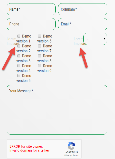
Contact form - poor alignment at lower resolutions 
Autor: Michal D.
Visitado 2415,
Followers 1,
Compartido 0
I use the Contact Form element. Unfortunately the responsive change of view works badly. See attachment. Where can I set the wrapping of each field? Thank you.


Publicado en

Take the width of 100% for the "simple selection" and not 50% for 2 fields next to each other.
Autor
I set both fields to 100% and it still misaligns.
Autor
It's this bad even if I set one column. Why not use the full available width and push it all to the left margin.
You have to increase the % values...
Autor
I have it set to 100%. Yet it shows up this badly on lower resolutions (phone or tablet).
No, this is in the tab "STYLE" at the email object to adjust
Autor
Well it's not quite ideal, but setting field labels outside the field and setting a fixed width helped a bit.
Thanks.