
Is there anyway the Fullscreen Scroll Text object image can be reduced 
Autor: Ross P.
Visitado 1591,
Followers 1,
Compartido 0
Hello all.
I recently purchased the Fullscreen Scroll Text but it doesn't show the image behind the text properly on smaller screens like mobile phones, as per the image attached.
Does anyone know how to fix this or is it a technical question for the object designers. It is a bit dissappointing that you purchase something like this but it then dosen't work properly on all the devices available.
Look forward to your comments.
Kind regards to you all
Ross
Publicado en
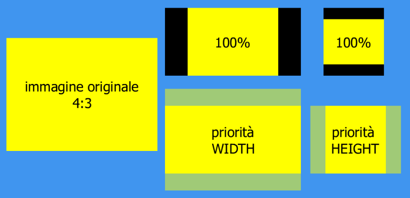
(It > En) ... how does a horizontally developed image fit into a vertically developed window in CSS-COVER mode ...?...
… … for all situations it is always better to use square images, in a rational 1:1 ratio...
… or, by now it should not be difficult for you, replace the background image with a simple css media-query code with a more suitable format for the purpose for lower resolutions...
.
ciao
Autor
Thank you KolAsim
Don't really understand anything about css media-query code.
Really feel that some of the object software should be looked at and designed for Mobile devices or have an image or some sort of warning as to how they show on such devices, as after all more and more people are using them for business purposes.
I am of the belief that if you purchase an object then it should work on all devices correctly without any modification, but if someone then ants to enhance it and have the knowledge of how to do it then that is up to them.
Have decided in the meantime that I will only use the object as a last resort in the future.
Kind regards
All objects with full-screen backgrounds require compromises in portrait and landscape display.
So choose images that look good in sections ranging from narrow and upright to very wide.
------
Autor
Thank you Daniel.
That is very helpful to know.
Kind regards
Ross
ciao, ...... that's what I told you before...
 .
. .
. .
. .
.
... for a WEB DESIGN you don't need any special knowledge, except the basic elementary ones...
... the object behaves correctly for the purpose for which it was designed...
... generally with square images you shouldn't have problems for promiscuous windows, ... or change approach with other types of objects...
... or, as already said, you can dynamically replace the background image with a more vertically suitable one for mobile devices, with a very simple code that I mentioned before, harmless, just a copy/paste in a second...
... if you want to try it, ...let me know...
... CSS COVER:
.
ciao
.