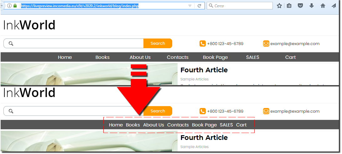
Menu width according to menu text length 
Auteur : Andre EIn X5 the menu width needs to be as long as your longest text in the menu, else that longer word wil not be fully visable.
This can end up taking up a lot of space in the complete horizontal menu specialy if you have more words that are a lot smaller, these smaller menu items take up the same width as the long word.
And yes, i know you can use a second line for the menu item but this is not always a good and nice looking solution.
So to get a nice menu (a menu that is filled nicely) we need to make up all kind of words or shortcuts to make all the menu items about the same length.
My request, make a TAG in the menu object so the width of every menu item takes up the space of the menu word/item, this is also seen in almost all modern websites on internet, and makes the menu items and words to be used for it way more versatail and you can use the words you want.
Because the menu is a very importand part of the website to guide your visitors correctly through your site you can do a way better job.
offcource this is for the horizontal main menu most importand.
Thanks!

+1
+1
+11
+1
Es una de las cosas que peor efecto da a la página, el hecho de tener un apartado más largo obliga a que el resto de apartados tengan que tener un ancho superior. Y estéticamente queda muy feo.
(It > En) ...hello, ... the idea is excellent, and so be it; ... it has also been expressed in the past years for the old versions ...

... but it's not a problem for those interested now! ...
... already from v.12 I have come up with and proposed an exclusive and very simple code ...
... those who want to try it have to do only one copy / paste to obtain this simulated result on a sample site of the Marketplace:
... in case it would be better to post the LINK of your site to evaluate inconsistencies, but in principle for similar structures this very simple code for the /HEAD section would be sufficient, 3rd option:
<style>
div[id^='imHeader_imMenuObject_'] > ul > li > .label-wrapper {
width: auto !important; padding: 0 15px 0 15px !important; }
</style>
.
ciao
.
Auteur
Thanks KolAsim, I know that your code is available. But it would be nicer to implement by using a tag in x5 for this. And this way everybode can easily benefit.
Anyway just used it but the level menu has now the same problem, anyway i don't think we should discuss that here. Also the hamburger menu is strange looking in lower resolutions.