Menu 
Auteur : L. MysonHello tell me how do I make your sub-menus go beyond the boundaries, and appear clearly in the center regardless of where they are located, I need to create different categories of products, men's and in them will be another category, women's and in them will also be categories, now they are incorrectly displayed and not adapted.
and 2 question about hamburgers, how do I divide the levels that they were clear, now they are all merged and there are not even signs of separation that the menu will fall down and how to paint the levels even lower? in the first picture of your menu opens not in the middle, I need it to open always in the center of the page and if desirable in 1 line, if the objects are not many
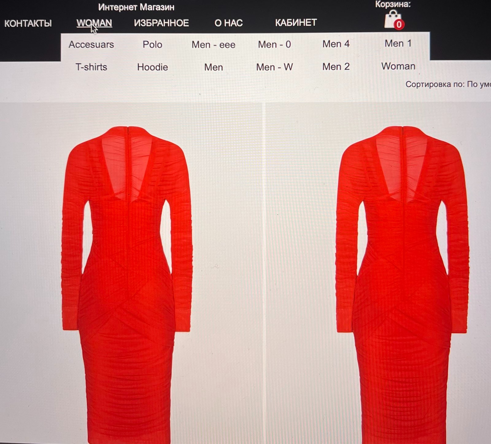
The second picture is not good at all, they are virtually impossible to use how do I change that?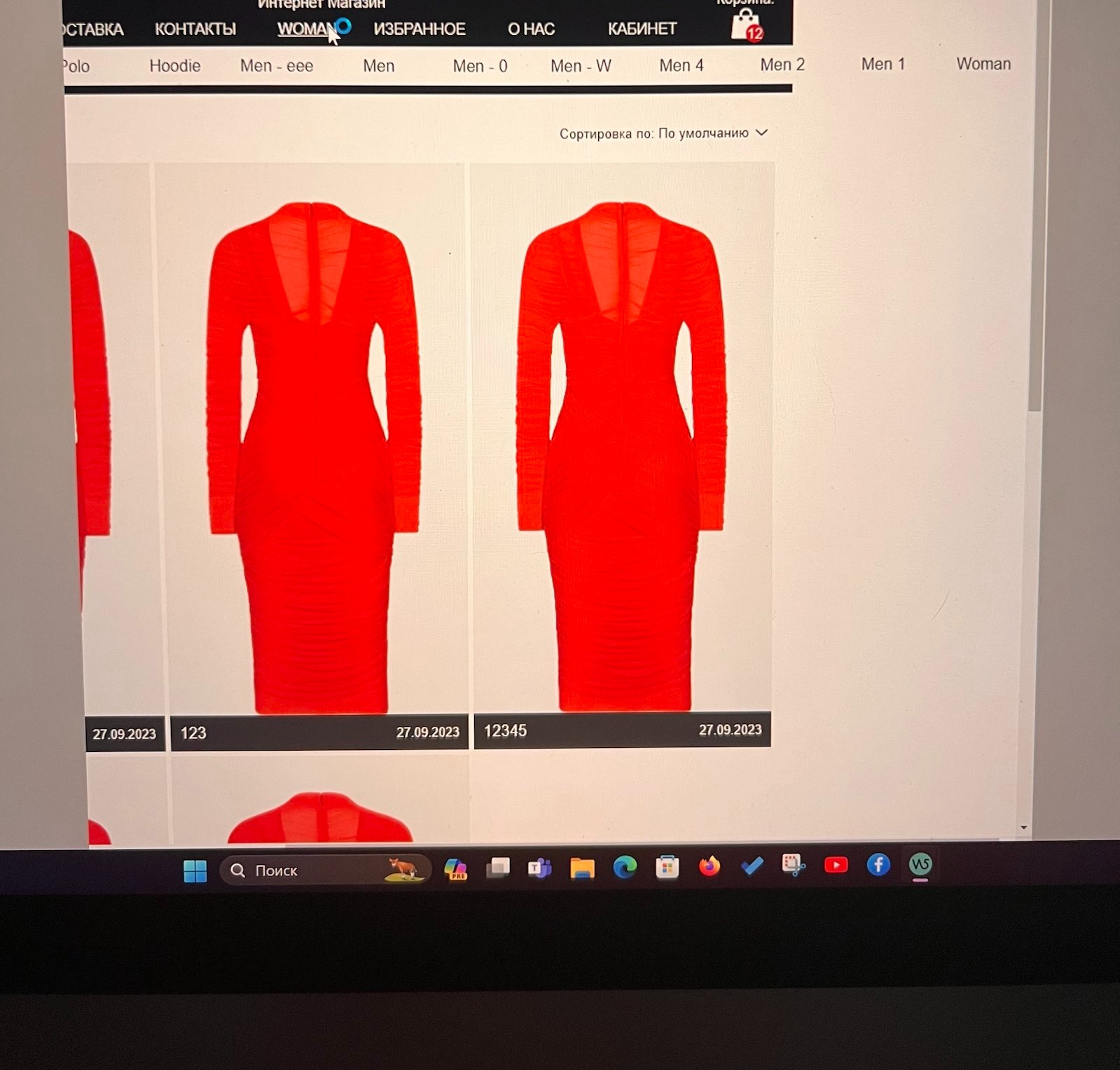
and the hamburger menu below is also how to make it understandable and that the girl immediately understands that the menu will open you have no signs or down arrows open close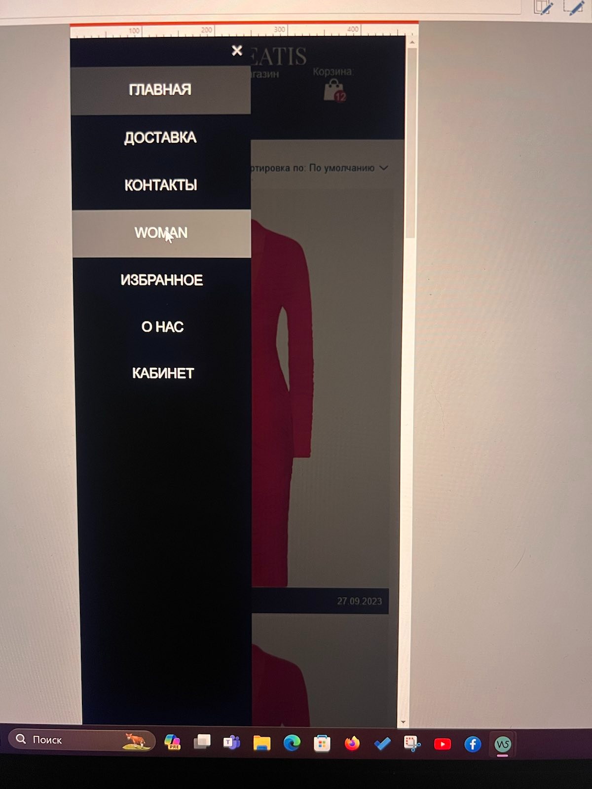
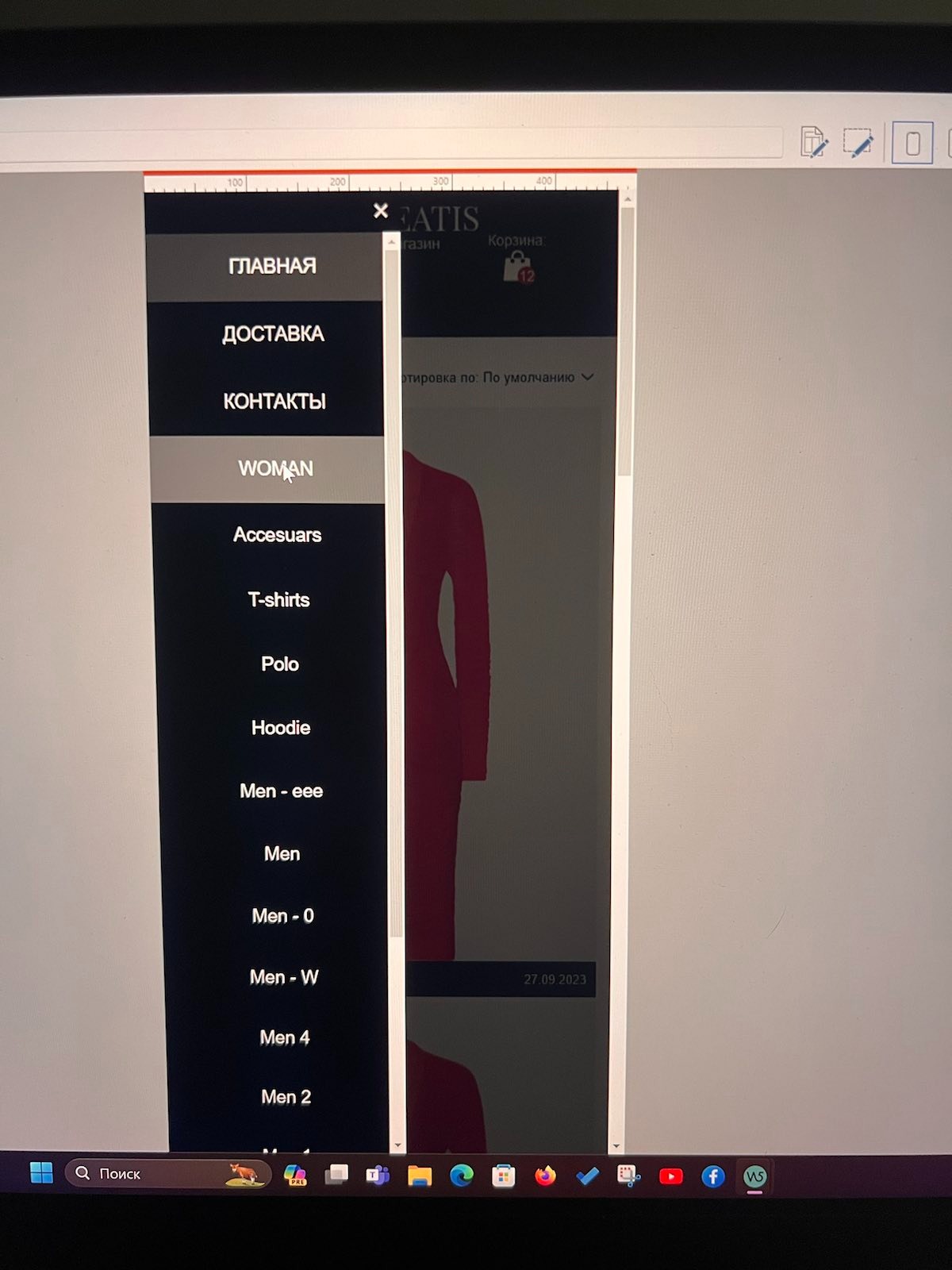
I like for example how to open FAQ object how to make something like that? I have seen that you can add a picture to the menu but I don't understand why? how to use it?
https://store.astribeatis.com/. (Test) Menu (Woman)
Thank you for your attention, if you can somehow fix the menu or do please

Auteur
Now discovered on my iPhone, open close menu? It opens and won't close!
For levels on mobile, arrows are helpful to indicate levels and sublevels.
-----
Click on the "X" at the top on your mobile phone and then click on the hamburger menu again, then the sub-levels are closed again.
I am going offline now. The moderators and other users may answer questions and provide tips.
Auteur
Thank you very much, but how do you get such icons on the right? I add icons they are only on the left and far away. !
!
Auteur
I do not understand how to put menu icons I put them, and how to customize them, already studied the forum but did not understand how to distance the size of the icon, why can not make the control simple?
Auteur
How to make icons on the right side and that they were also in the hamburger? Dear developers fix this situation why is it so difficult to make a normal menu and levels understandable! I'm not the first day sitting with these menus!
Auteur
I bought another menu and it doesn't show levels, what is it for?
Lucifer, if you purchased the overlay menu (designed to allow quick creation of hamburger menus but NEVER show submenus) and it is of no use to you, you can create a new post and request a refund.
I look forward to further input from Daniel in case I am missing the obvious, but as far as I can recall, the only way to get the icon to the right of the wording is to design a graphic the size of the menu object with the "bullet" on the right hand side. Sadly these do not display in the mobile menus. Menu design still leaves much to be desired in WX5, especially mobile with the cascading level pages rather than pop-out which would make navigation easier.
Added triangles, arrows, etc. in the menu before or after the menu names under "3 Sitemap".
You can copy the symbols for the menu names here, see
Triangles >> https://www.w3schools.com/charsets/ref_utf_geometric.asp
Arrows >> https://www.w3schools.com/charsets/ref_utf_arrows.asp
-----
Very good, nice workaround - thanks Daniel