Styling of entries in Google Full Calendar 
Auteur : Jim S.
Visité 1440,
Followers 1,
Partagé 0
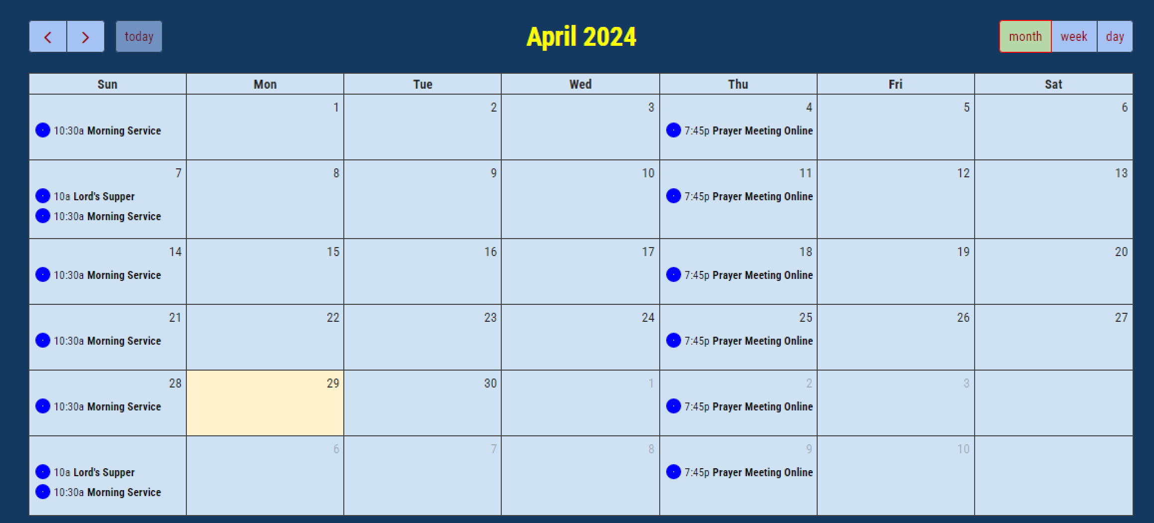
When I add the Google full calendar, the daily entries display very clunky with a big blue dot next to each one.

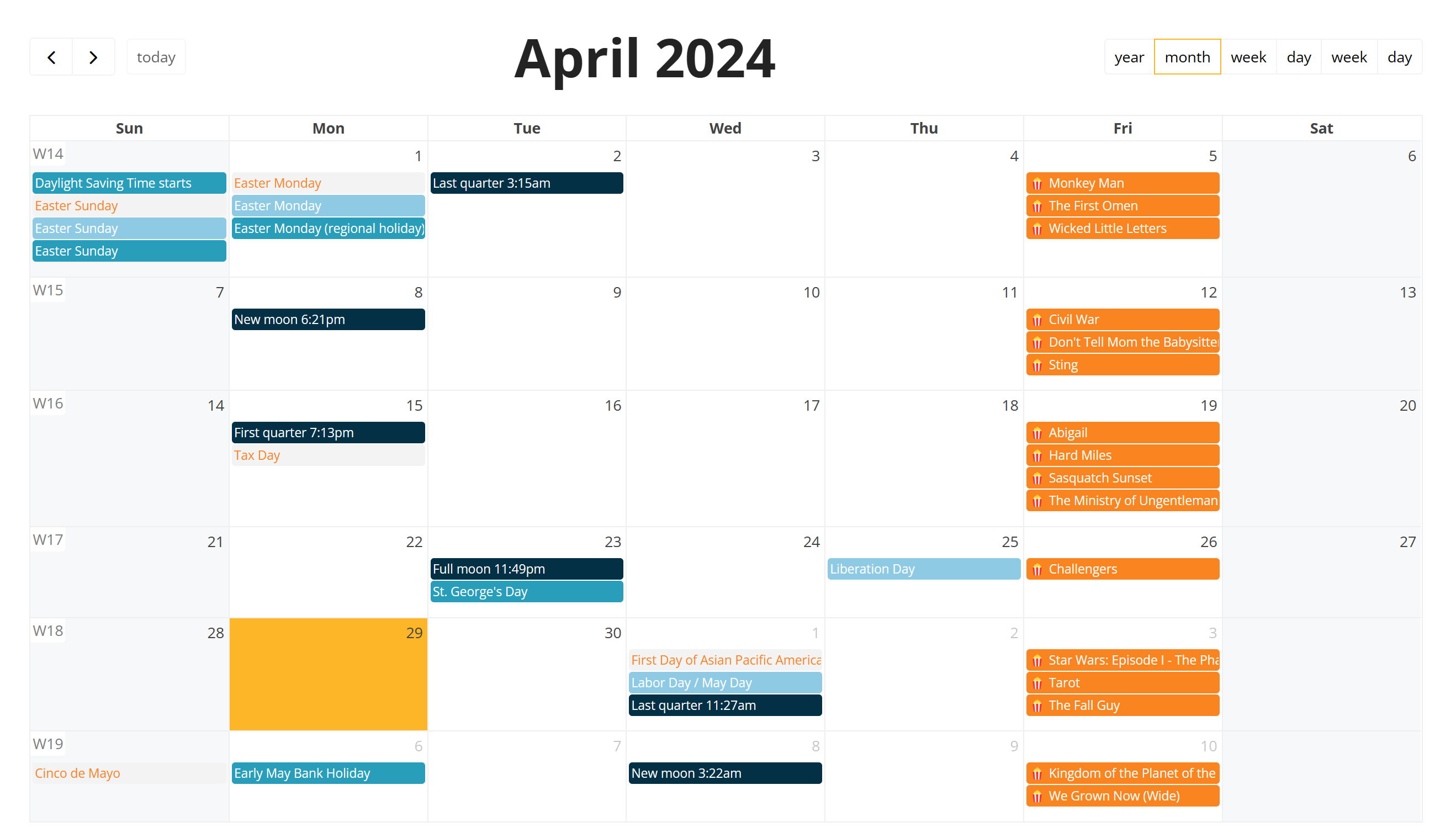
This is not like the picture next to the object in the marketplace that has nice stying.

How can I change the styling of the daily entries to be like the picture on the marketplace? (There don't seem to be any options on the Style tab to change the appearance of the daily entry background or to get rid of the blue circle)
Thanks
Posté le

... maybe you have to select the style on Google...
Auteur
The style does look OK on Google for the calendar I am using so don't think that is it ...

Hello Kim,
Nothing in the documentation to help you ?
https://guide.websitex5.com/en/support/solutions/articles/44002442379
Axel
Auteur
Yes thanks I looked at that but there are no options to remove the bluie circle next to entries or to format the background colour for entries like on the marketplace picture. You can just change the background for the complete calendar.
(It > En) ... maybe you made a mistake in the procedure, because your colors are different from those of the marketplace, so it seems that somehow you set them...
... it's written on the market place:
Show your Google Calendar activities in your web pages: customize them according to needs knowing that they will always be up to date in real time.
.
Auteur
I was experimenting with setting colours in the marketplace object in my own website. But my problem is that I can't find any options in the object settings to change the background colour of events like in the marketplace graphic. And there is no option to remove the blue circle next to events in the object settings. I don't think that it is possible to display the calendar entries in the actual object like it is shown on the marketplace graphic (which isn't a live view of the object appearance but some static picture).
This is the closest I can get the actual object to appear to the marketplace picture.
Not nearly as nice as the picture in the marketplace advert:
Auteur
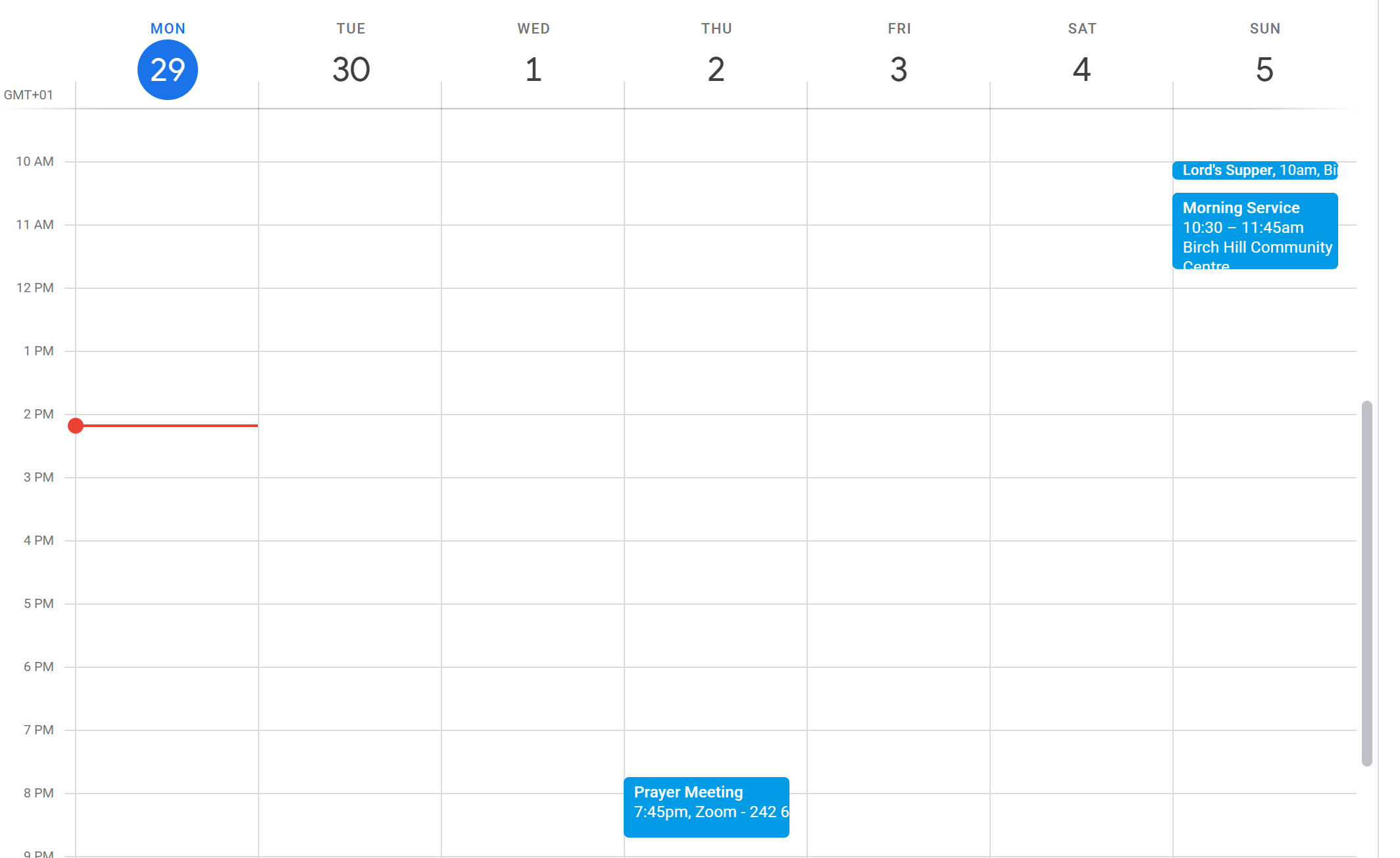
(Maybe the marketplace picture is not actually a screenshot of how the actual object displaying a google calendar, but the actual calendar as seen on the google website)
... no! ... it's not a screenshot, but it's actually the active calendar object...!...
.
... you closed the topic, so out of curiosity about the solution, apparently there was no problem...
Auteur
Ah sorry I clicked the green tick by mistake! I still haven't been able to work out how to do it.
... the gear icon of your Post, ... but the important thing is that you understood how to set the options...
... if necessary you can always use the Google calendar directly...
.
ciao
.
Auteur
Thanks for all the suggestions. I decided in the end to just embed the calender directly as an iframe. I think it looks better for my use.