Menu (Burger) goes onto a new line when viewport is used 
Autor: Peter H.
Visited 2479,
Followers 1,
Udostępniony 0
This is now driving me crazier than a fly that’s just been zapped! If I manage to calm down a little I will try and explain what’s going on.

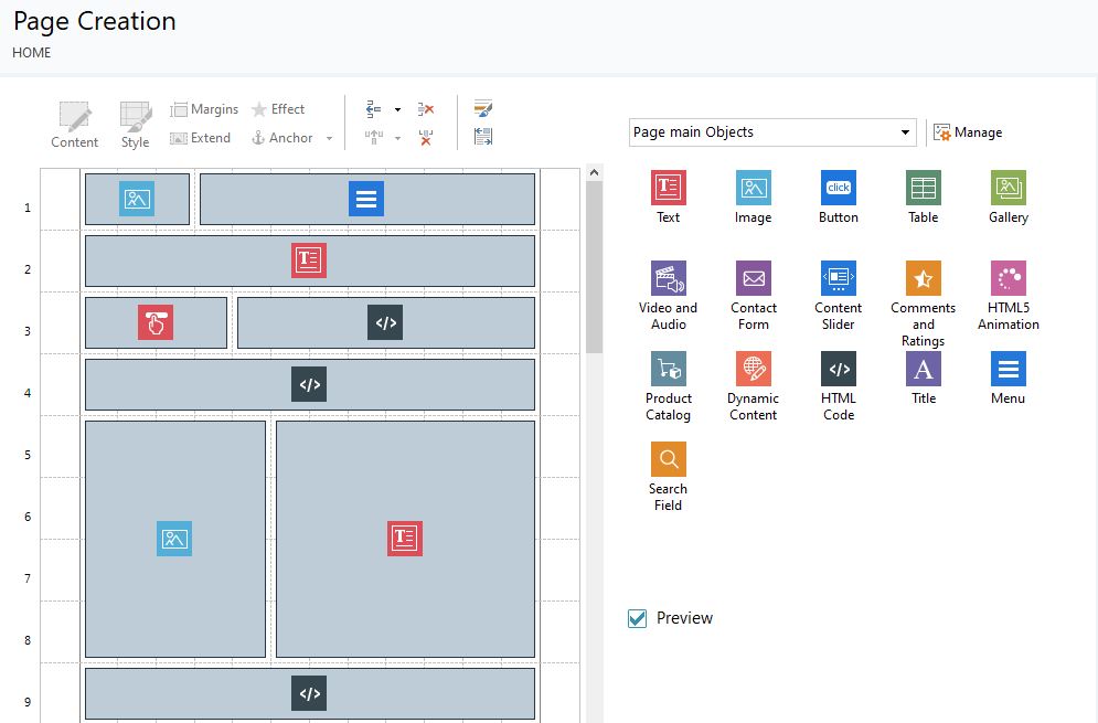
Above is the single webpage and the two top icons are the menu and an image to display to the leftt of it.

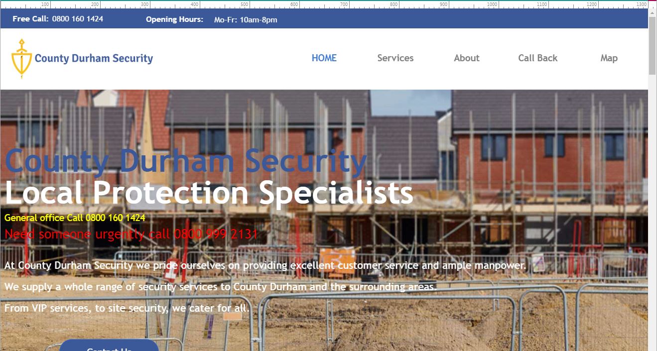
As you can see in the preview all looks good in normal website view.

But when I view in 1300px or less the burger menu decides to either go top right or bottom right but NEVER on the same line as in the normal view. I have been on this for hrs. and hrs. now and I just can’t figure out what has happened, if it displays on the same line in normal view then why not in burger menu view.
Please help meeeeeee i am now starting to disintegrate into a pile of mush on the floor…….
Posted on the

Did you change the resolutions settings in step2 and why? Or do you use a template? What template?
You can adjust the position for the menu just by dragging it around within the header for every viewport. step2 template content. use the colour bar on the left and to adjust use the same colour bar in preview above, you can select them easily with the 4 screen buttons top right (4 viewports normaly)
There you shuld be able to fine tune all resolutions.
Peter, Andre is quite right. In the header you have absolute control over the logo and menu placement and sizes for every resolution. Even in mobile view you can have a logo (small) and menu next to each other on one line.
However, according to your screen shot you have chosen to use the top row on your page as the "header" with the logo in the left cell and the menu in the right cell. You do have some control over whether cells remain next to each other by removing the break for lesser resolutions, but unfortunately at mobile resolution WX5 will always place all cells into a single column. You can defeat this to some extent by creating an extra resolution of 320px in step 2 resolutions and responsive design. This 320px resolution will seldom be visible except on very old or very cheap mobiles.
You can solve your problem by using a real header (step 2 template structure) and placing the logo and menu in there and then adjusting for each resolution as described by Andre. If you wish to have a floating menu you can replicate the header in the sticky bar.
Autor
Thanks Guys I changed everything around to use the header for the menu, been working on it for a while and forgot why I did it that way in the first place, anyways all sorted now and I will be a good boy and use the header in future. Thanks for all the help.
Great Peter,
Thanks for the feedback.