
RESPONSIVE SETTINGS 
Author: Mariana B.
Visited 1671,
Followers 1,
Shared 0
Hello!
I want to delete a slideshow from the mobile home page.
I had hided in the responsive settings, but I still see the slideshow.
Posted on the
Author
00000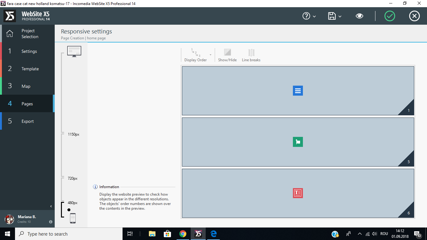
Author
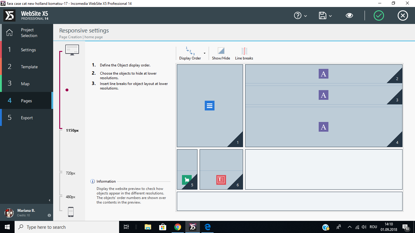
The slideshow is created like this
Author
Can I do another home page only for mobile device?
If I can do another one how can I link to the website. How Can I recognise if is mobile or desktop?
Thank you
Hello Mariana,
First of all I would like to say that the viewport for mobile is 320 px. So 1st create a viewport of 320 px to make it mobile responsive.
Then in Step 4:Pages, open the page where the slideshow is situated. Then click on the responsive settings. Then in the left side you will see that a new viewport of 320px has come. Click on that and then make the slideshow hidden.
Hope this will help you. Keep posting if you have any query regarding this. We will be happy to help you.
Thank you
You can not create another home page for mobile device. But you can choose objects to hide or show fo the device.
For example, let a website www.example.com
In the header sections there are objects like Title, logo, Social Icons, Menu
In the main page there are objects like Title, Text, Slideshow
In the footer there are objects like Text and Social Icons.
Now for all devices from Desktop to smartphone this will same. But you can edit this objects. If you would like to hide the Social Icons from the Header and want to insert a Animated Headline instead of the Social Icons, then you can do that.
Hope this will help you.
Thank you
Author
I understood that I didn t create a mobile viewpoint, but in my lowest viepoint, 480 PX I had hidden the slideshow but it didn t disappear. You can see this from the pictures that I had enclosed.
The picture behind the menu is part of the slideshow.
Mariana,
If you hide an object in one of the viewports it hides it in the next lower one.
So you need to hide in the previous viewport.
Hey Mariana,
Do one thing. Export your project to your computer then upload here. I want to check your project.
Thank you
It's not the best idea to ask people to upload there project in the helpdesk.
I would suggest to mail or use a personal upload portal.
Oops!
Sorry Andre E. You are right.
I think the slideshow created in the Row format option. What do you think? Can you solve problem of Mariana?
Thanks you
Yes I think it is in the row formats, just select colored in the pulldown and make it transparant as colour (standard setting)
that should solve it.
Author
it will solve the problem, but i won t see anymore the slideshow in the desktop size.
Author
This is my project.
***
Hello Mariana,
As suggested it is not smart to leave your project here in the helpdesk, I have removed your link.
With your project you give everybody here acces to your webserver, this is not save to do.
for your problem:
Yes it is then removed on all pages. the responsive settings on a page object cannot be removed only for lower viewports.
If you want this you need to make a seperate project that is not responsive and use some coding to automaticly switch to the other project. But it is not very friendly and I guess the google SEO will also suffer from this.
But I would recommend to keep the lowest viewport as it is in the desktop.
But beside this it is maybe a good suggustion!
So my advice: create an IDEA post for Incomedia and ask if they can make objects hide like in the header and footer because there you could make this.