Lower resolution Responsive settings 
Author: Tom G.Hi, this is the link to page I have a problem with:
http://www.ownitconsignment.com/ResTest/index.html
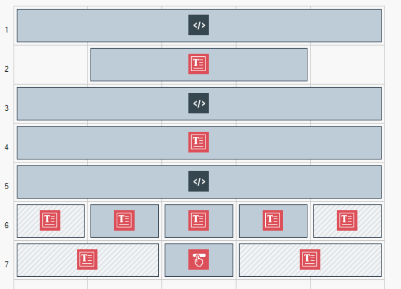
and this is a HOME page structure:

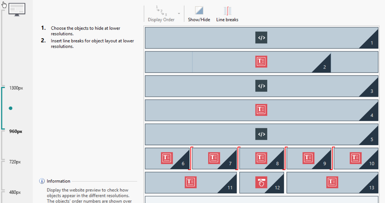
The three Text objects in row 6 - the square boxes which appear next to each other in high resolution. Below 960px the three boxes should (and do) appear under each other, as shown in Responsive settings.

For lower resolutions the boxes “drift” to the left – are not in center. The button (Hover Button) is shrinking. When reaching resolution 360px, the boxes are in the page’s center and the Hover Button gets proper size.
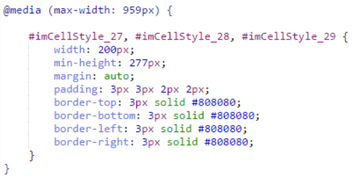
There is a code to size boxes for resolution below 960px:

How can I make the vertically positioned boxes appear in the center and the Hover Button of the normal size to be directly under the boxes?

Author
Nobody?
I would expect Incomedia support to at least try to help...
Hi Thomas.
I'm unsure as to why this would be happening exactly, but I believe you might have set some kind of padding/margin wrongly inside the software. Please check that first so that we can be sure:
As you can see from my screenshot, it seems like a padding is being added at a certain resolution:
At Step 2, check under Template structure that you didn't add any excessive margin in a specific resolution only.
Should that not be it, let me know so that I might investigate this further
Thank you
Stefano
Author
Thank you, Stefano! You pointed me to the right direction! The Structure type was set as "Header, footer and right side bar". After changing it to just "Header and footer" the "shifting to the left" problem has been fixed.
The problem with the "shrinking" Hover Button still needs to be explained. I hope you will find the solution as well.
Thanks again, Stefano!
Author
I solved the Hover Button shrinking problem.
1. Created it the whole page wide:
2. Set the size of the button:
All works as desired!