Text aligned with icon 
Author: Sinisa B.
Visited 1269,
Followers 1,
Shared 0
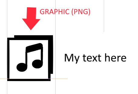
In the TEXT OBJECT - how can I position the text to be aligned with the middle of an icon?
(I do not want to convert the text into graphic)
Please see the image below:

Posted on the

Works fine.... have a play :-)
Sinisa, did you achieve acceptable text placement by playing around?
Most of the time I can get the desired placement by using text on right and simply adding a carriage return, by varying the point size I can make a line feed take up more or less space, then I simply block the text and change it back to the appropriate point size.
You can also use the paragraph line spacing feature to get closer to where you want as well.
If you don't want to place text next to an icon by trial and error and you are prepared to add the appropriate columns in page layout, you can simply add a 2 cell table object in each cell, place icon/picture in one cell of the table and text in the other. By default the text will always be centered vertically
Author
@ Esahc ..
Thank you very much for your help!
I was playing around - before writing the post - with the options you mentioned but got no satisfying results...
When I put an icon and text in the different table cells (table object) - then I got problems with displaying it on a smaller screens (icon up, text down - right or so...). BTW- the table object is not behaving in order like a fluid layout (in the mobile view) should do...
It seems that I should settle with not so perfect solution for this alignment (I started to get used to this when working with X5).
Yes, tables can be a problem, but if they are never wider than 320px they will fit on a mobile screen.