Template margins - pages display beyond areas defined, menu for low res not with 
Author: John K.
Visited 2030,
Followers 1,
Shared 0
Good day to you all,
I beleive I have an issue with my responsive template.
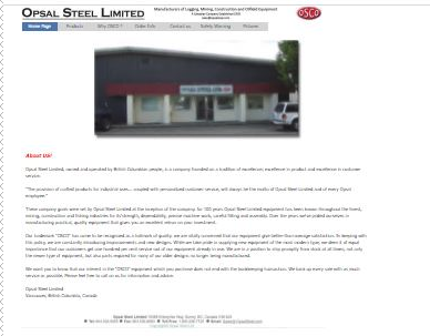
The content of the pages extrudes beyond the margins and the low res ( phone ) menu is not responsive.
Look at the extent of the menu versus the content..

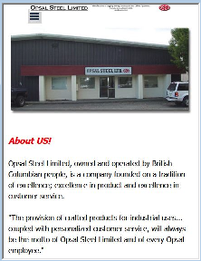
Here is what the mobile looks like

Notice the menu misaligment?
Any ideas anyone?
As always, thank you, keep well everyone and,
Cheers, JK
Posted on the

JK, I found the burger menu works OK, could part of it be overlayed by the image? If so use the front to back option to put it behind the menu object. In step 2 template content, select every object (especially the menu object) and ensure you can see all 8 handles within the displayable area. If an object extends "off screen" it results in a page that can be scrolled left and right as yours currently does on a mobile. This also applies to the footer
Also be aware that if you choose to you need not have the hamburger menu, all you have to do is make the object big enough (might mean making the header bigger at mobile resolution?) to display all the words.
I also highly recommend adding a resolution of 320
This will not display on the vast majority of phones giving you absolute control of layout for your users on their mobiles (320-480px)
Author
Thank you!
I will follow your recomendations and revert..
Cheers JK