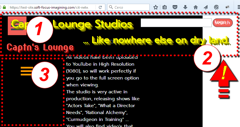
"Table" not being "Responsive" at all. 
Author: Nigel A.
Visited 2224,
Followers 1,
Shared 0
https://test-site.soft-focus-imagining.com (This is a work in progress)
I've run into a snag while building a new web-site to replace our old Joomla site.
I've attached an image file showing full width and then the next resolution down. Or see live on my test site.
We have a long list of programs that I have listed in a 3 Col. table. And the results at full resolution are perfect. But as soon as I shrink the browser window to check the next resolution down the Table is not effected and it just cuts the text off (just discovered that the same thing happens in the Pre-View window)
Am I doing something wrong here?
Regards - Nigel.
Posted on the

Nigel, there are posts here on using 3rd party code to create responsive tables (eg https://helpcenter.websitex5.com/en/post/245588), but I have always simply used the page layout to emulate a table. As such I have absolute control over responsive layout and how the cells "wrap" when there is insufficient space.
... (It > En) ... the problem is not a problem, as you can scroll the table horizontally...
... (It > En) ... ... for what is the current situation, it is important to make these corrections:

1) > ... fix the main menu level (+hamburger);
2) > ... correct the header in the various breakpoints, it must fit into the layout;
3) > ... delete the second menu and the sidebar, they are useless and take up useful space...
.
...!... when you have made the corrections, notify me, and then immediately solve for the current table with simple and appropriate EXTRA code, (copy/paste)...!...
.