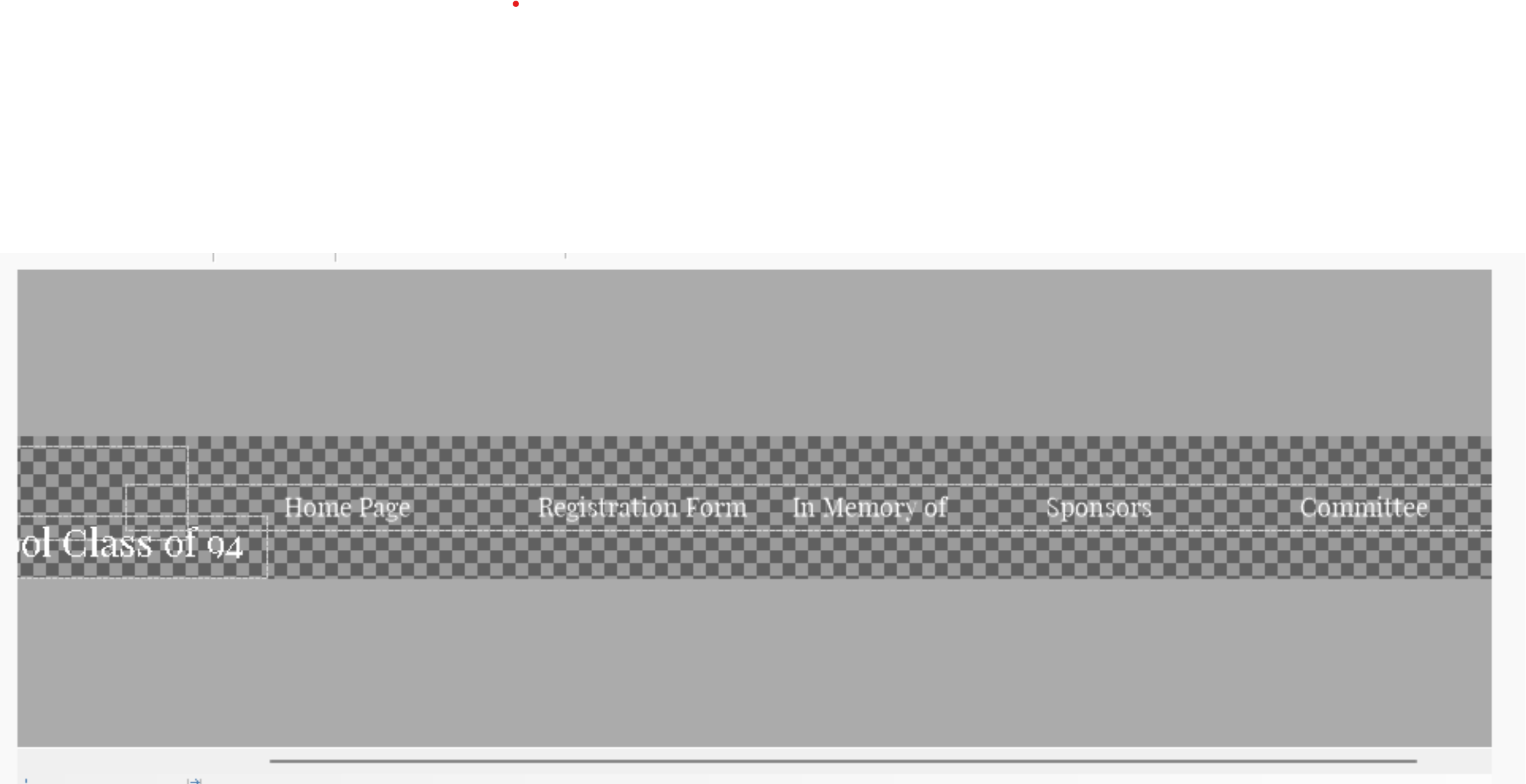
Resize template content for header menu 
Author: Nicole B.
Visited 1581,
Followers 1,
Shared 0
This is the page that as the menu header https://nicole-baker.websitex5.me/ instead of an hamburger
This has the hamburger https://nicole-b.websitex5.me/ but i know its because i added another page.
I want to resize the template content to resize it to list 6 pages. I will rename photos to fit. I am unable to to resize and delete spacing.

Posted on the

Without words
-----
-----
-----
It is an option, but only for desktop view, as soon as the screen becomes narrower the hamburger menu can be seen again.
So don't waste too much time on it.
-----
For many menu items there would still be an option that works without a Hamburger menu even on narrow screens, but the menu would then have to be created manually and expanded manually if new menu items were added, see post
>> https://helpcenter.websitex5.com/en/post/259508
-----
Author
Funny I played with that number but i guess didnt do it enough to see a difference. Thank you once again Daniel. Can i put you on speed dial hehe
Author
Ive lowered the number but it compressed the words, so i am asumming I am going to have change the wording to get it to fit or ceate the menu manually. Thanks again

(It > En) ... ... I don't know if I understand what you want to achieve, but if you are interested in an aspect of the menu as a result as in my printout below, it's simple with my exclusive EXTRA code, now used by many...

... the basis of my code can also be found in this topic:
>> https://helpcenter.websitex5.com/en/post/219404#comment43
... just customize the value of the reference selector, ... otherwise let me know if this is exactly what interests you, and I will post the code dedicated to you, one line, which you can then apply with a simple copy/paste. ..
.
ciao
.
Author
Thanks KolAsim
Author
Yes KolAsim, Im interested in your code
... OK ... ... ... code:
<style>
/** menu elastic -- K -- **/
div[id^='imHeader_imMenuObject_'] ul > li > .label-wrapper { width: auto !important;padding: 0 10px !important}
</style>
.....................................
ciao
.
Author
Hey KolAsim, I thought I replied, where do your code go?
ciao, ... ...paste the code in this section:
>> Step 1 - Settings > Statistics and Code > Options in the Code section:
▪Custom Code: > (3) third option > Before closing the HEAD tag.
.
ciao
.
Author
i put the code but it change the how hamburger menu look
I found that in my test too.
The code writer has to test it himself first and then post the correct code.
Author
Thanks Daniel
I adapted and tested KolAsim's code, the code works for me.
The number "03" may need to be adjusted in the code. To do this, check the source code view on your own website to see what number is there.
<divid="imHeader_imMenuObject_03_container">
-----
<style>
/** menu elastic -- K -- **/
div[id^='imHeader_imMenuObject_03_container'] ul > li > .label-wrapper { width: auto !important;padding: 0 10px !important}
</style>
My test page before and after inserting KolAsim's code.
-----
-----
In the hamburger menu there are two menu items on one line, perhaps KolAsim can adapt the code so that each menu item is on its own line.
-----
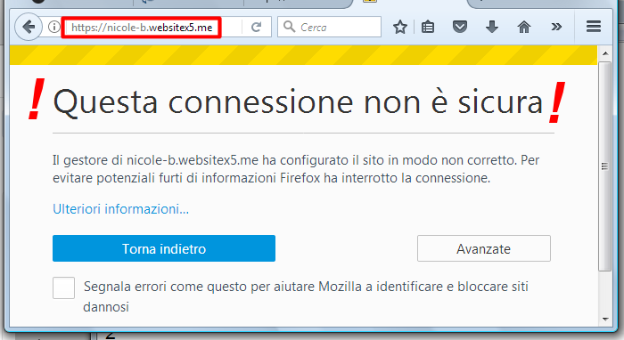
.... the second of the two LINKS in the first post doesn't work for me...

[ This connection is not secure ]
.
... instead regarding the first of the two LINKS, nicole-baker.websitex5.me,
... in this case there are two alternative paths that can be taken;
> ...the first selective with unique selector ID for the single site;
> ... and the second global or general for sites with similar structure...
.
> ... code for the first way:
<style>
/** menu elastic -- K -- **/
#imHeader_imMenuObject_03_container > ul > li > .label-wrapper { width: auto !important;padding: 0 10px !important}
</style>
> ... code for the second way:
<style>
/** menu elastic -- K -- **/
div:not([id$='-menu-opened']) [id^='imHeader_imMenuObject_'] ul > li > .label-wrapper { width: auto !important;padding: 0 10px !important}
</style>
-
ciao
.
Author
Thanks, I added the code to the site and it didnt change for me
KolAsim, i got a domain name https://rhs94alum.org/index.html
...depends on the options you used...
...now the extended normal menu is missing...
... there is only the hamburger menu...
...check what you have applied in this option:
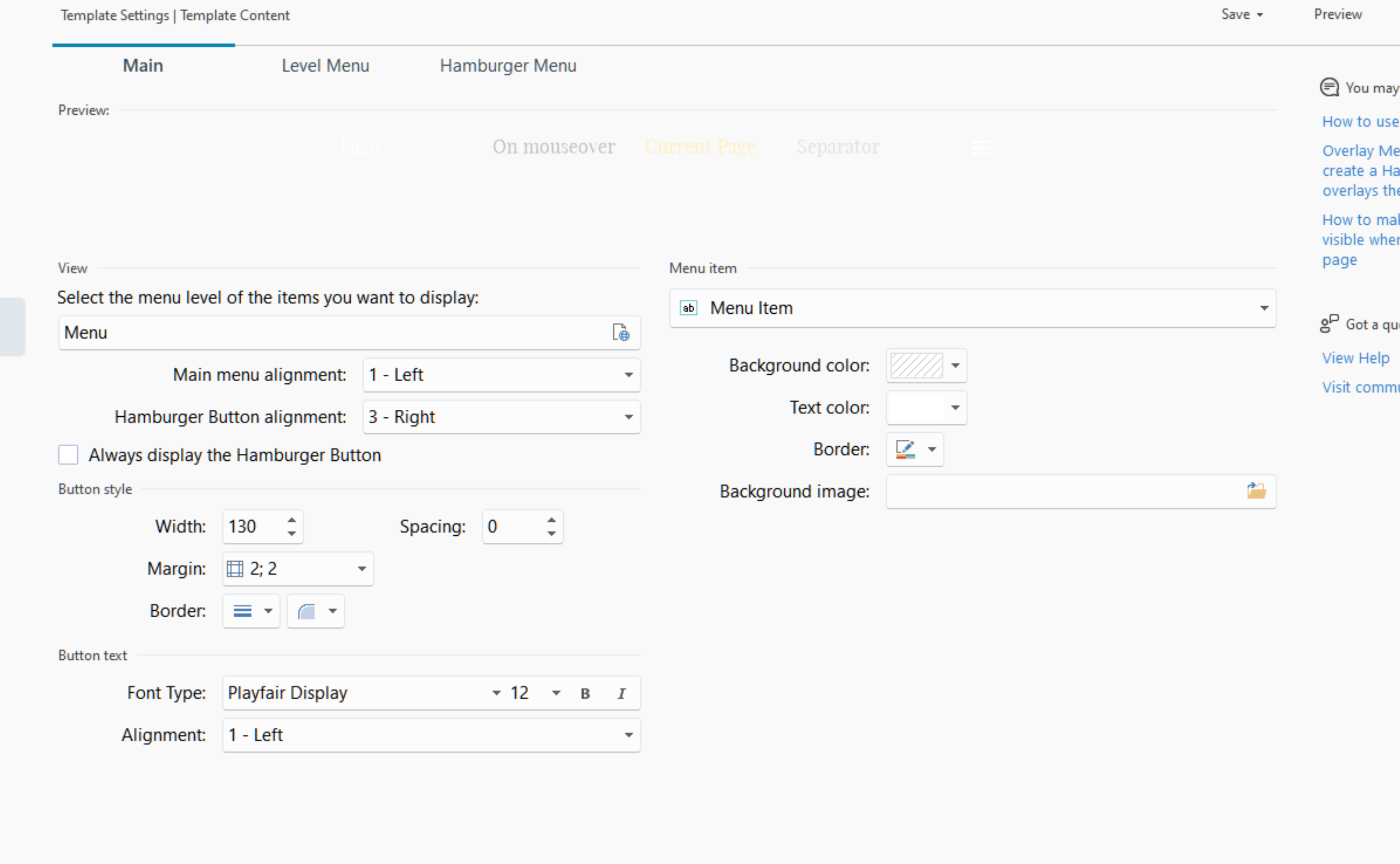
>> ▪Always display the Hamburger Button: this allows the Hamburger Button to always be displayed instead of the main Navigation Menu, regardless of whether the available space is large enough to accommodate the expanded view of all the options.
.
Author
Hey KolAsim, i do not have that check

... check and adopt the same settings you used on this site:
>> https://nicole-baker.websitex5.me/
.
ciao
.
Author
Hey KolAsim, that page only had 7 items, I added another, the word pay. I figured if i could condense the header all 8 would show.
Maybe KolAsim can write the code so that the menu items are spread over 2 lines, then there would be scope for menu extensions.
Or in the header of the website the menu items are manually placed in a text object and linked, see my blue highlighted post above.
On my test page I put it in two lines in a text object in the header.
However, with the last two smaller resolutions I had to hide the text object and inserted the menu object there instead, so that the hamburger menu appears on the very narrow screens.
And I had to change the placement of the objects a bit so that everything could be seen. The preview often showed the wrong thing, so I had to switch between the device symbols several times. I also often exported and tested online because I could never rely 100% on the preview during my test.
For my test I only used text without links.
-----
I linked to the 2nd line of text on my test page.
>> http://finde-links.de/test123-beautyblog/blog/index.php
If KolAsim can offer a code for 2-line menus then all the better, otherwise my method would remain with text object and manual linking.
... I don't know what you did in the project, ... but when I first checked, the menu was set up correctly on both sites...

.
... widen the menu across the entire width of the header, and increase the height by at least double to arrange the menu items on two lines...
(...or merge two menu items into one level...)
.
.
Author
I did widen it, all it did was add padding around the words. I'll just remove one thanks for trying.
Daniel if I went with the text and look option, on Mobile would it look condensed or would hamburger menu show
... ...check better...
...my previous code is an EXTRA invention of mine which is only used for elastic spacing between menu items...
...but the menu must be properly constructed with the program options that you have to try yourself...
.
ciao
.
My method uses here...
2 Template > Contents of the template
Header __________
... inserted the text object with the manual links in the 1st (top) of the 4 sections in the appropriate size so that there is space for 2 lines.
Then in the second section you can resize the text object so that it fits and is large enough for 2 lines.
In the 3rd section, the text object is hidden because there is no longer enough space for 2 lines, and the menu object is inserted.
In the 4th section (below), the text object is also hidden because there is no longer enough space for 2 lines, and the menu object is inserted.
-----
Author
Thanks you two for help. I drag the box outside the screen and used KolAsim code and got all 8 to show. Thank you again you two. The reunion page is slowly coming together
.... OK. ... ciao
.
.
... add this code:
<style>
#imHeader_imMenuObject_03_wrapper { width: auto !important }
</style>
.
Author
with the old code it shows it straight no scroll, when i put that new line of code, it put the menu on two lines
new code
...my last code must be added to the previous one and not replaced...(add this code)
...
... or to replace everything you can use this code that incorporates everything together:
<style>
/** menu elastic -- K -- **/
div:not([id$='-menu-opened']) [id^='imHeader_imMenuObject_'] ul > li > .label-wrapper { width: auto !important;padding: 0 10px !important}
div[id^='imHeader_imMenuObject_'] { width: auto !important }
</style>
.
.
Author
ROFL my bad KolAsim, I have made the suggestions as stated.Thank you very much
Author
I add the code now the hamburger menu doesnt show on mobile or tables. just blank space
... ...
...  ... I saw, ... you're right...
...so let's go back to the origins of my code...
...replace everything with this:
<style>
/** -- menu elastic -- K -- **/
#imHeader_imMenuObject_03_container > ul > li > .label-wrapper { width: auto !important;padding: 0 10px !important}
#imHeader_imMenuObject_03_wrapper { width: auto !important }
</style>
...
... y ou check online and let me know...
.
ciao
.
Author
Ciao KolAsim, it is working now. One problem down several more to go hehe. Thank you for taking the time to help me.
... ... Ciao
.