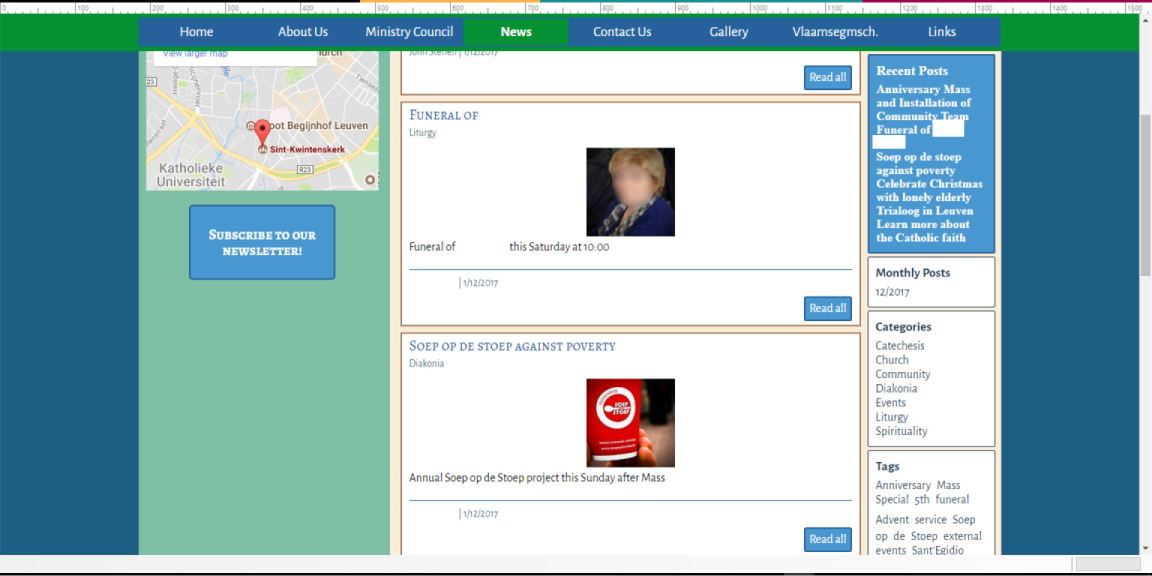
Blog: Recent Posts not distinct 
Author: Tyler D.
Visited 2897,
Followers 1,
Shared 0
Hello, I am using WebSite X5 Evo 14. In my website's blog, I find the "Recent Posts" box doesn't distinguish the different articles very well. It just looks like one continuous block of text. I would like to make the articles list bulleted, or at least add more vertical whitespace between each list entry. I appreciate any help you can offer!

Posted on the

Hello Tyler,
The recent post object in the sidebar shows every title on a new line unless the title is too long and then it continues on another line. You can increase the width of the sidebar to make them appear more distinct.
Many thanks!
Author
Thank you for your response! Some of our titles are relatively long...not unreasonably long, but just too long to give a full line to each title. But even still, there isn't any vertical whitespace between the lines, so it's just a big block of text. It would be nice to have either more control over the display, or at least to have a bit more whitespace built in.
Hello Tyler,
I would like to suggest that you open an "Idea" Post where you describe to us the feature you would like to see implemented in the future releases of WebSite X5.
Many thanks!